Lead Product Designer · Toronto

I make complex
systems feel
obvious.

12+ years designing digital products and complex systems that make everyday experiences simpler, clearer, and more human.

Ellie Farahani
12+
years shipping
16+
products live
Work

Selected work

Grouped by organization. Open one to see the products.

Government of Ontario

Research & Design Lead2025 — Present2 products
See the work +
Designing a More Proactive Government Service
Flagship case study

Designing a More Proactive Government Service

Leading design of an AI-powered online service, including inclusive, trustworthy AI identity verification, that helps people find the right service, complete it, and know what comes next.

Service designHuman Centered AI DesignAI Design Assistants
Also shipped here
Reimagining Driver & Vehicle Services
ServiceOntario

Leading product design across online, counter, and internal systems, transforming a decades-old platform into a connected, guided, and role-based experience serving millions of Ontarians.

2025 — Present
Lead Designer

TD Insurance

Lead Experience Designer2023 — 20252 products
See the work +
TD MyAdvantage: Usage-Based Insurance
Flagship case study

TD MyAdvantage: Usage-Based Insurance

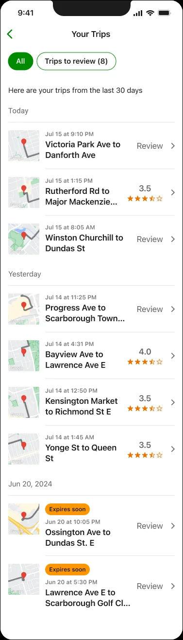
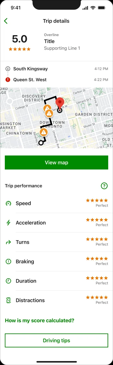
Redesigned and integrated a standalone telematics app serving 150K+ users into the TD Insurance platform. Transformed a confusing score into a transparent, motivating system that drives safer driving.

Mobile appBehavioural design
Also shipped here
Home & Auto Insurance
TD Insurance

Led design across claims, billing & payments, Apple Pay, Google Wallet, push notifications, dashboard modernization, and design system migration for 3M+ customers.

2023 — 2025
Lead Experience Designer

TD Bank Group

Lead Experience Designer2021 — 20232 products
See the work +
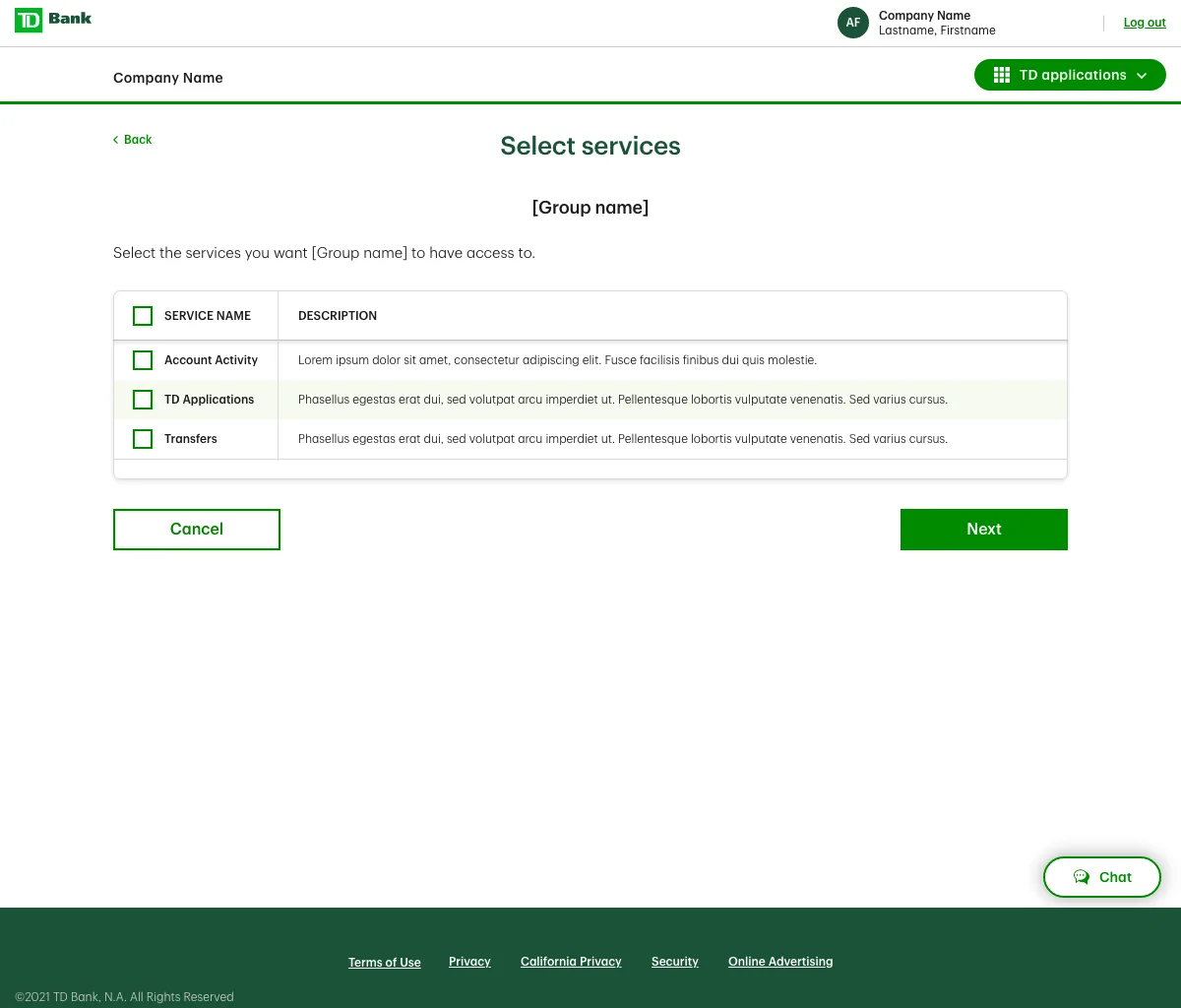
Canadian & U.S. Business Banking Platform
Flagship case study

Canadian & U.S. Business Banking Platform

Joined a struggling mid-stream project and turned it around. Unified a commercial banking platform for 2M+ business users. Won TD Project of the Year.

PersonalizationSystems Thinking
Also shipped here
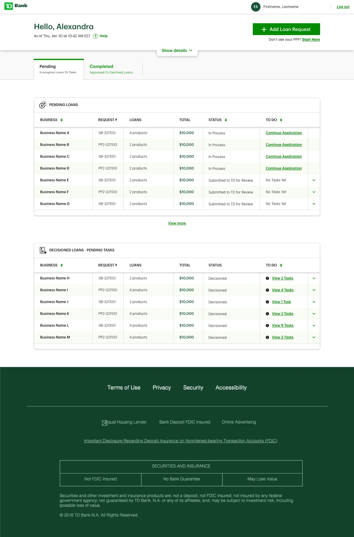
U.S. Business Loan Application
TD Commercial Banking

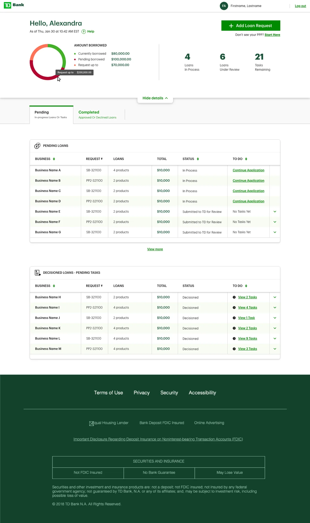
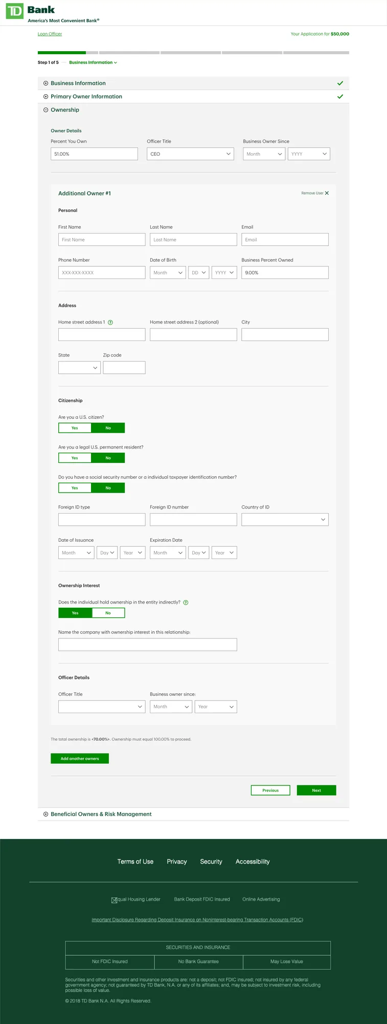
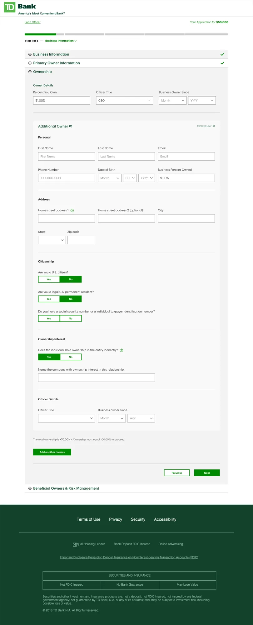
Redesigned end-to-end digital loan application for U.S. small business customers, unifying multiple product flows into one adaptive, scalable experience.

2021 — 2023
Lead Experience Designer

Ministry of Labour & Transportation

Research & Design Lead2018 — 20217 products
See the work +
Self-Audit Digitization Tool
Flagship case study

Self-Audit Digitization Tool

Replaced a paper-based compliance process with a digital platform. Cut ESA compliance time 84%, from 12 months to 60 days, helping workers recover unpaid wages faster.

Compliance serviceAODA / WCAG 2.0 AA
Also shipped here
Officer Case Management Portal
Ministry of Labour

Designed the ESO case management tool, executive manager dashboard, and admin panel enabling Officers across Ontario to track and manage compliance workflows.

2018 — 2020
Research & Design Lead
Inspection Tool
Ministry of Labour

Led discovery and framing for a digital tool that streamlines employment standards inspections, from initiation through site visit to bringing employers into compliance across Ontario.

2019 — 2020
Research & Design Lead
Claims Processing System
Ministry of Labour

Led discovery, framing, and design of a digital claims processing platform, streamlining 17,000+ annual claims for officers and claimants across Ontario.

2019 — 2020
Research & Design Lead
Highway Corridor Management System
Ministry of Transportation

Designed HCMS 2.0, expanding a permit management platform into a full end-to-end land development review system across Ontario's road network.

2020 — 2021
Research & Design Lead
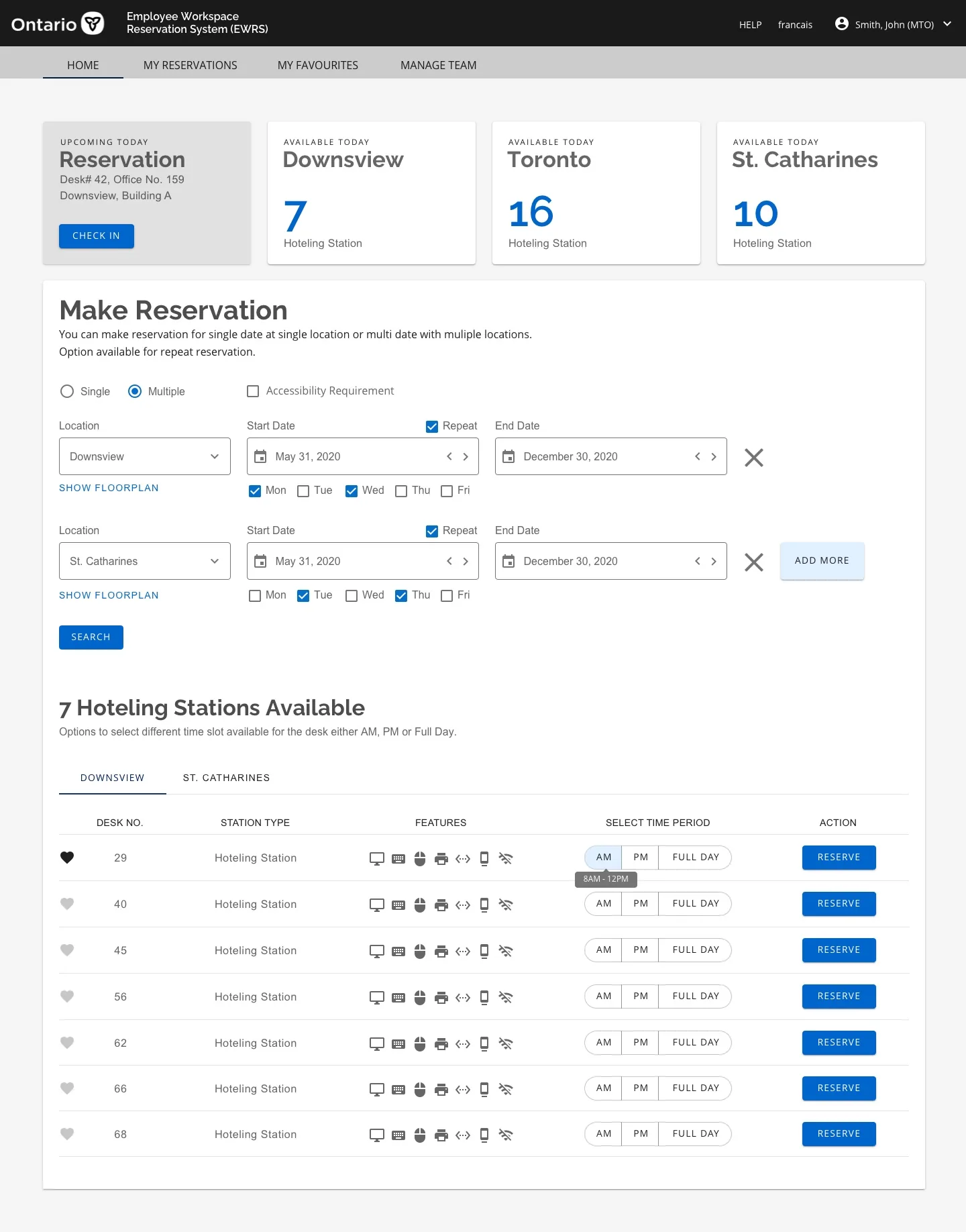
Employee Workstation Reservation System
Ministry of Government & Consumer Services

Designed EWRS, a government-wide hot-desking platform supporting COVID-19 recovery by enabling flexible workspace booking.

2020 — 2021
Research & Design Lead
Self-Check Tool
Ministry of Labour

A self-serve compliance checking tool enabling Ontario employers to assess their adherence to employment standards before an Officer investigation is triggered.

2018 — 2019
Research & Design Lead
MLTSD Design Style Guide
Ministry of Labour

Foundational design style guide for the Ministry, establishing visual standards, components, and patterns adopted across 5+ digital products.

2018 — 2021
Research & Design Lead
About

Strategic thinking.
Human empathy.

I'm at my best when the problem is complex and the path forward isn't obvious. I bring structure to ambiguity, connect the dots across systems and people, and turn ideas into experiences that are clear, useful, and thoughtful.

I've led design across large-scale enterprises and startups, working end to end from research and strategy through execution, while helping teams build stronger products, practices, and ways of working.

Human-Centered AI Design AI Design Assistants Vibe Coding Product Strategy UX Research Service Design Design Systems Accessibility Team Leadership Design Facilitation
01
Reframe before designing

I start by challenging the brief. Most stalled projects are a definition problem wearing a design problem's clothes.

02
Design in the open

Early, rough, and shared. Alignment comes from people watching the thinking happen, not from a polished reveal.

03
Systems over screens

A component, a pattern, a rule. Anything designed once and reused is worth more than anything designed beautifully once.

04
Grow the team

Mentorship, documentation and shared craft standards, so the work keeps improving after I leave.

Career

12+ years of
shipping things that matter

2025 — Now
Research & Design Lead
Ontario Government

Lead research and product design for complex, province-wide digital services. Explore and apply AI across the design process to accelerate research, synthesis, prototyping, and workflow exploration while partnering with product, engineering, and policy teams to improve high-impact public services.

2023 — 2025
Lead Experience Designer
TD Insurance

Led product and experience design across mobile and web insurance experiences, translating complex customer, business, and regulatory requirements into clear, accessible journeys. Partnered with Product, Engineering, and Research from discovery and strategy through validation and delivery.

2021 — 2023
Lead Experience Designer
TD Bank Group

Led product design for commercial banking and business lending, designing complex dashboards, workflows, and financial tools across web and mobile. Worked closely with Product and Engineering to simplify complex experiences while balancing customer needs, risk, compliance, and technical constraints.

2018 — 2021
Senior Product Designer & Researcher
Ministry of Labour & Transportation, Ontario

Led UX research and product design for public-sector digital services, translating complex policies and workflows into accessible, user-centered experiences. Designed to AODA and WCAG 2.0 AA standards while partnering with multidisciplinary teams through delivery.

2017 — 2018
UX/UI Designer
Jonas Software

Designed web and desktop experiences for club-management software, supporting complex workflows across golf, hospitality, and recreation businesses.

2015 — 2017
UX/UI Designer & Front-End Developer
Three Point Turn

Designed and built responsive marketing websites, combining UX, visual design, and front-end development to deliver client-ready digital experiences.

2014 — 2015
UI Designer & Front-End Developer
Orcasense Inc.

Designed and developed responsive digital experiences for a smart-sensing startup, combining UI design with front-end development to bring the product and brand to life online.

2013 — 2015
UX/UI Designer & Front-End Developer
Bartar Media Group

Designed and built consumer web applications from wireframes through launch, translating concepts into responsive, production-ready experiences.

2012 — 2013
UI Designer & Developer
Red Planet Technologies Inc.

Designed and developed responsive marketing and product websites using HTML, CSS, and JavaScript.

2007 — 2012
Lead Designer
Safe Gas Energy Engineering Co.

Led UX/UI design across multiple web applications, owning the design process from requirements and prototyping through implementation and release.

Get in touch

Let's work
together

Open to new roles, collaborations, or a straightforward chat about design.

TD Insurance · iOS & Android · 2023–2025

TD MyAdvantage
UBI Redesign

Role
Experience Design Lead
Platform
iOS & Android
Team
2 PODs — 6 designers
Launched
September 2025

Integrating a standalone UBI app into a unified, trustworthy experience

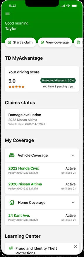
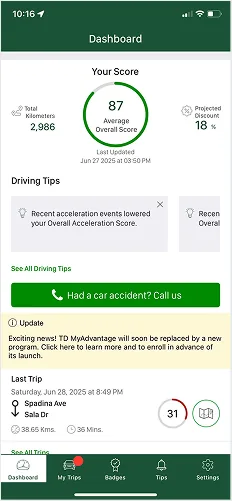
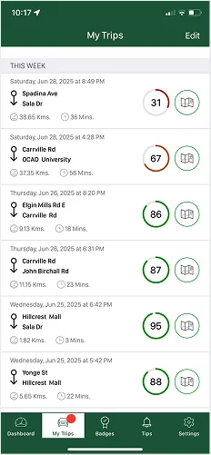
TD MyAdvantage rewards safer driving with personalized discounts. With ~150,000 active users and a 40% closing ratio, the program had strong adoption — but engagement had plateaued. Users lacked confidence in what was being tracked, didn't trust the scoring system, and found it frustrating to toggle between apps.

As UX Lead, I was tasked with integrating MyAdvantage into the main TD Insurance mobile app — a full experience rethink built to address real user concerns, preserve existing functionality, and support future growth.

Three pain points driving disengagement

Data transparency
Users weren't confident about what was being tracked or how their data was being used — eroding trust.
Perceived inaccuracy
Many didn't trust the driving behaviour scoring system, causing friction and attrition at key moments.
Fragmented experience
Toggling between apps led to confusion and reduced cross-sell opportunities within the TD ecosystem.

Five design objectives

  • Unify the experience by integrating MyAdvantage into the main TDI app
  • Improve transparency around data collection and scoring
  • Build trust through clear UI and feedback mechanisms
  • Promote deeper engagement through personalised tips and milestones
  • Mitigate migration risk by maintaining continuity for existing users

Discovery, design, and migration — in that order

Discovery & Research

  • Facilitated workshops with internal stakeholders and frontline support teams to map pain points
  • Synthesized research from usability sessions and app store reviews to define opportunity areas
  • Collaborated with legal and privacy teams to align on compliant yet user-friendly communication

Experience Design

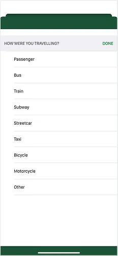
  • Reimagined onboarding to clearly explain what data is collected, how it's used, and how it benefits the user
  • Designed a new driving behaviour dashboard with intuitive feedback, visualizations, and educational tips
  • Simplified navigation so MyAdvantage feels like a natural extension of the broader app

Migration Strategy

  • Designed flexible transition flows to preserve user progress and score history during migration
  • Developed proactive communication templates to inform users ahead of the switch and reduce anxiety

Legacy experience

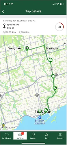
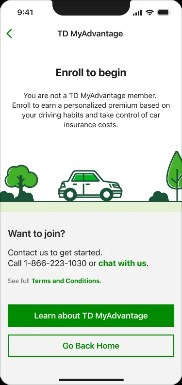
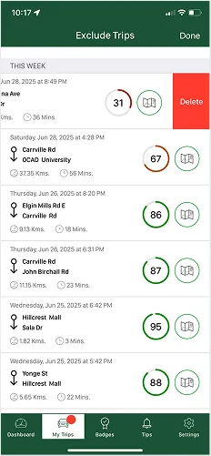
The original standalone MyAdvantage app — showing the score-only dashboard with no breakdown, no context, and no connection to the main TD Insurance app.

Current state 1 Current state 2 Current state 3 Current state 4 Current state 5

Redesigned experience

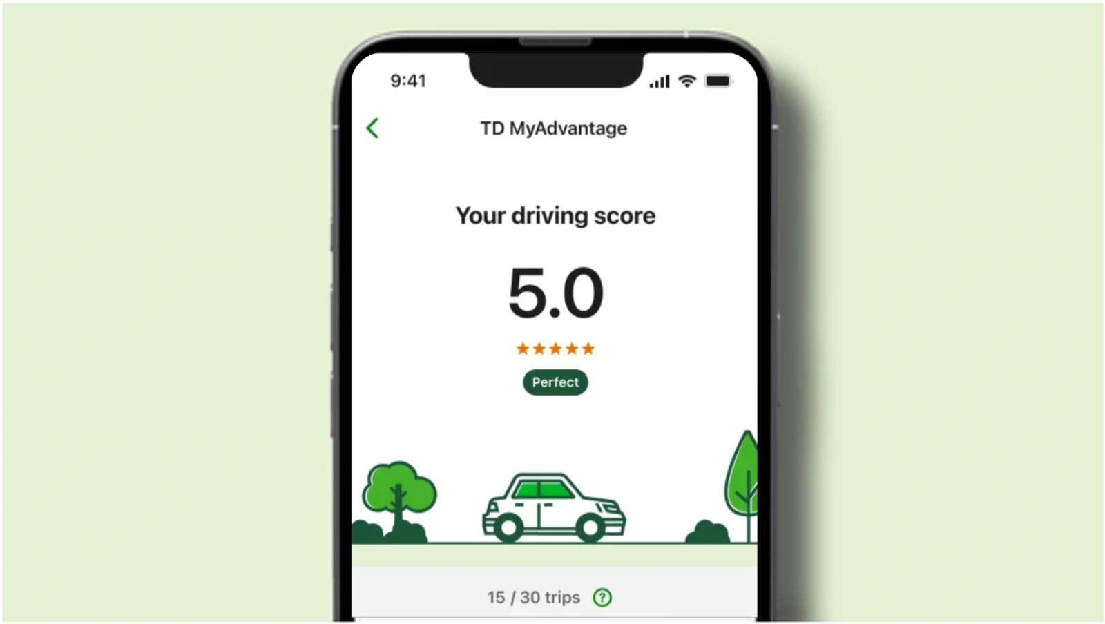
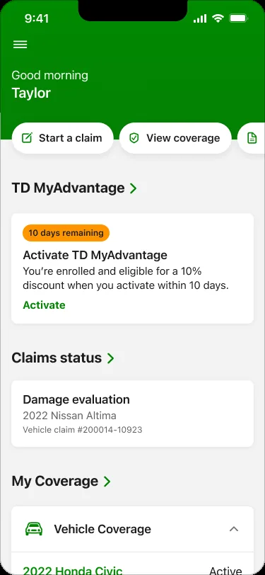
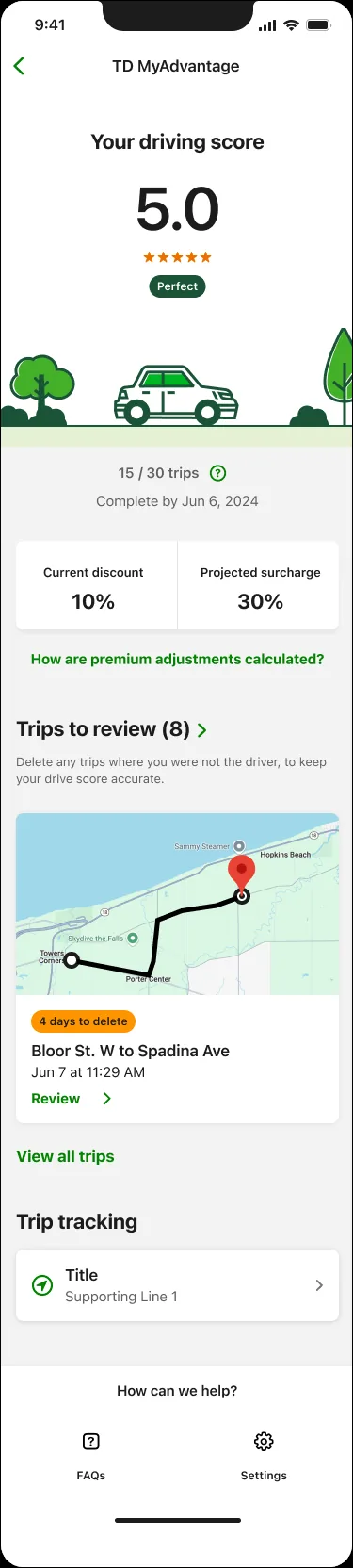
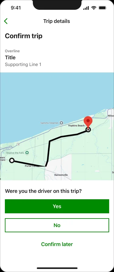
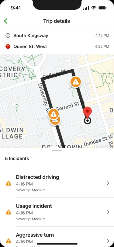
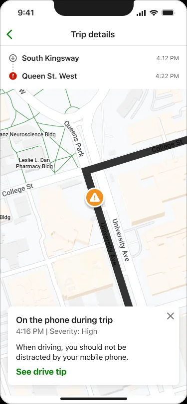
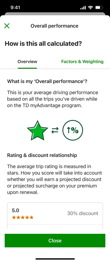
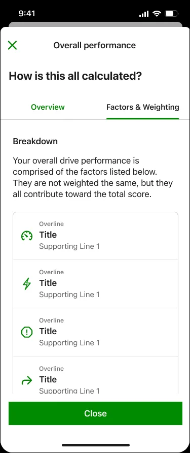
The new integrated experience — transparent score breakdown, trip progress, personalised tips, and a unified home inside the TD Insurance app.

MVP1 screen 1 MVP1 screen 2 MVP1 screen 3 MVP1 screen 4 MVP1 screen 5
MVP1 screen 6 MVP1 screen 7 MVP1 screen 8 MVP1 screen 9 MVP1 screen 10

Measurable impact post-launch

+18%
Onboarding completion rate
+15%
Task success in usability testing
−22%
Reduction in support tickets
4.8★
Overall app rating
Next project
Home & Auto Insurance App & Web →
Also worth reading
TD Business Banking Platform →
Ontario Government / ServiceOntario · 2025–Present

Reimagining Driver & Vehicle Services

Designing a connected service across online, in-person, and internal government systems
Role
Lead Product Designer
Organization
Ontario Government / ServiceOntario
Focus
Driver's Licence, Photo Card, Counter, AI
Timeline
2025 – Present

How do you redesign a government service used by millions of people when the technology behind it is decades old, the service spans multiple products, and every interaction has policy, operational, and accessibility constraints?

I'm part of the team transforming Ontario's driver and vehicle services, working across public-facing, counter, and internal experiences. My focus is on Driver's Licence and Ontario Photo Card services, the counter experience, and exploring how AI can make these services simpler, faster, and more efficient.

At the counter, DVIS is replacing a 40-year-old system that supports more than 75% of in-person transactions. The project is projected to reduce manual work and hotline calls while speeding up completion across services used by 10.6M drivers, 13.5M vehicles, and 60,000 bus and truck companies.

"I can't believe government is still working with this dinosaur."

— ServiceOntario staff member during research

The system was making people learn the complexity

Ontario's driver and vehicle services are used by millions of people every year, both online and at ServiceOntario locations. Behind these services, however, much of the experience has been supported by technology that was designed decades ago.

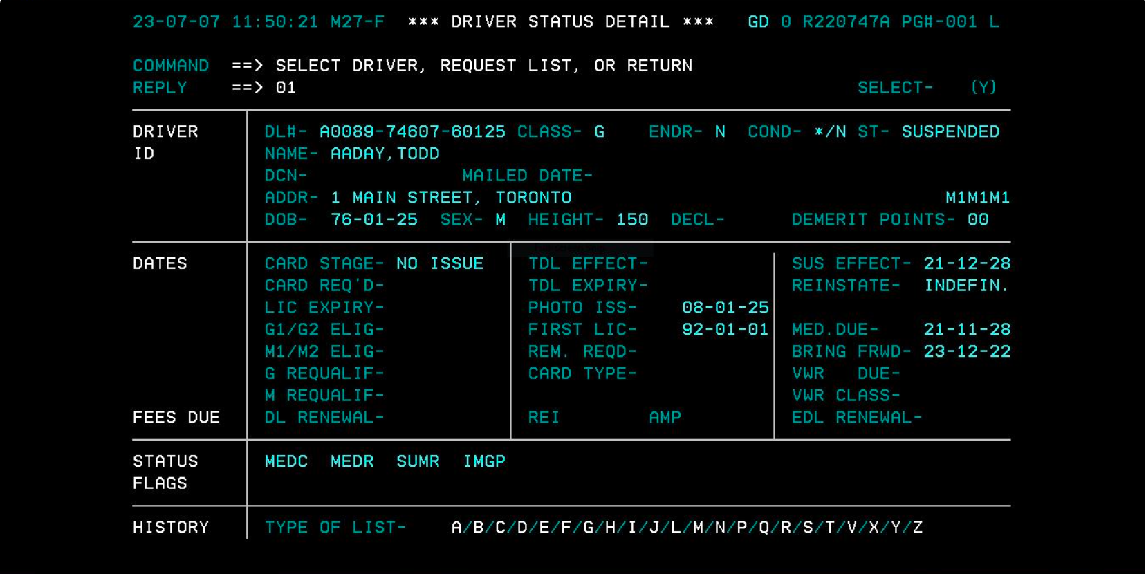
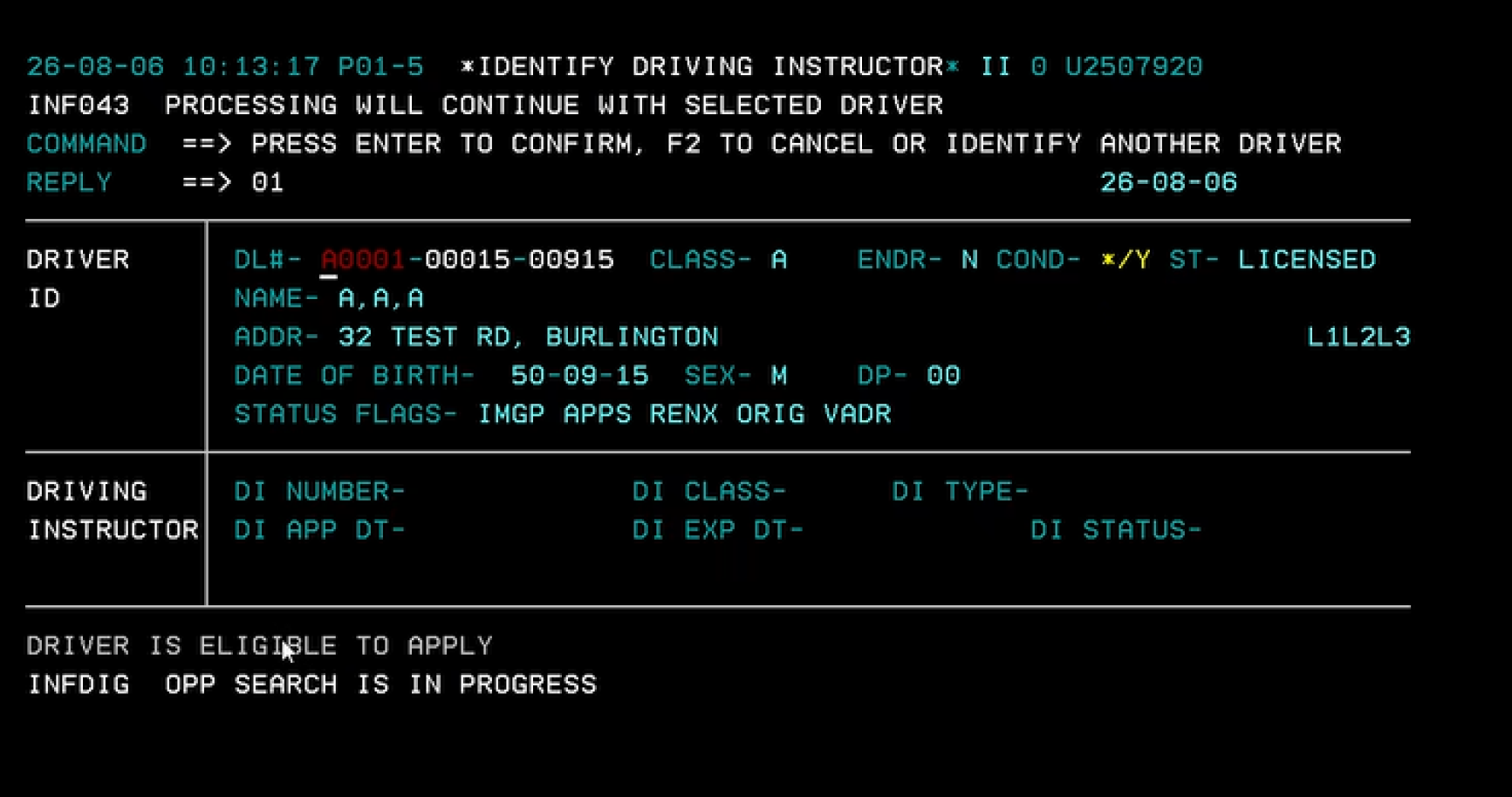
For counter staff, the experience was especially difficult. The system was text-based. Staff had to remember codes and syntax, navigate using the Enter and Tab keys, and rely on their own knowledge to know which steps to take. The system didn't always guide them through the process, and important policy rules weren't necessarily built into the workflow.

When something went wrong, recovering from the mistake could be just as difficult. A payment failure, photo-capture issue, or data-entry mistake could mean backing out of the transaction, starting again, and sometimes processing a refund before trying again.

Over time, experienced staff learned how to work around these limitations. But that created another problem: a lot of the knowledge needed to use the system effectively lived in people's heads. For a new employee, getting comfortable with the system could take around a year.

That became one of the biggest things I wanted to understand. Why was the system making people learn the complexity instead of helping them through it?

Legacy driver status detail screen, dense, text-based record with no guidance
Legacy driver and vehicle services terminal screen

Current state: the legacy text-based system, numbered menus, memorised codes, and dense record screens that staff had to navigate from memory.

Hands-on, end to end, across both sides of the service

I'm the Lead Product Designer on this work, and I stay hands-on throughout the process, from research and problem framing through design, prototyping, validation, and developer handoff. I focus primarily on the Driver's Licence and Ontario Photo Card experiences and the counter experience, as well as AI-driven opportunities across the service.

I also run research myself. That means talking to both sides of the service:

  • The people using government services
  • The staff delivering those services

I find that especially valuable because it gives me a view of the service from both perspectives. I'm not just looking at what happens on a screen. I'm trying to understand what happens before, during, and after the interaction.

I work closely with product owners, business analysts, engineering, policy, accessibility, and data teams, and I also coach other designers through critique, feedback, and mentorship.

The system was fighting the person using it

One of the clearest insights from research was that the system fights the person using it. Staff had developed their own ways of getting around the limitations of the technology. They knew which codes to use, which sequence to follow, where to look for information, and what to do when something went wrong.

That experience was valuable, but it wasn't scalable. It also meant that the system wasn't really helping staff do their jobs, the staff were compensating for the system.

The "dinosaur" comment from our research captured it perfectly. It wasn't really about how the interface looked, it was about how much effort staff had to put into making the system work.

Move the complexity from people into the product

At first glance, the problem could have been framed as: "How do we modernize the old counter application?" But that felt too narrow. The real opportunity was to rethink how the service supported staff.

Instead of asking staff to remember codes, policies, and recovery steps, what if the system could carry more of that complexity for them? That became the foundation of our approach. We focused on three things:

Make the next step clear
Instead of relying on memorized codes and sequences, the system guides staff through the process in plain language.
Put policy into the workflow
Where appropriate, the system can help staff apply policy at the point where they need to make a decision.
Make mistakes easier to recover from
If something goes wrong, staff shouldn't have to abandon the entire transaction and start again.

Deciding where the complexity should live

There was an interesting tension here. Experienced staff had become very efficient with the old system because they knew all the shortcuts. A more guided experience could potentially feel slower for someone who had been using the system for years.

We had to decide what mattered more. We chose to prioritize making the correct path easier and reducing costly mistakes, even if that meant adding some guidance for experienced users.

For me, this was an important design decision because it wasn't about making the interface look better. It was about deciding where the complexity should live. The old system put much of the complexity on the staff. The new experience puts more of it into the product.

Designing around what the person is trying to accomplish

Another thing we changed was how staff think about a customer's request. The old experience treated services more like separate transactions.

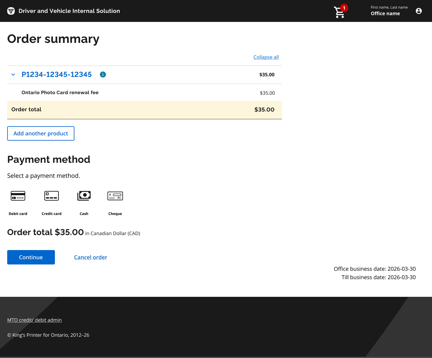
We introduced a shopping-cart approach so staff can add multiple products and complete them together. This means they don't have to repeatedly enter the same information or start a completely separate process for every service.

It's a small example of a bigger shift: we're designing around what the person is trying to accomplish, rather than how the old system happened to structure the transaction.

People will make mistakes, the product should help them recover

One of the simplest but most important improvements is what happens when something goes wrong. In the old experience, an error could mean backing out of the entire transaction and starting again. That's frustrating for staff, but it also affects the person standing at the counter.

We designed the new experience so staff can correct errors within the transaction instead of throwing everything away and starting over. The principle is simple: people will make mistakes, and the product should help them recover.

Reduce cognitive load without taking the decision away

Another challenge was that staff shouldn't have to remember every policy rule themselves. We started bringing those rules closer to the point where staff make decisions.

For example, the system can help ensure that a pickup truck is registered appropriately as a commercial vehicle based on the information being entered. Instead of expecting someone to remember the rule or look it up separately, the system can help guide the decision.

This is one of the areas where I think good product design can make a real difference in government services: the product can reduce cognitive load without taking the decision away from the person.

Three products, one connected service

The counter experience is only one part of the service. The broader transformation includes three connected products:

Online ServiceOntario
Where people can complete services themselves.
Counter
Where ServiceOntario staff help people in person.
DVIS
The internal system that manages the underlying driver and vehicle records.

I don't see these as three separate products. I see them as three parts of the same service. A person might start online, continue at a ServiceOntario location, and have their information ultimately managed through the internal system.

That means a problem in one part of the service can create problems somewhere else. Looking across all three experiences helps us design for the whole journey rather than optimizing one interface in isolation.

A human-in-the-loop approach to AI

AI is another part of my role on this work. I'm interested in AI beyond simply adding a chatbot to an existing service. The more interesting question is: where can AI actually reduce the amount of work people have to do?

That could mean helping staff understand complex information, reducing repetitive work, supporting decision-making, or helping people navigate a complicated service.

But government services also come with a high level of responsibility. People need to understand what is happening, know when a decision is being made, and be able to trust the system. So I'm thinking about AI through a human-in-the-loop approach:

  • What should the system do automatically?
  • Where should it assist?
  • Where should a person remain in control?

Research is continuous, not a one-time phase

I work in three-week design sprints and bring research into the process continuously. I don't treat research as something that happens once at the beginning of a project.

At the start of a sprint, I talk to users and staff to understand what's happening and challenge our assumptions. Then I use what I learn to shape the next design direction. I prototype early so the team can react to something tangible rather than debating abstract ideas. I test the designs, learn what isn't working, and bring those findings back into the next iteration.

Research Design Prototype Test Learn Iterate

It's a continuous loop rather than a straight line.

Helping many perspectives make decisions together

This work involves a lot of different perspectives. I work closely with:

  • Product owners
  • Business analysts
  • Engineering
  • Policy
  • Accessibility
  • Data science
  • Other designers

A big part of my role is helping these groups make decisions together. Sometimes that means facilitating a workshop. Sometimes it means challenging an assumption. Sometimes it means taking a complex policy or technical constraint and finding a way to translate it into something people can actually use. And sometimes it means helping the team understand that the problem we're trying to solve isn't the problem we started with.

Validated direction, phased rollout

The new experience isn't live yet, so I'm deliberately not presenting projected numbers as results. We have defined success around:

  • Reducing the time it takes new staff to become comfortable with the system
  • Reducing errors and transaction back-outs
  • Reducing manual work
  • Making policy easier to apply correctly
  • Helping staff complete transactions more efficiently
The experience is planned to soft-launch in three offices in September 2026 before expanding further. At this stage, the most important result is that we've validated the core direction through research and testing. The real test will come when people start using it in their day-to-day work.

Good design puts complexity in the right place

This project has reinforced something I've learned throughout my career: complex products don't become simple just because you give them a cleaner interface.

The hard part is understanding where the complexity comes from and deciding what the product should take on versus what the user should have to manage. In this case, the old system made staff carry a lot of that complexity. Our job is to move more of it into the system.

And for me, that's what good product design is about: making difficult things easier without hiding the things people need to understand or control.

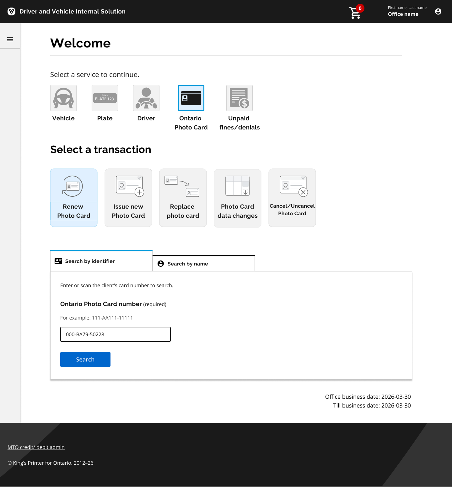
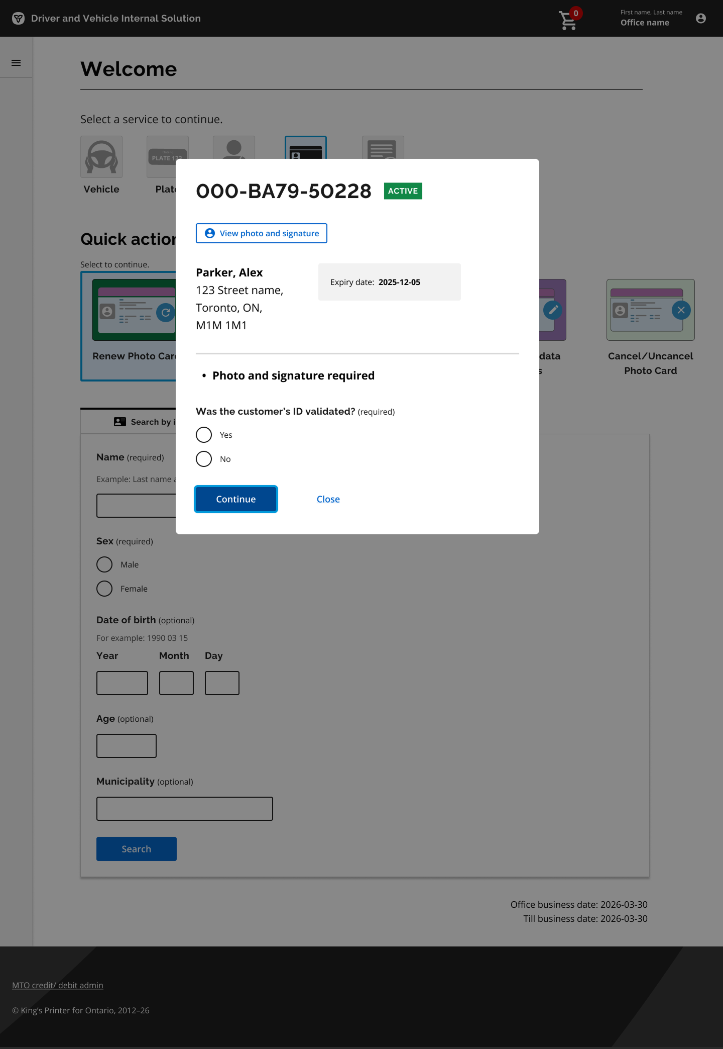
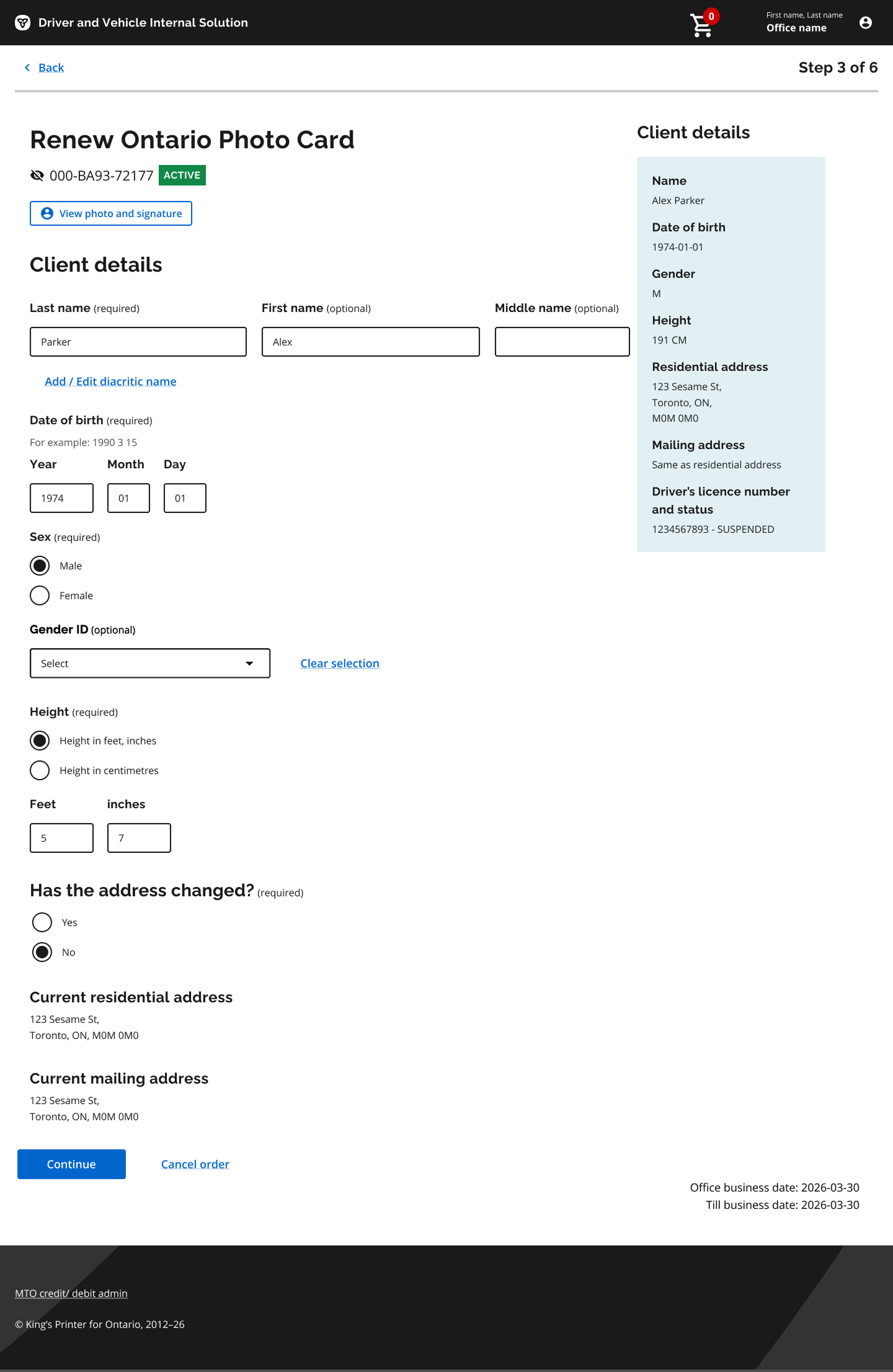
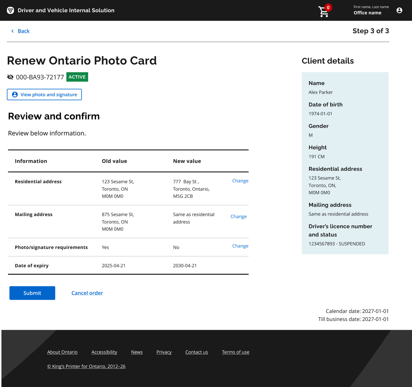
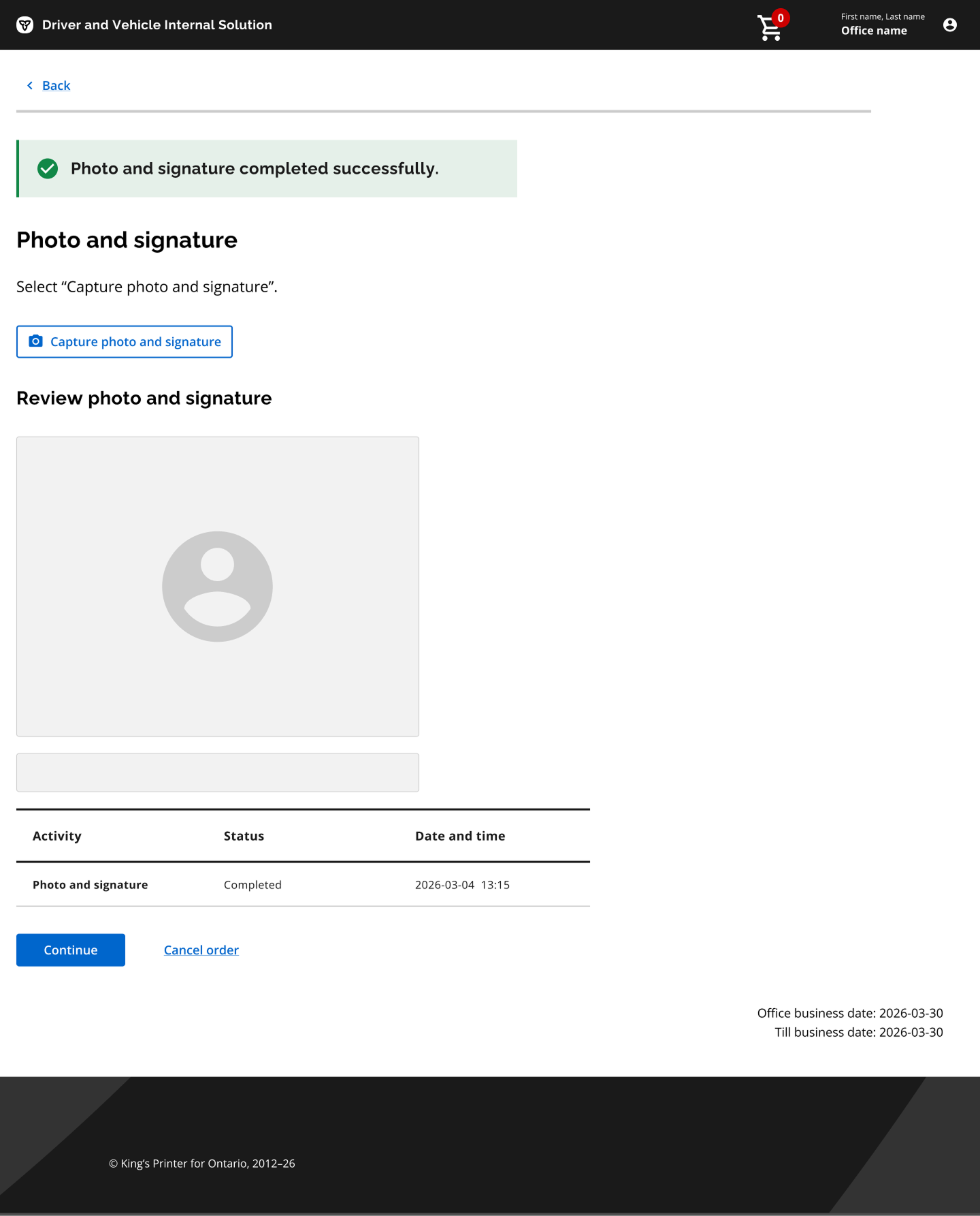
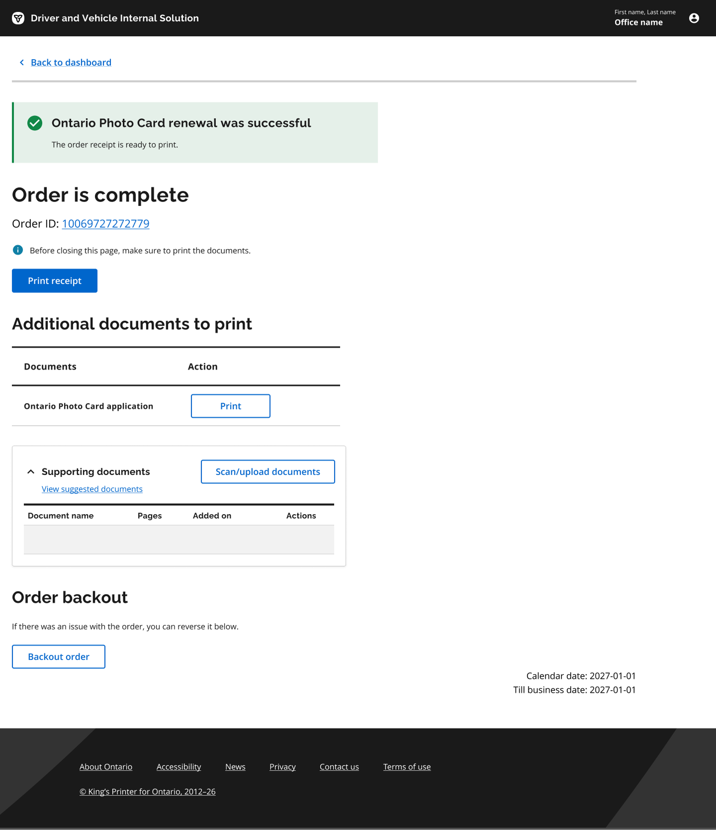
A look at the new counter: Renew Photo Card

So far I've designed 12 transactions in the new Driver and Vehicle Internal Solution (DVIS). The screens below are just a few from a single transaction, for consistency, every transaction follows the same pattern.

Some screens, project details, technical information, and internal artifacts have been intentionally omitted because the project is still in progress and subject to confidentiality restrictions.

New DVIS, Welcome screen: select a service and transaction, search by identifier New DVIS, Renew Ontario Photo Card, guided step New DVIS, Renew Ontario Photo Card, client details, step 3 of 6 New DVIS, Renew Ontario Photo Card, guided step New DVIS, Renew Ontario Photo Card, guided step New DVIS, Renew Ontario Photo Card, guided step New DVIS, Renew Ontario Photo Card, review and complete
Role
Lead Product Designer
Organization
Ontario Government / ServiceOntario
Focus
Driver's Licence, Ontario Photo Card, Counter, AI experiences
Scope
Public, staff, and internal service experiences
Methods
User research, service design, journey mapping, interaction design, prototyping, usability testing
Collaboration
Product, Engineering, Policy, Accessibility, Business Analysis, Data Science
Delivery
Three-week design sprints · Research through implementation
Next project
A More Proactive Government Service →
Also worth reading
TD MyAdvantage UBI Redesign →

Ontario Government / ServiceOntario · AI-Native Service

Designing a More Proactive Government Service

From fragmented online transactions to an AI-powered service that helps people get things done
Role
Lead Product Designer
Organization
Ontario Government / ServiceOntario
Focus
Online service & AI identity verification
Timeline
2025 – Present

Online services exist, but getting something done is still hard

Online government services already exist, with 1.5M monthly views, but getting something done online can still be surprisingly difficult. People often have to figure out which service they need, whether they're eligible, and what information they need before they can even start.

Once they begin, they may move through several separate workflows, each with its own steps and requirements. And after they're done, they're often left to remember when they need to renew something or take another action.

The result is friction for everyone. People abandon applications, call for help, or visit a ServiceOntario location for something they could potentially have completed online. For the government, those unfinished applications and unnecessary visits also create additional cost and operational pressure.

So the opportunity wasn't simply "How do we make the forms better?"

It was: "How can we help people from the moment they have a need, all the way through to getting it done?"

A proactive, AI-powered assistant, not a collection of transactions

We started thinking about the online experience as more than a collection of government transactions. The goal was to create a proactive, AI-powered assistant that could help people:

Find the right service Understand what they need Complete it Know what comes next

Instead of making people navigate government based on how the organization is structured, we wanted the experience to start with what the person is trying to accomplish.

Designing for different relationships with the service

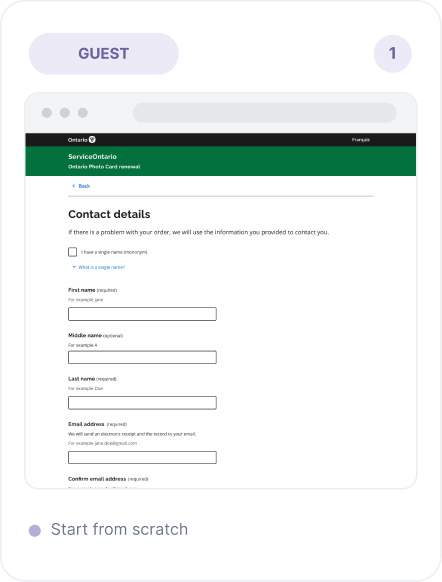
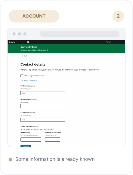
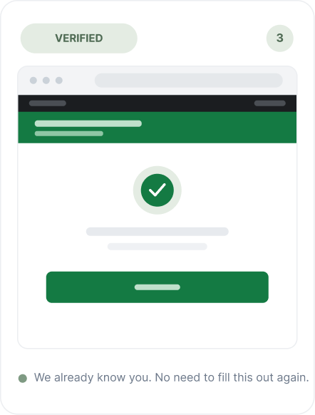
Not everyone using the service has the same relationship with the platform. We designed around three levels:

Guest
Someone visiting the service without an account. They need enough information to understand what they can do and what they need to get started.
Account user
Someone who has created an account. We can provide a more personalized experience based on information they have chosen to provide.
Verified user
Someone who has gone through identity verification. The service can provide a much more personalized experience based on information already associated with them.
Guest — starts from scratch with no account Account user — a more personalized experience based on saved information Verified user — a fully personalized experience after identity verification

The principle was simple: the more we know about you, the more useful the service can become. But personalization also creates responsibility. The more information we use, the more people need to understand what we're doing with it and why. That became especially important when we started exploring AI-powered identity verification.

Not a technical problem, but a trust problem

One of my clearest findings from our public research was also one of the most important:

"I don't trust a government AI face check."

— Participant, public research

That changed the conversation. This wasn't primarily a technical problem. It was a trust problem. People wanted to know:

  • Why do you need my face?
  • What exactly are you doing with it?
  • What happens to my photo?
  • Who can see it?
  • Can I opt out?
  • What happens if the AI gets it wrong?

We couldn't expect people to trust the technology simply because we told them it was secure. We had to design an experience that earned that trust.

Three approaches, one hard choice

To complete certain services online, we need to establish that the person is who they say they are. We explored three approaches.

Option A: Active liveness
Ask people to perform actions such as blinking, turning their head, or following something on screen. A strong signal, but it creates problems for people with motor or cognitive differences and can confuse older or lower-literacy users.
Option B: Passive liveness
Ask the person to take a single capture without performing an action. A simpler experience, but technically harder, and it requires careful thinking about how we handle cases where the system isn't confident.
Option C: No online verification
Avoid the risk altogether and send people to a ServiceOntario location. Safer from an online identity perspective, but it keeps the very problem we're trying to solve: people still have to go to a counter.

I chose passive liveness. It was the harder option. But we believed it gave us the best opportunity to create an experience that was both secure and inclusive.

In government, everyone is the user

This was one of the biggest differences between designing this and designing a typical commercial product. A commercial product can sometimes define its target audience. Government can't. Everyone is the user. That includes:

  • Older people
  • People with disabilities
  • People with lower digital literacy
  • People using older phones
  • People in poor lighting conditions
  • People with limited English proficiency
  • People who may simply be uncomfortable with new technology

If the identity check doesn't work for one of these groups, they don't just have a bad experience; they may lose access to a public service. So inclusion wasn't something we could add later. It had to be part of the design decision itself.

Why we don't ask people to blink or turn

Many identity verification experiences ask people to perform an action: blink, turn your head, follow the dot. These interactions may work well for many people, but they introduce unnecessary barriers for others.

I chose a single guided capture instead. There is nothing to perform. The person simply positions themselves in front of the camera and follows the guidance.

There was a genuine trade-off here. Active checks can provide a stronger signal. But we chose to prioritize an experience that more people could successfully complete. For the cases where the system isn't confident, we designed a human fallback.

Don't let the camera fail silently

One of the most important design decisions came from thinking about what happens when the capture doesn't work. A generic error message like "Verification failed." doesn't help anyone. It doesn't tell the person what went wrong or what they should do next.

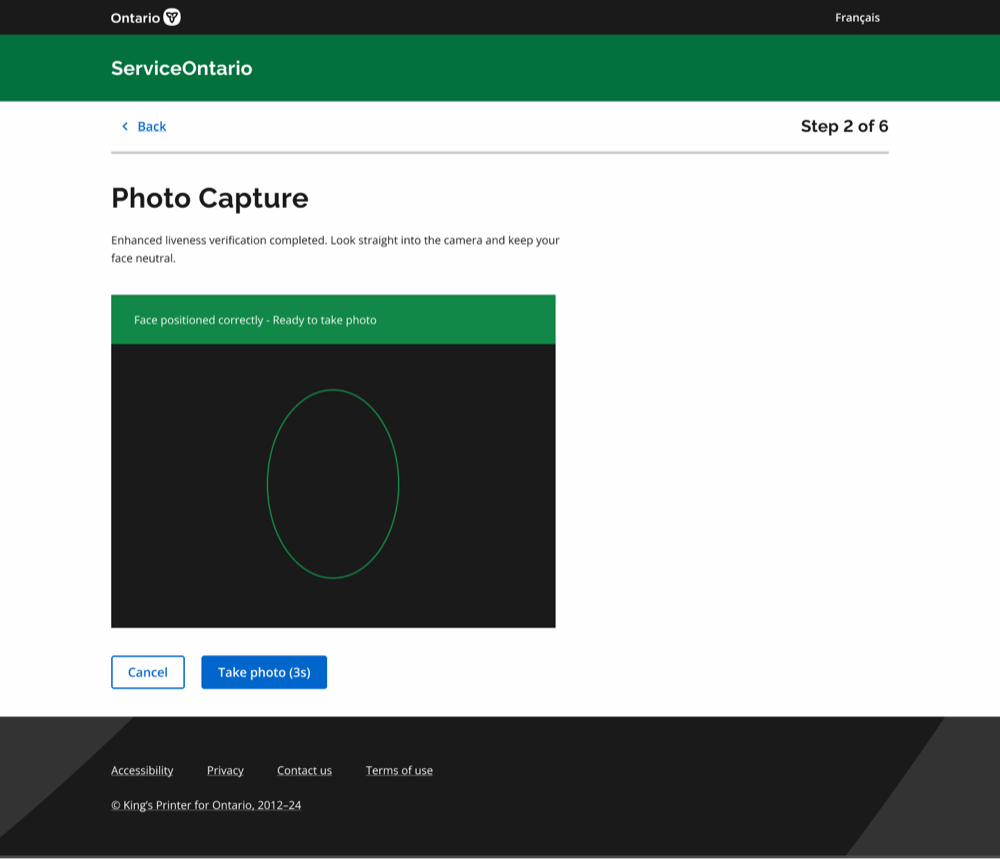
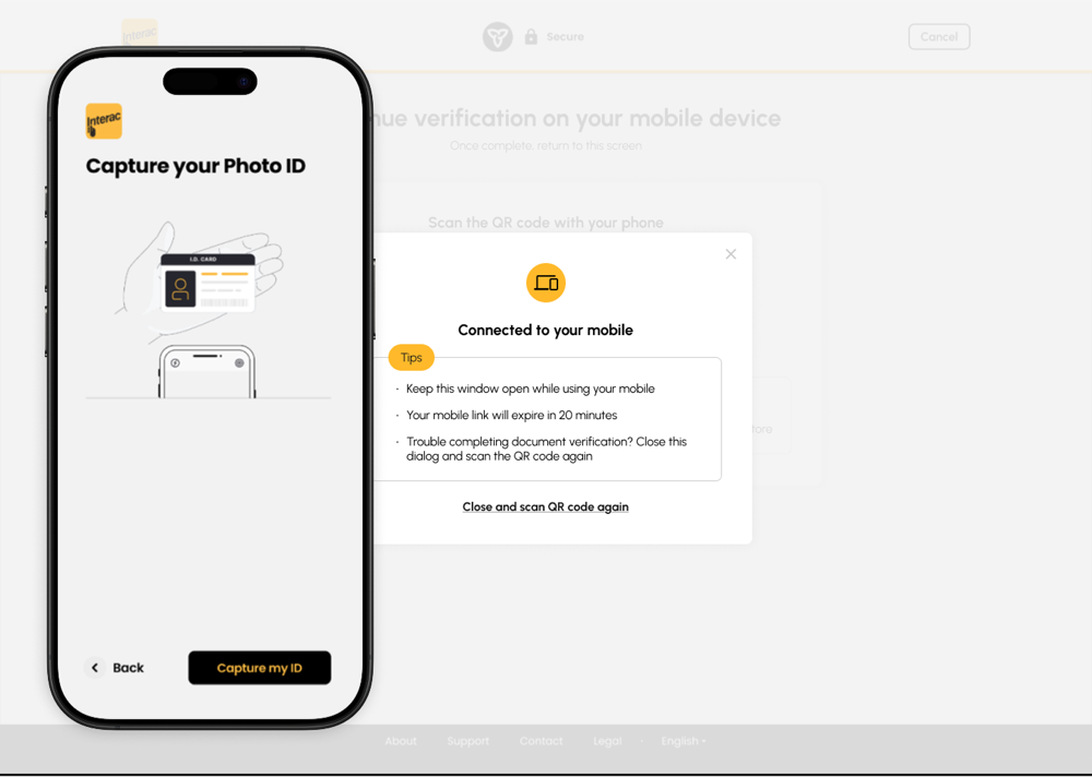
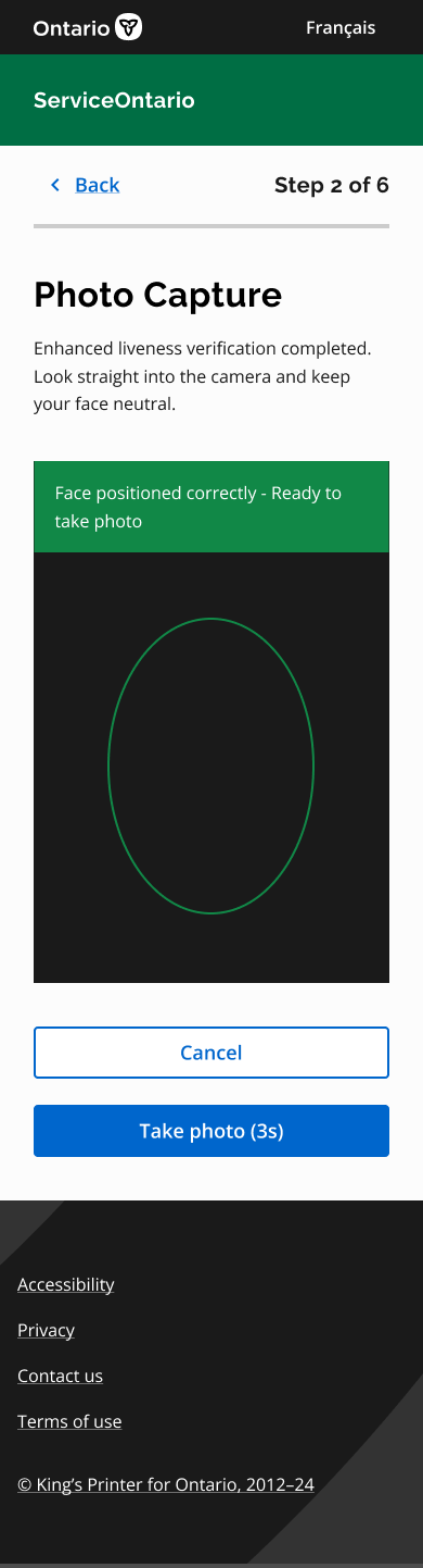
So instead, I designed the experience to coach people while they're capturing their image:

  • Move a little closer.
  • Find a brighter place.
  • Hold still.
  • Make sure your face is inside the frame.

Most first attempts don't necessarily fail because the person did something wrong; lighting and framing can make a huge difference. So rather than waiting until the end to tell someone they failed, we help them while they're doing it. Even something as simple as showing "Step 2 of 3" helps communicate that they're making progress and are almost done.

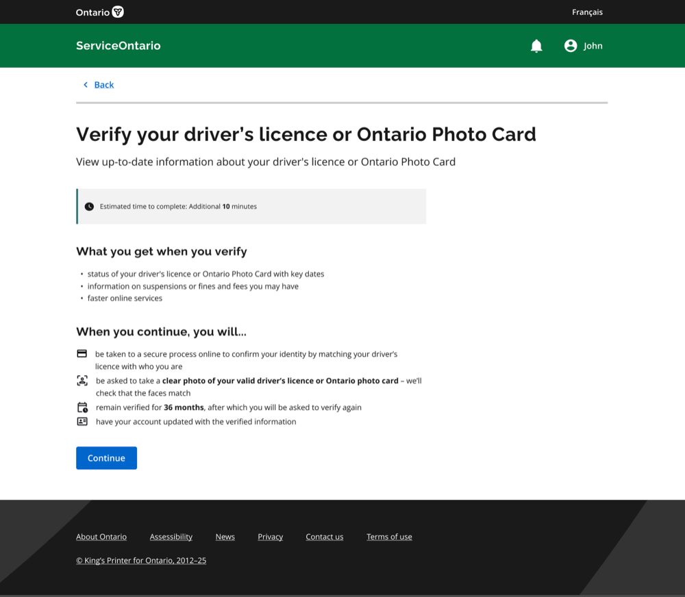
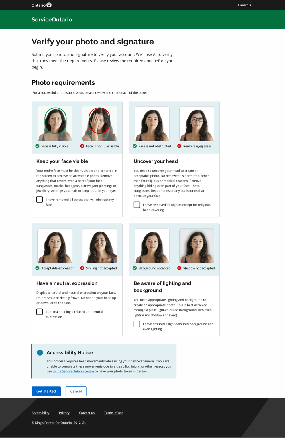
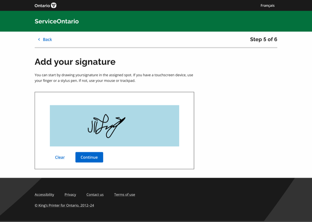
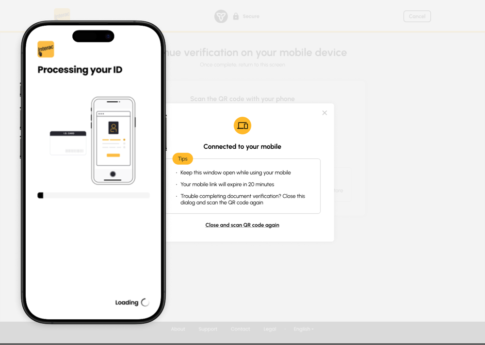
Mobile — photo and signature requirements before capture begins
Mobile — photo capture coaching, face positioned correctly
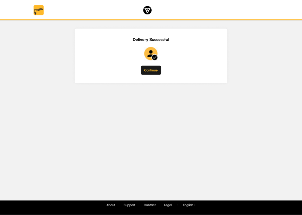
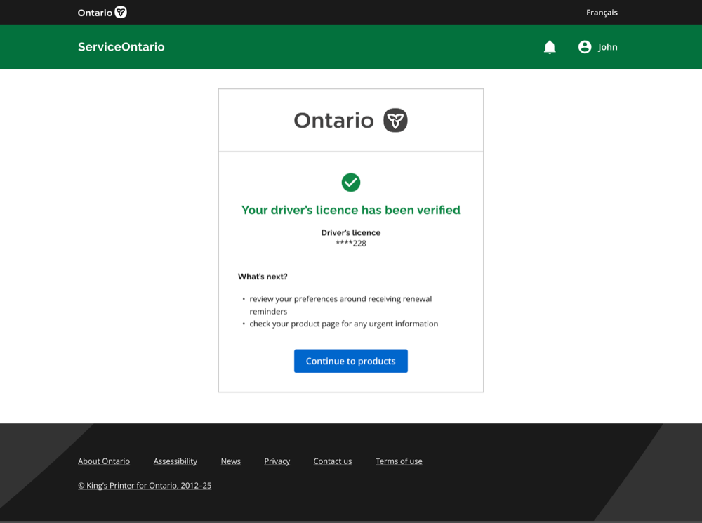
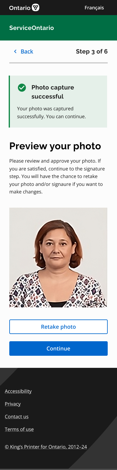
Mobile — capture result and next step

Failure can't be a dead end

This became one of our strongest principles: a face check can never lock someone out of a service they're entitled to.

I designed failure to be gentle. The language doesn't blame the person. I limit retries rather than allowing someone to get stuck indefinitely. And when the system can't complete the verification, we provide another path to complete the transaction.

For the first release, the fallback is to complete the transaction as an account user. A live video fallback is planned for a later release. This was a deliberate prioritization decision; we could have waited until the richer fallback experience was available, but instead chose to launch the core experience, learn where users actually struggle, and use those insights to inform and shape the next iteration.

Consent as part of the experience, not a checkbox

The research told us people were concerned about the AI. So we addressed that concern directly. I worked closely with Legal and Privacy to make consent part of the experience rather than treating it as a checkbox. Before the capture begins, people need to understand:

  • What is about to happen
  • Why we need it
  • What happens to their information
  • What we retain
  • What happens after processing

We also deliberately avoid exposing security details that could make the system easier to circumvent. The goal is to be transparent about what people need to know without revealing information that could compromise the security of the experience.

When accuracy differences become access issues

Trust isn't only about explaining the technology. It's also about making sure the technology works for people. Face-matching and AI systems can perform differently across factors such as age, skin tone, and gender. In a commercial product, that might be treated as a product quality issue. In a government service, it can become an access issue.

That's why I am testing with diverse groups intentionally rather than assuming that a system that works well for the average user will work well for everyone. I am looking at:

  • Completion rates
  • Failure rates
  • Differences between user groups
  • Device and environmental conditions
  • How often people need human assistance

And if one group is struggling more than another, the answer isn't "those users need to try harder." It's "we need to fix the experience."

Use AI where it helps, and fail responsibly

At a high level, the identity verification journey is intentionally simple:

Consent Capture Processing Result

But there is another layer running through every step: a path to a human. That's important because AI doesn't have to be perfect to be useful. But it does need to fail responsibly.

The promise isn't "the AI will always get it right." It's "we'll use AI where it helps, and you won't be abandoned when it doesn't."

From disconnected transactions to one continuous relationship

The identity experience is only one part of the larger online transformation. We're designing the online service so that people don't have to understand how government is organized in order to get something done. The long-term experience should help people:

Tell us what they need Find the right service Understand eligibility Complete it Know what's next

The goal is to move from a collection of disconnected transactions toward a service that feels more like one continuous relationship with government.

Research at the center, across many disciplines

I led the product design work from research through prototyping and validation, working across product, engineering, AI/ML, Legal, Privacy, accessibility, and policy.

Research played a central role. I used conversations with the public to understand trust, expectations, and barriers. I also looked at the staff side of the service to understand what happens when an online journey eventually reaches a ServiceOntario location. That helped me think about the experience as a service rather than simply an online interface.

Success defined, not yet claimed

The experience isn't live yet, so I don't want to claim outcomes we haven't measured. Instead, we've defined what success should look like. We want to see:

  • More people completing renewals online
  • High completion rates
  • Fewer people abandoning the identity verification process
  • Consistent completion across different user groups
  • A manageable rate of human fallback

The last point is especially important. If one group needs human support significantly more often than another, that's something we need to investigate. We shouldn't measure success only by the average user.

A phased rollout that learns from real usage

The first release is planned as a soft launch without marketing, allowing us to test how many customers understand the value of becoming a verified user versus completing transactions as a guest or account user. A richer live-video fallback is planned for a later release. This phased approach allows us to learn from real-world usage and user behaviour before investing further in the more complex parts of the experience.

Useful enough to help, transparent enough to trust, inclusive enough for everyone

This project has pushed me to think about AI product design differently. It's easy to focus on what AI can technically do. The harder question is: should we use it here, and what does the experience need to look like for people to trust it?

In government, that question becomes even more important because you don't get to choose your users. Everyone is your user. That means accessibility isn't an edge case. Trust isn't a nice-to-have. And when AI makes a mistake, there needs to be a way for a person to step in.

That's the kind of AI experience I want to design: useful enough to help, transparent enough to trust, and inclusive enough that everyone can use it.

A look at the redesigned ServiceOntario

Some screens, technical details, model information, internal artifacts, and implementation details have been intentionally omitted because the project is still in progress and subject to confidentiality restrictions.

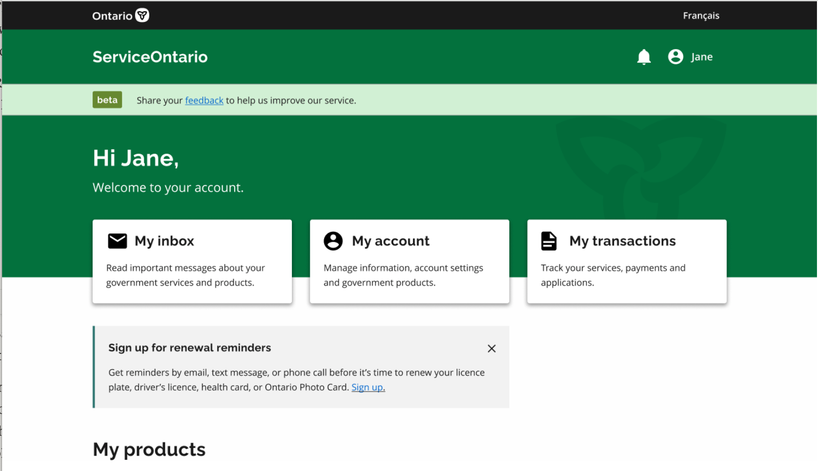
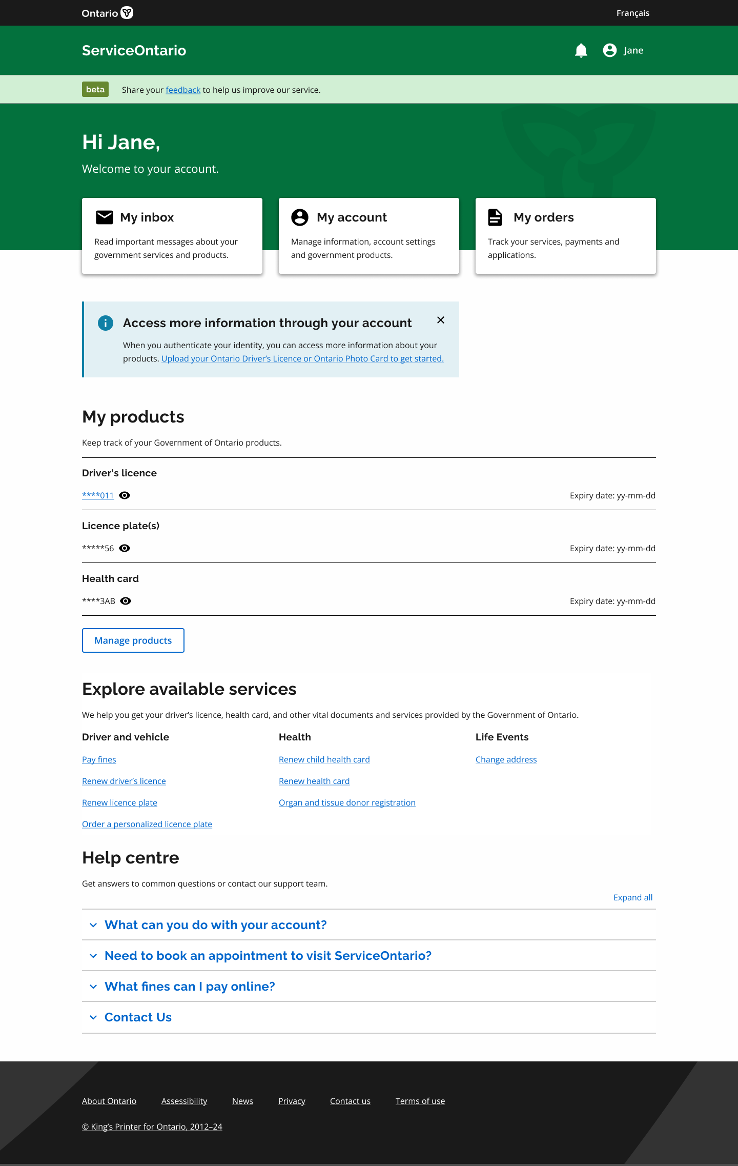
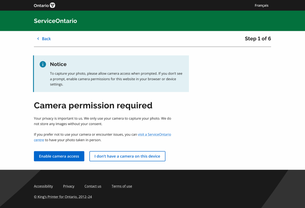
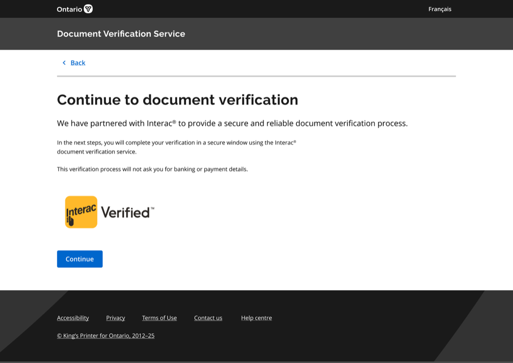
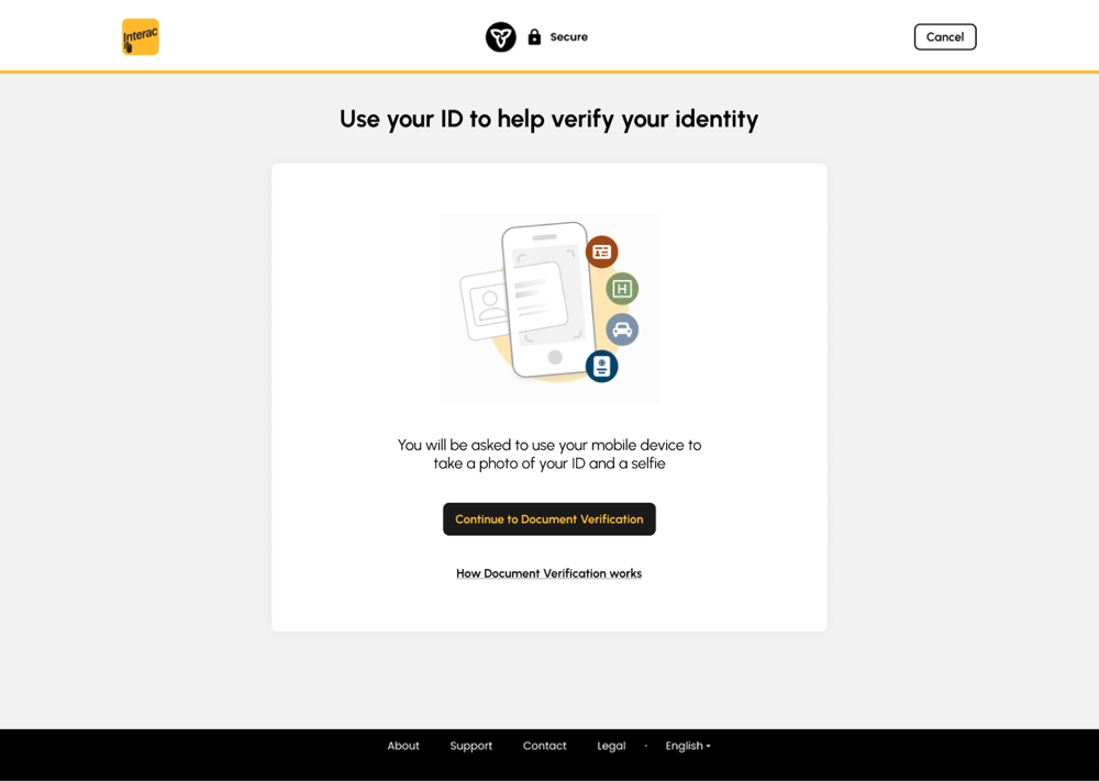
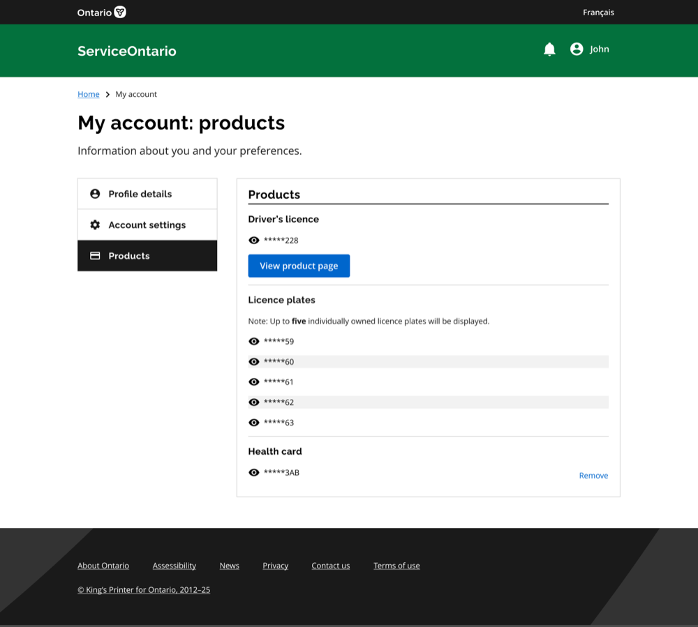
Redesigned ServiceOntario — account dashboard Redesigned ServiceOntario screen Redesigned ServiceOntario screen Redesigned ServiceOntario screen Redesigned ServiceOntario screen Redesigned ServiceOntario screen Redesigned ServiceOntario screen Redesigned ServiceOntario screen Redesigned ServiceOntario screen Redesigned ServiceOntario screen Redesigned ServiceOntario screen Redesigned ServiceOntario screen Redesigned ServiceOntario screen
Role
Lead Product Designer
Organization
Ontario Government / ServiceOntario
Focus
Proactive online service & AI-powered identity verification
Scope
Public online experience, consent, capture, and human fallback
Methods
User research, service design, interaction design, prototyping, usability testing, inclusive testing
Collaboration
Product, Engineering, AI/ML, Legal, Privacy, Accessibility, Policy
Status
Soft-launch planned Sept 2026 · phased rollout
Also from ServiceOntario
Reimagining Driver & Vehicle Services →
More recent work
TD MyAdvantage UBI Redesign →
TD Insurance · iOS, Android & Web · 2023–Present

Home & Auto
Insurance

Role
Experience Design Lead
Platform
iOS, Android & Web
Team
4 PODs — 8 designers
Release
Multi-phase

Transforming how 3M+ customers manage their insurance

As Lead Experience Designer, I led the transformation of TD Insurance's mobile and web experiences — elevating how over 3 million customers interact with their home and auto policies. Historically, the app served as a basic gateway to a responsive web view, lacking native interactions and personalization.

I partnered closely with product and engineering to identify user pain points, leverage the new design system, and deliver modern self-serve features that enabled customers to confidently manage policies, submit claims, and handle billing — all from their devices.

Surpassed LEI satisfaction targets Reduced claims support calls Elevated TD digital position

Redesigning a broken claims experience

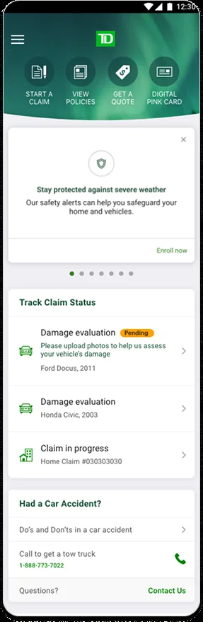
The auto claim process was confusing and disconnected. Users had to re-enter information they'd already provided, navigate a fragmented flow, and deal with poor visibility into claim status — leading to frustrated customers and a spike in call center dependency.

Pain Points
Fragmented non-intuitive flow, repetitive data entry, no real-time status visibility, heavy call center dependency.
What I Did
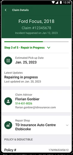
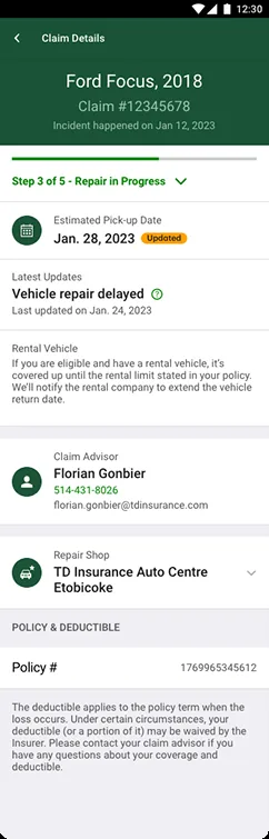
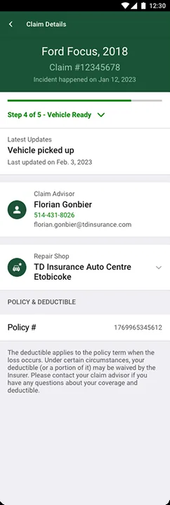
Audited existing workflows, proposed a step-by-step claims tracker, designed progressive disclosure model, collaborated with legal on simplified language.
Result
Significant drop in claim-related support calls, higher in-app submission completion rates, surpassed LEI benchmarks.

Claim Submission

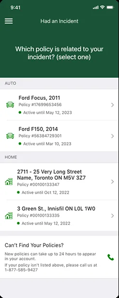
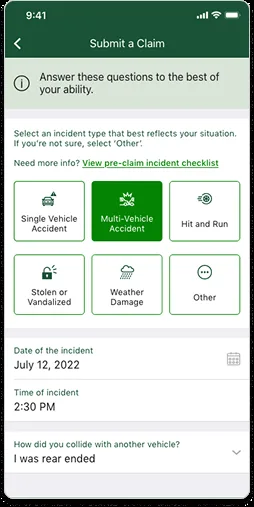
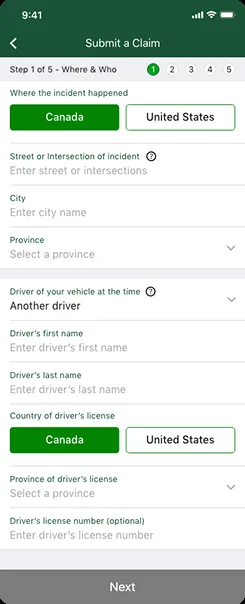
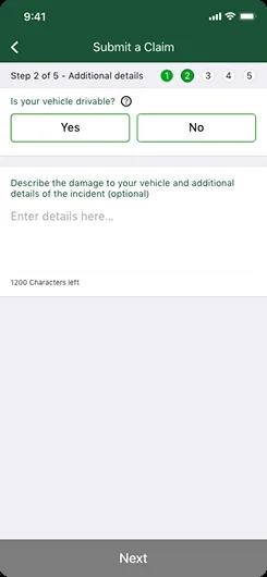
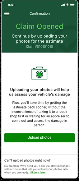
Claim submission 1 Claim submission 2 Claim submission 3 Claim submission 4 Claim submission 5

Claim Status Tracker

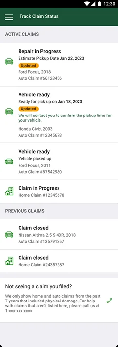
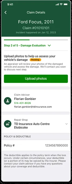
Claim tracker 1 Claim tracker 2 Claim tracker 3 Claim tracker 4 Claim tracker 5

Going native to build trust and completion

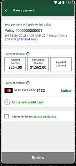
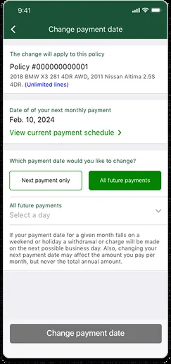
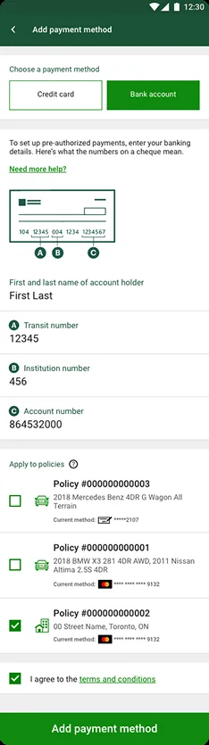
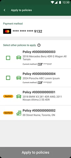
The embedded web iframe used for billing created a disjointed, slow, non-native payment experience — leading to drop-offs, payment errors, and diminished trust.

Pain Points
Non-native iframe experience, drop-offs on payment, no Apple Pay, no scheduled payments, no real-time status.
What I Did
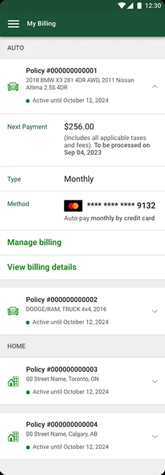
Designed native-first billing with Apple Pay, scheduled payments, push notification strategy for delinquent accounts, and modular reusable components.
Result
−30% payment support calls, increased digital payment adoption, reduced delinquency via targeted push notifications.
Billing 1 Billing 2 Billing 3 Billing 4 Billing 5

A personalized home for insurance management

The original dashboard lacked personalization and wasn't aligned with the new design system. It offered limited navigation and failed to surface relevant entry points tailored to individual user needs.

Pain Points
Static generic home screen, no launching points for key journeys, no personalized content based on user context.
What I Did
Designed a modular card-based layout adapting to user status — surfacing upcoming payments, recent claims, or coverage summaries based on individual context.
Result
Increased home screen engagement, reduced bounce rate, created scalable framework for future AI-driven personalization.
Legacy Version
TDI Dashboard old
New Design
TDI Dashboard new
Also from TD Insurance
TD MyAdvantage UBI Redesign →
Next project
TD Business Banking Platform →
TD Commercial Banking · Responsive Web · 2021–2023

Canadian & U.S.
Business Banking

Role
Experience Design Lead
Users
2M+ business clients
Team
3 PODs — 8 designers
Award
🏆 Project of the Year

Rescuing a mid-stream project — and winning Project of the Year

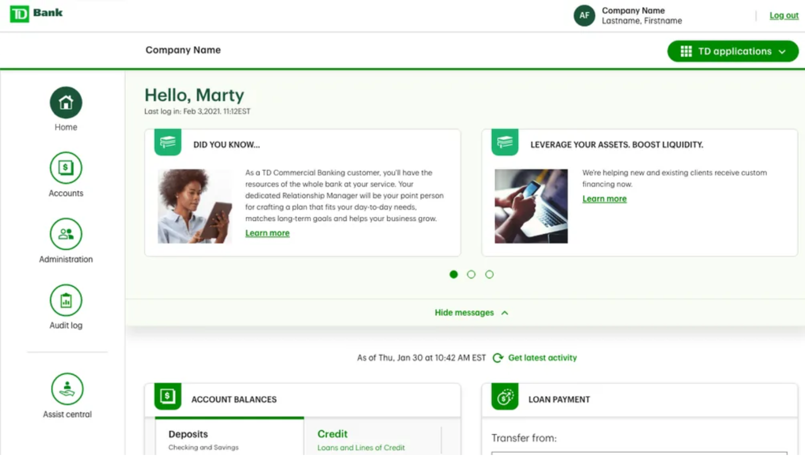
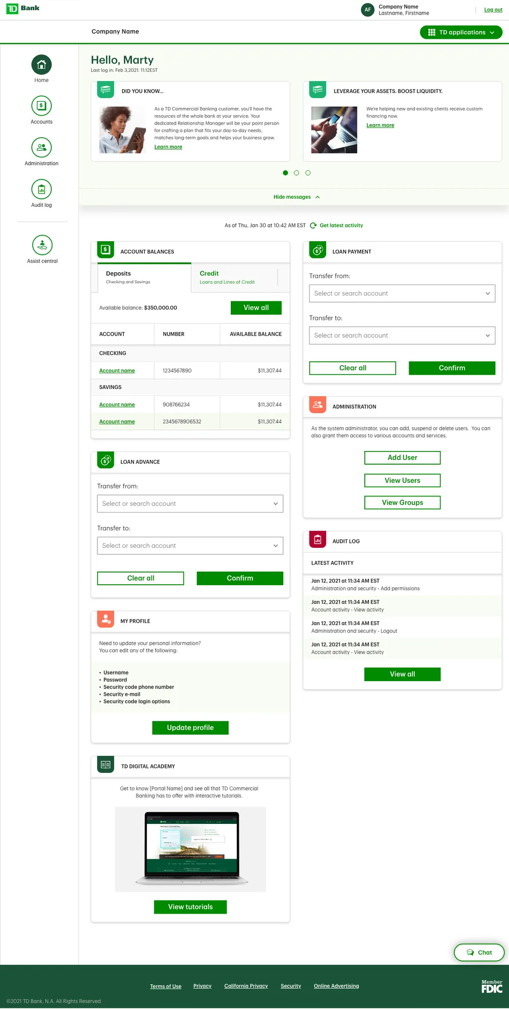
I led the end-to-end redesign of TD's Canadian Commercial Banking platform, focusing on simplifying complex workflows and aligning the experience with the evolving needs of over 1 million business clients. Our mandate was to modernize core digital banking experiences across money movement, account activity, and user management — and design a scalable future-state vision for ongoing business innovation.

🏆 TD Project of the Year LEI Score 72.70 (target: 71.22) MVP1 launched on time

Why this mattered

  • Streamline high-frequency workflows like transactions, account review, and user authorization
  • Reduce friction and error risk in key tasks
  • Deliver long-term customer retention by improving control, visibility, and personalization
  • Align with TD's digital-first innovation roadmap for business banking

What we heard from clients

Fragmented workflows
Disconnected experiences across money movement and account activity led to inefficient task completion.
Cumbersome onboarding
Inflexible access control required manual intervention or in-branch support — slowing teams down.
Limited admin control
Administrators couldn't easily add, remove, or assign permissions to users independently.
Static dashboard
A generic home screen failed to surface relevant tools or alerts for different business roles.

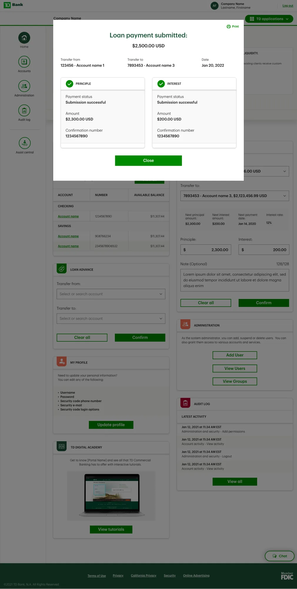
Money Movement & Account Activity

Pain Points
Complex outdated UI for payments and transfers. Non-intuitive workflows, poor status visibility, frequent transaction errors.
What I Did
Redesigned workflows with simplified forms, inline validations, and real-time status updates. Introduced bulk actions, scheduling, and saved templates to reduce repetitive tasks.
Result: Significant reduction in task completion time · Decrease in transaction-related support calls · Positive feedback on transparency
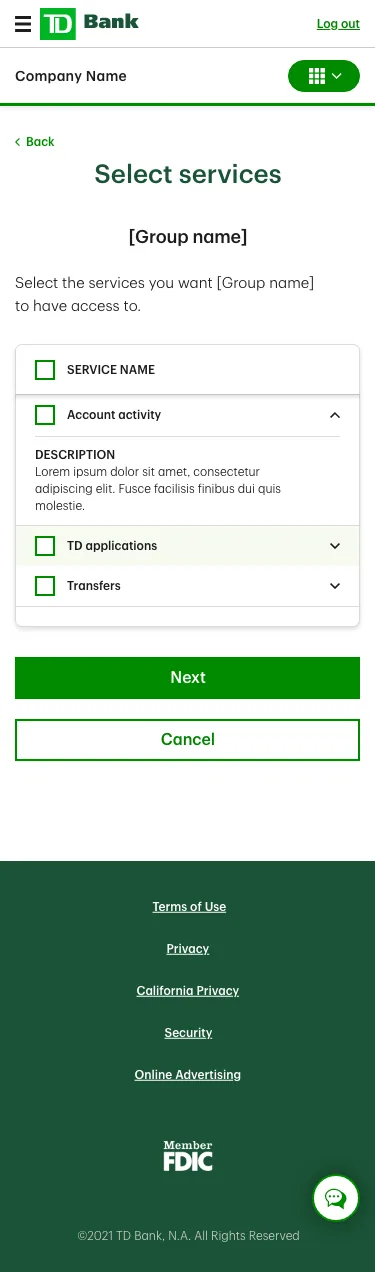
Money movement web 1 Money movement mobile 1 Money movement web 2 Money movement mobile 2
Money movement web 3

User Authorization & Access Control

Pain Points
Administrators had limited ability to manage user roles or permissions independently — increasing security risks and operational delays.
What I Did
Designed a role-based access model with granular permissions. Built flows for adding, removing, and modifying users with permission previews and risk flags.
Result: Faster user provisioning · Improved security compliance · Increased administrator independence
Access control web 1 Access control mobile 1 Access control web 2 Access control mobile 2

Dashboard Personalization

Pain Points
Static, generic dashboard failed to surface relevant tools or alerts for different business roles or company sizes.
What I Did
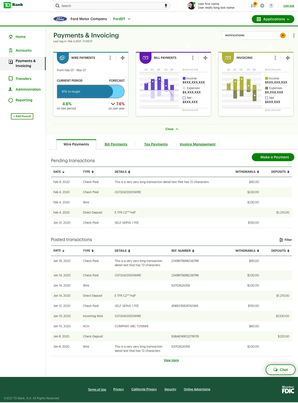
Introduced a widget-based configurable framework. Enabled users to add, remove, and reorder components by role (CFO, Accountant, Admin). Applied TD's new design system throughout.
Result: Higher dashboard engagement · Reduced navigation friction · Flexible foundation for future AI-driven insights
Dashboard

Lasting results

Surpassed LEI benchmarks
Exceeded the Legendary Experience Index target of 71.22 — achieved 72.70. Measurable improvement in customer and partner experience.
Improved admin efficiency
Role-based access control gave admins full independence — reducing security risks and eliminating in-branch dependency.
Reduced support calls
Significant reduction in transaction and onboarding-related support calls following launch of simplified workflows.
Foundation for AI
Created a scalable framework ready for future AI-driven insights, predictions, and integrated business banking features.
Also from TD Banking
U.S. Business Loan Application →
Government work
Self-Audit Digitization →
TD Commercial Banking · Responsive Web · 2021–2023

U.S. Business
Loan Application

Role
Experience Design Lead
Platform
Responsive Web
Team
1 POD — 3 designers
Release
Multi-phase

One adaptive flow for all business loan products

I led the redesign of the digital loan application experience for TD's U.S. small business customers — supporting multiple loan products within a single, scalable interface. By rethinking the end-to-end flow, we significantly reduced friction and elevated digital adoption, enabling business clients to apply confidently without branch support.

What was breaking the experience

Fragmented flows
Separate product-specific flows created confusion and inconsistency across loan types.
No eligibility signals
Users discovered qualification requirements too late, causing frustration and early abandonment.
Repetitive forms
Cumbersome documentation and repetitive fields slowed completion significantly.
Branch dependency
Many users relied on in-branch support due to lack of digital clarity and guidance.

Four experience transformations

Unified Application Flow
Before: Separate flows per product. After: One adaptive flow handles all loan types, improving usability and scalability.
Eligibility & Guidance
Before: Users unaware of requirements until late. After: Early eligibility checks and product comparisons reduce wasted effort.
Clarity & Confidence
Before: Complex language, unclear progress, redundant questions. After: Simplified content and visual progress tracking.
Smarter Data Handling
Before: Manual repetitive entry. After: Autofill from existing business profiles and dynamic question logic.

Selected screens — web & mobile

Unified flow web Unified flow mobile Eligibility web Eligibility mobile
Clarity web Clarity mobile Data handling web Data handling mobile
Also from TD Banking
Business Banking Platform →
Government work
Self-Audit Digitization →
Ministry of Labour · Responsive Web · 2018–2019

Self-Audit
Digitization Tool

Role
Research & Design Lead
Partner
Pivotal Labs
Launched
January 2019

Digitizing a paper-based compliance process

Imagine a small mom and pop shop with five employees. They're not sure of Ontario's employee regulations, so for the past four statutory holidays they haven't paid overtime. This is a violation.

The Ministry of Labour has Officers who investigate companies to ensure they're abiding by Ontario regulations. Sometimes Officers request a company complete a "Self Audit" — reviewing their own records to get up to compliance standards. Before this project, Self Audits were done manually on Excel, paper, or even napkins.

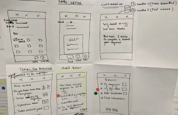
I set out to digitize the Self Audit — allowing Officers to request audits digitally, employers to enter data online, and the system to automatically calculate whether they're meeting compliance standards.

84%
Reduction in ESA compliance time
12mo
→ 60 days
50+
Ministry designers upskilled

Designing for opposite mental models

Employment Standards Officer
Government investigator managing a caseload. Needs to assign audits, track submissions, review results, and take action. Values accuracy, auditability, and efficiency.
Ontario Employer
Business owner asked by government to audit themselves. Often anxious and unfamiliar with the process. Needs clarity, guidance, and confidence that they're doing it right.

Aligning on shared goals early

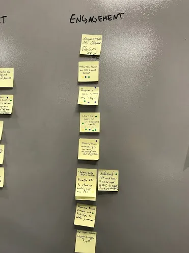
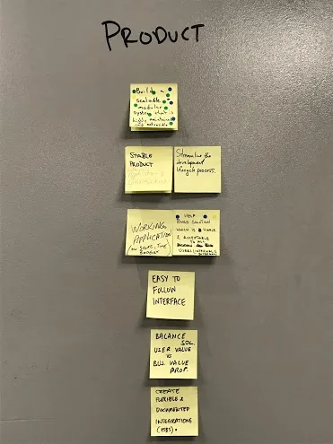
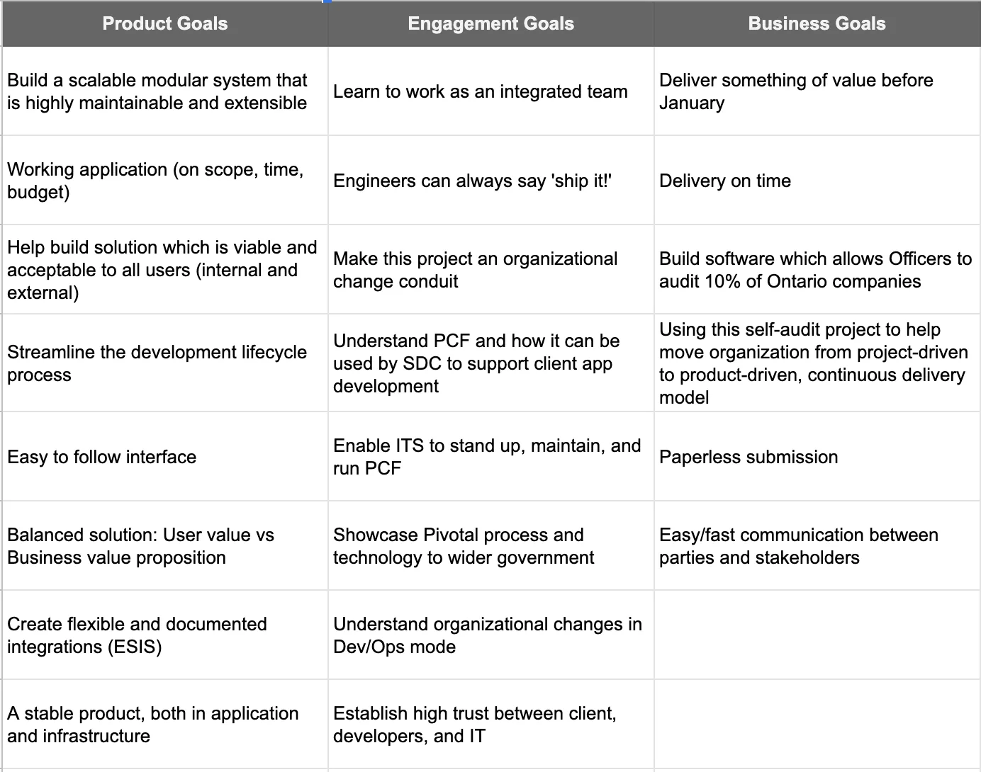
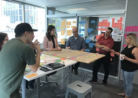
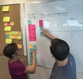
I led the Goals exercise as early as possible to gain a shared understanding of high-level goals and surface competing priorities. This helped the team decide where to focus time and effort throughout the project.

Goals workshop 1 Goals workshop 2 Goals workshop 3
Goals consolidated

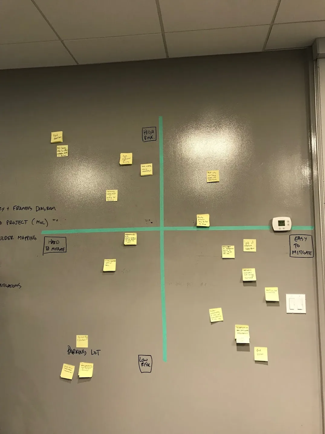
Proactively surfacing project risks

I led a session that gave the team a forum to share fears and concerns openly and proactively mitigate issues — producing a prioritized list of action items to get ahead of risks before they became blockers.

Risks and mitigations

Building empathy for both users

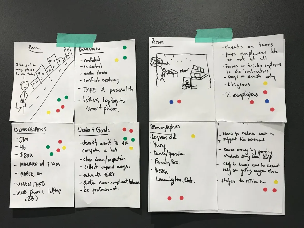
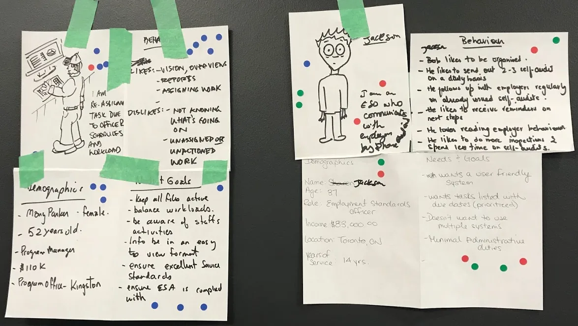
I led the team in building two personas — an Employment Standards Officer and an Ontario Employer — to give everyone a clear vision of the people using this software and build genuine empathy for their very different needs.

Personas workshop — Officer and Employer

Defining the highest value for each user

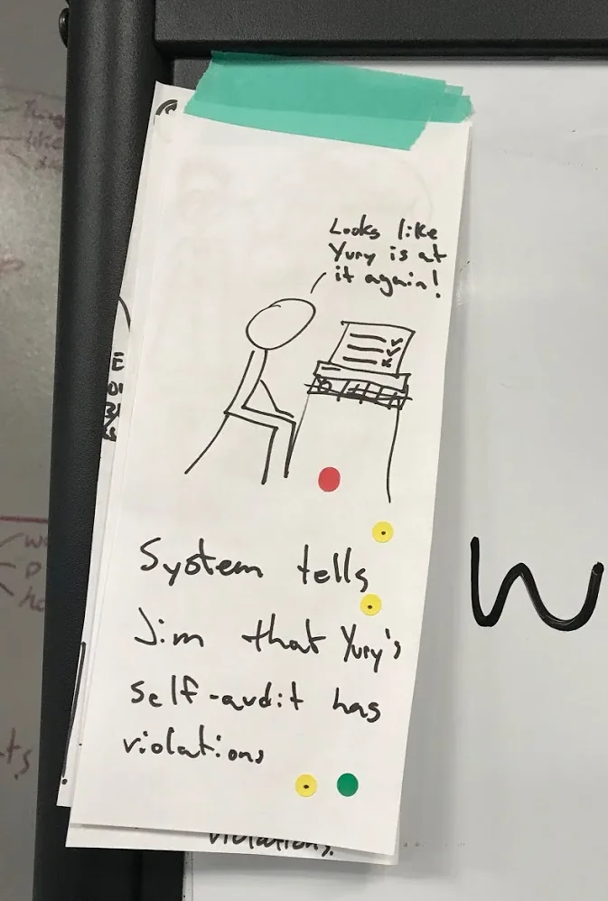
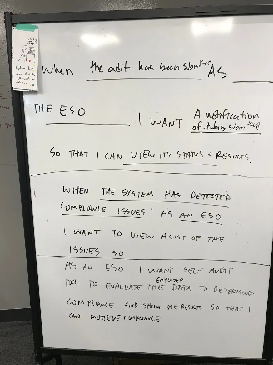
Starting as a sketching activity to generate moments of delight, then turning into a writing activity, I led the team in defining the highest value this product could deliver for both the Officer and the Employer.

Value prop Officer Value prop Employer

Mapping the full self-audit journey

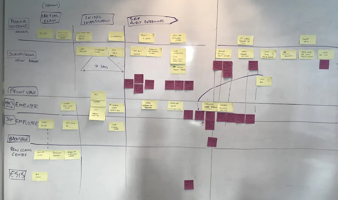
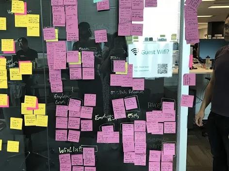
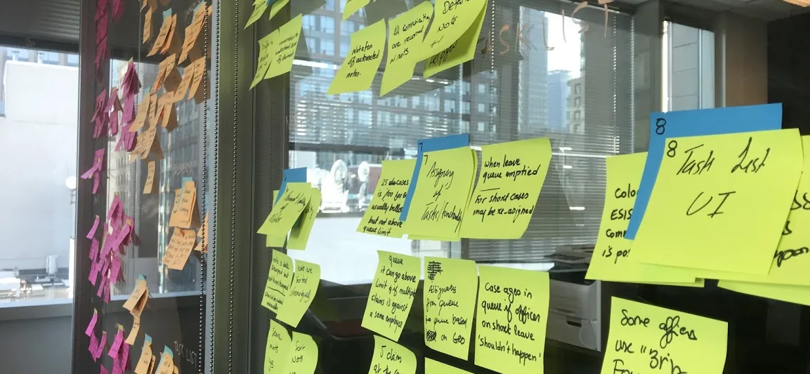
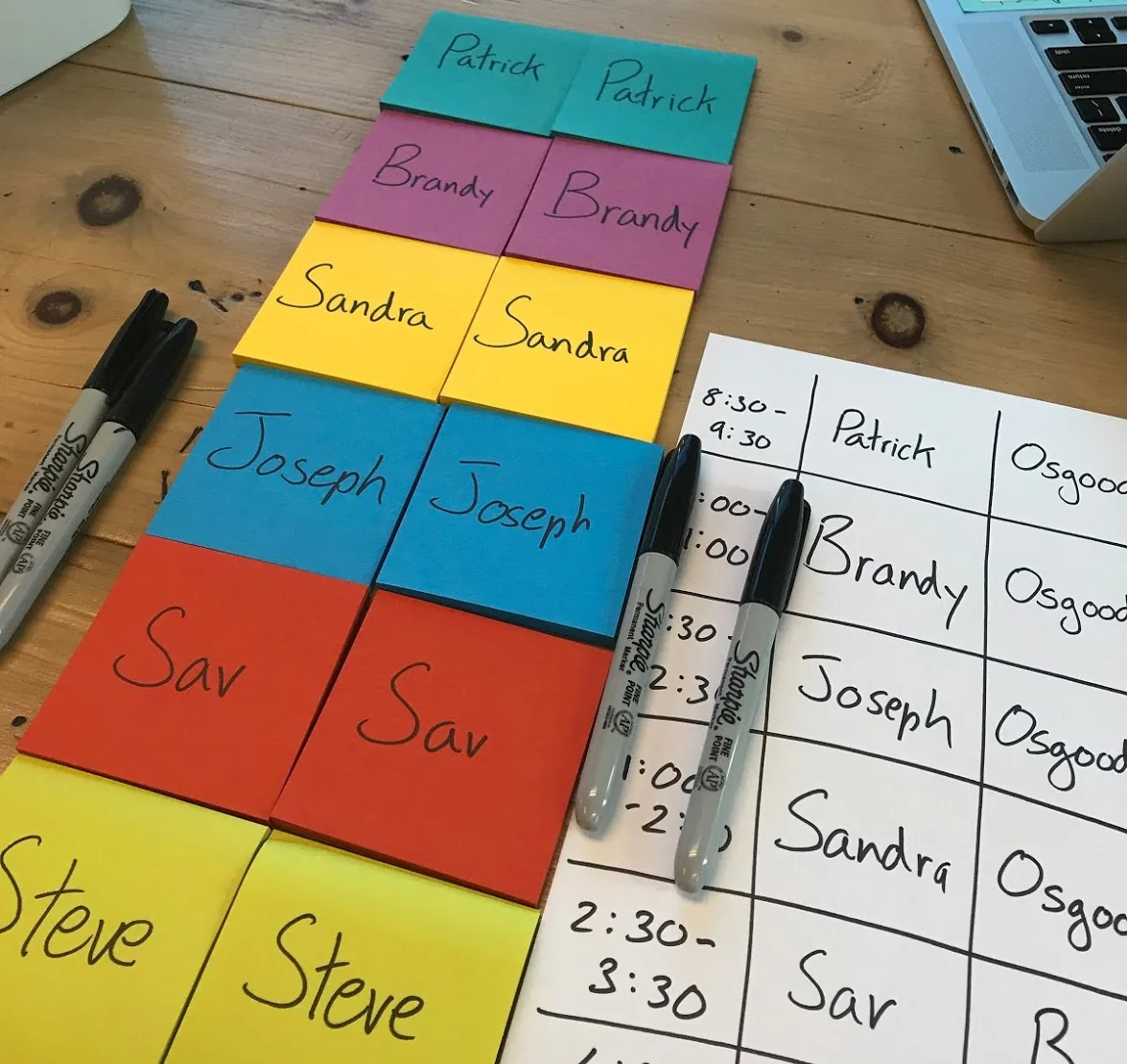
I led the team in mapping all steps of a self-audit from the Officer's and Employer's perspective. Yellow post-its = current experience. Purple post-its = future digital experience. This gave the whole team a shared understanding of the audit process complexity and a document to reference throughout delivery.

Service blueprint workshop

Interview prep with 6 Employment Standards Officers

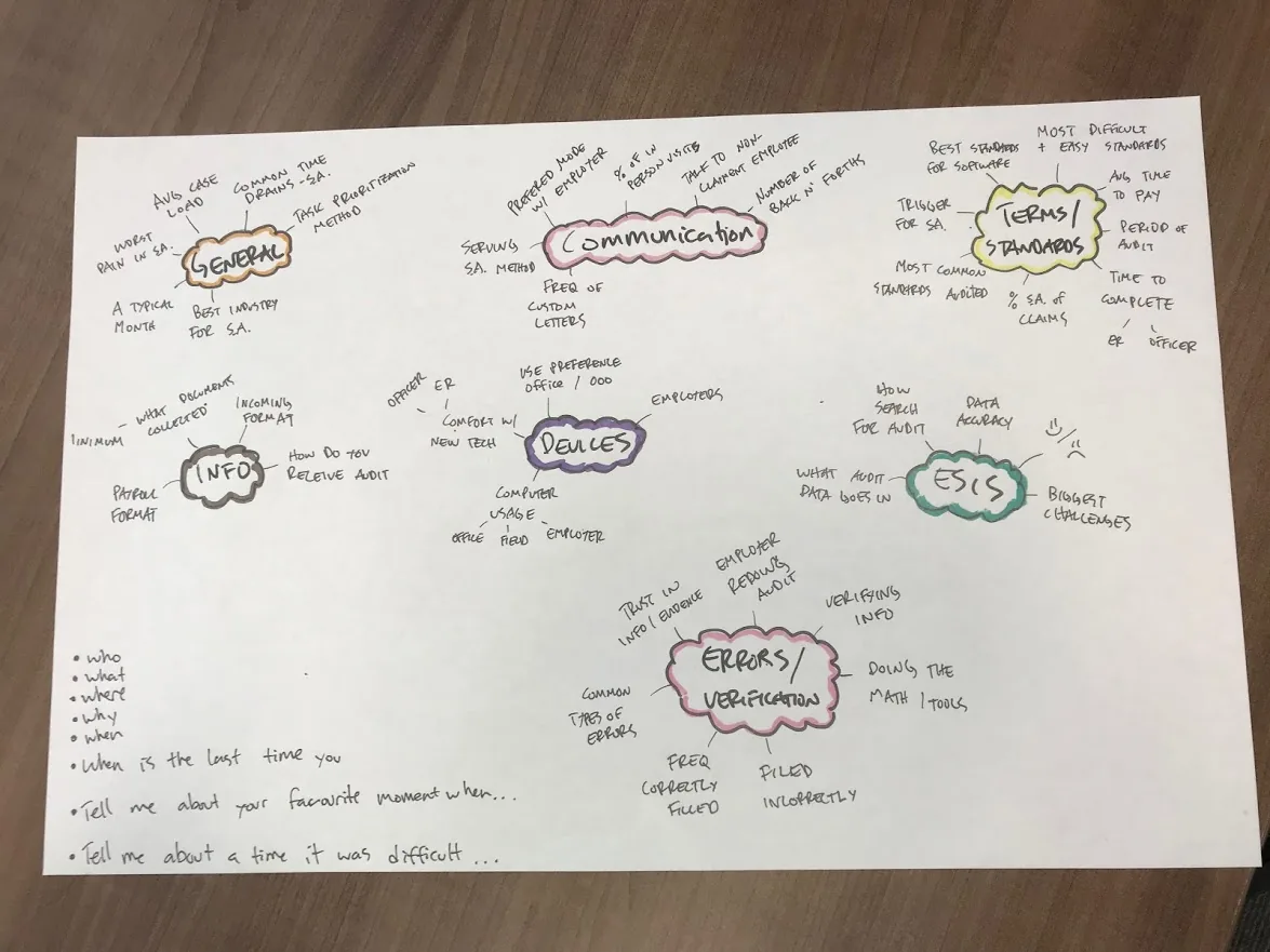
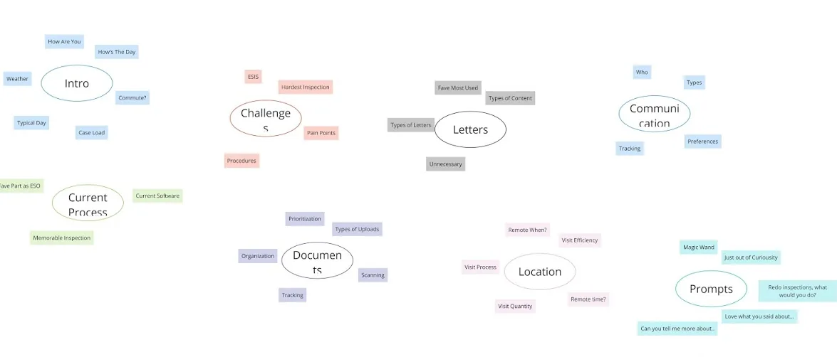
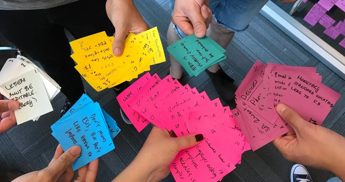
Instead of a rigid questionnaire, I organized interview questions into a topic map — clusters of related themes so conversations felt natural. I then led 6 exploratory interviews with Officers from across Ontario.

Topic map

Synthesizing 6 Officer interviews

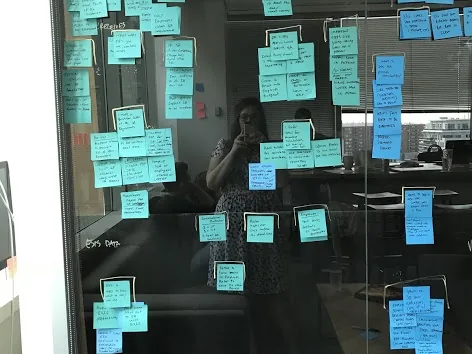
After completing interviews with Officers from across Ontario, I led the synthesis — color-coding each interview and grouping insights by key themes to surface patterns and design priorities.

Synthesis 1 Synthesis 2 Synthesis 3 Synthesis 4

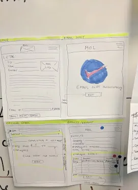
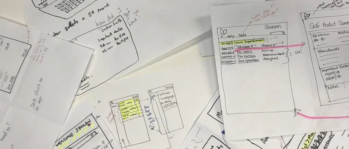
Full-team sketching before going digital

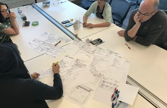
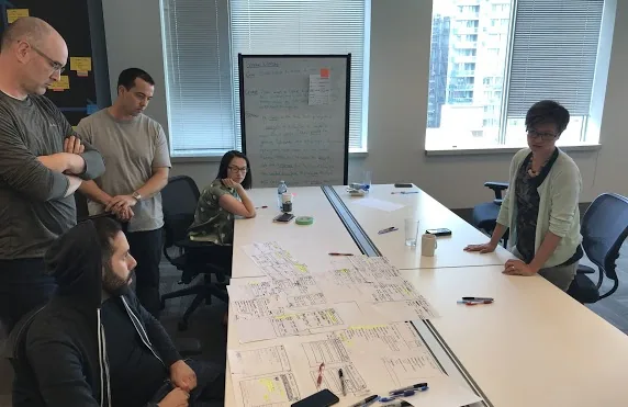
I ran a sketching workshop where the entire team — not just designers — sketched basic wireframes to express ideas visually. This aligned the team on direction before investing time in digital wireframes, reducing rework significantly.

Sketching 1 Sketching 2

Selected screens

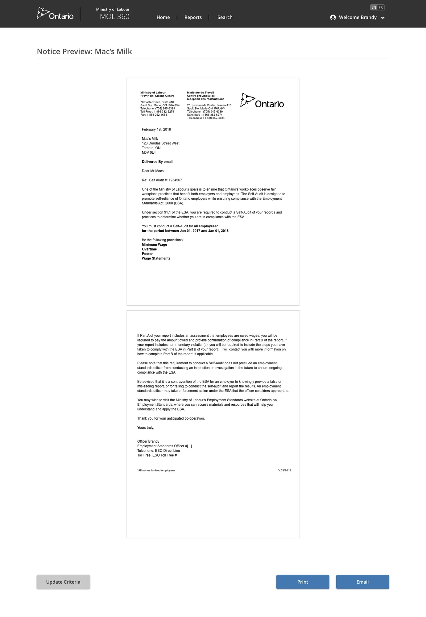
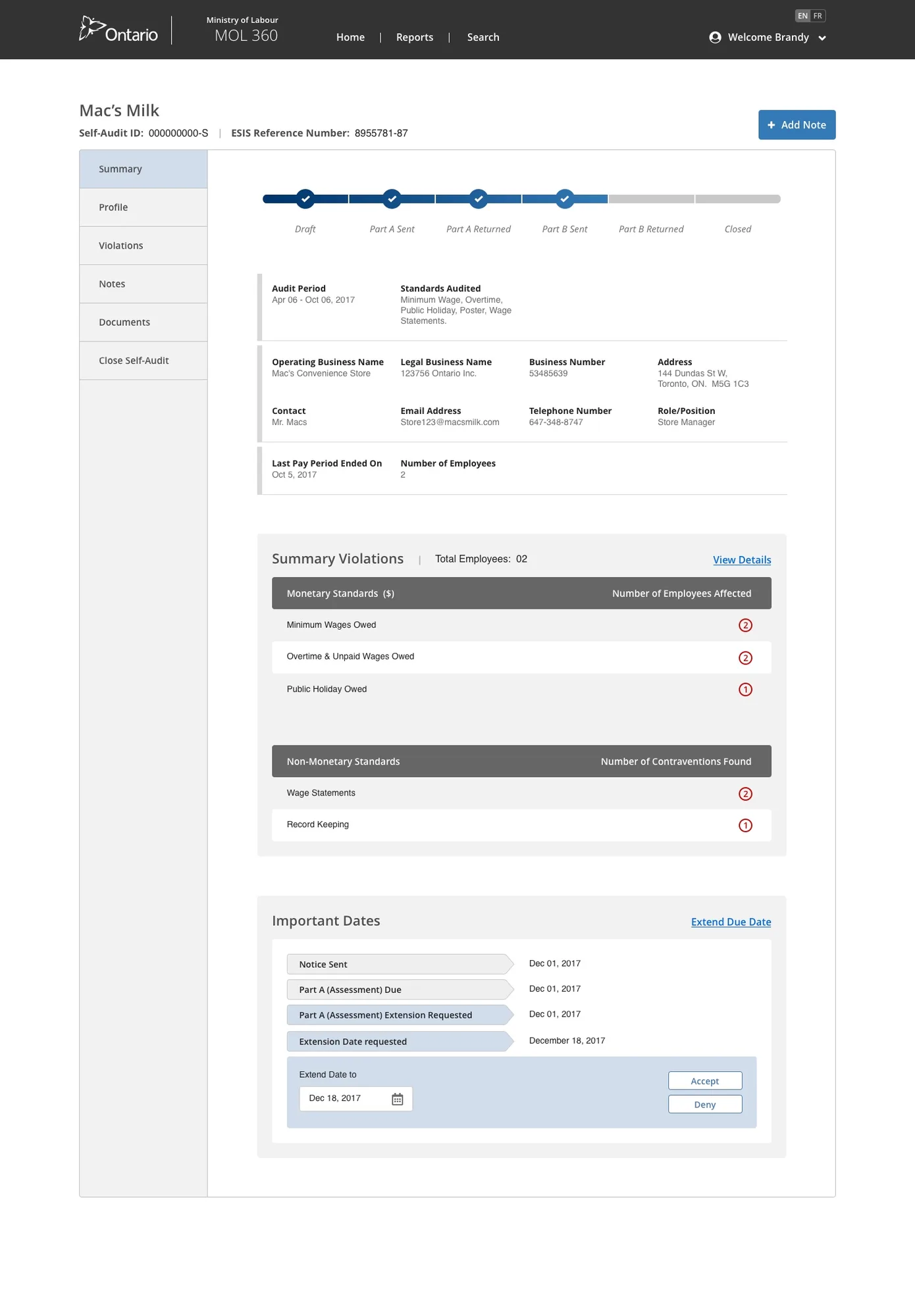
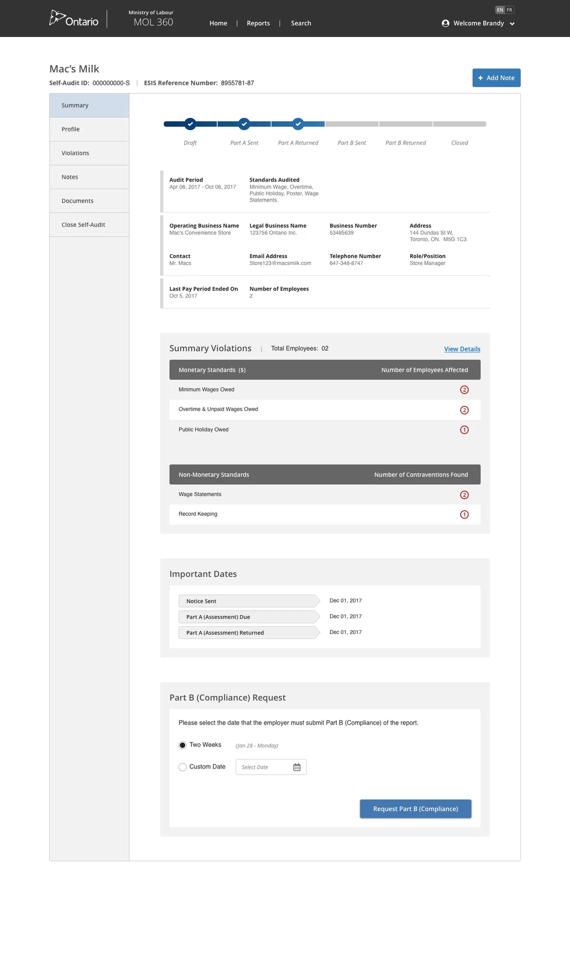
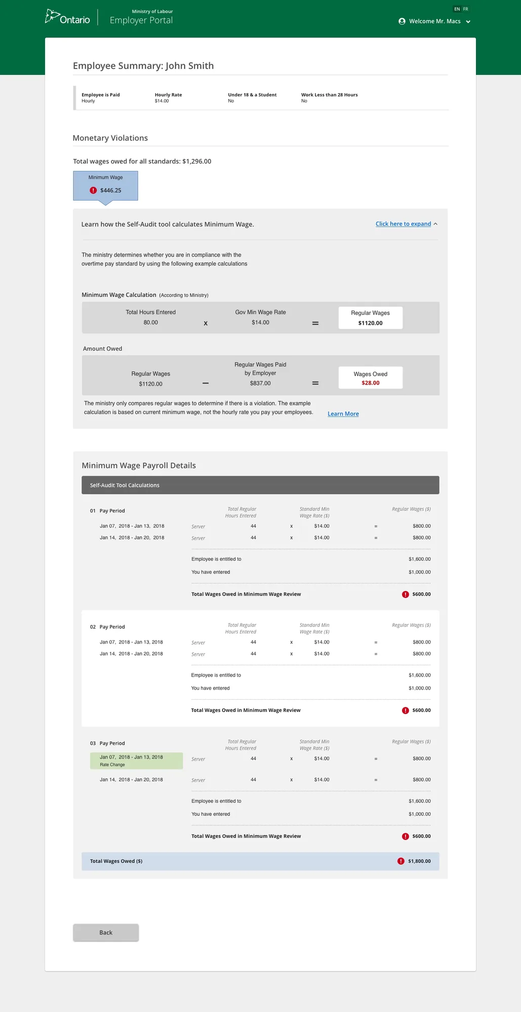
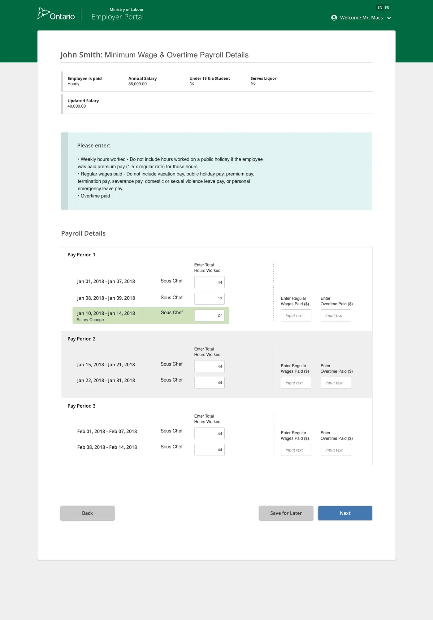
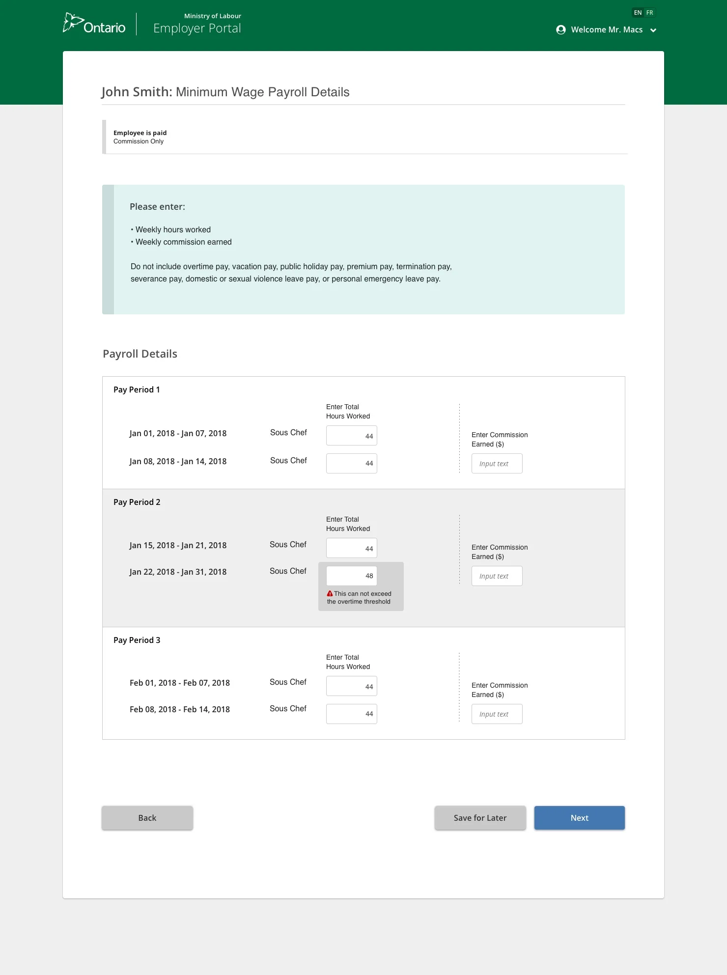
I designed a guided, step-by-step digital self-audit experience — from the Officer's letter request through to the employer completing the audit and the system calculating compliance automatically.

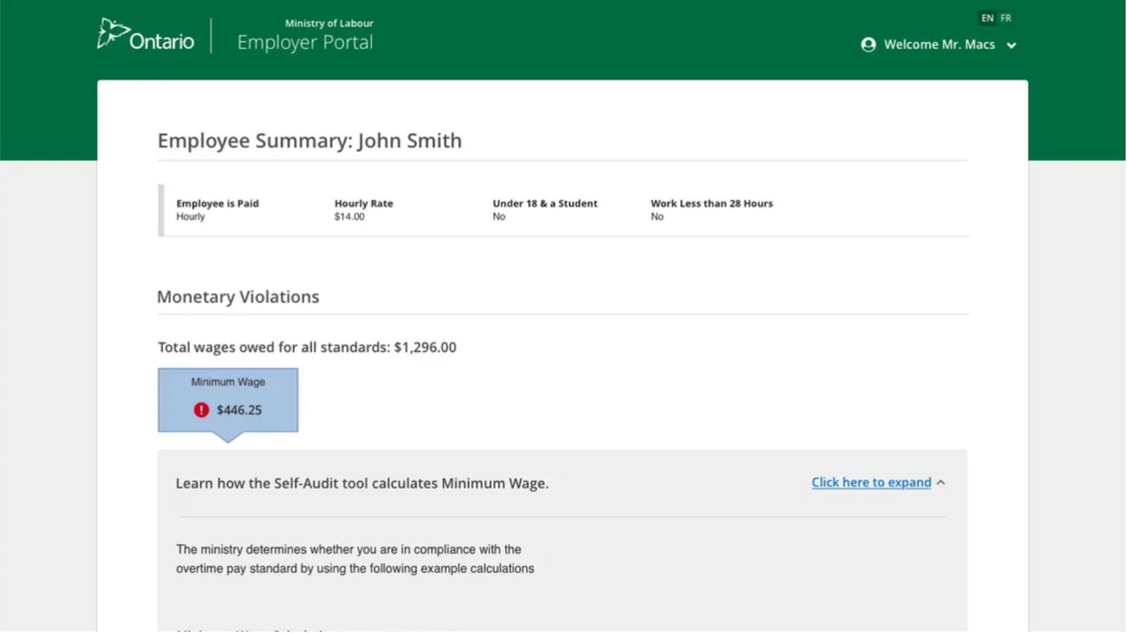
Employer letter Extension request Summary compliance Violations page Employee info salary Employee info regular
Also Ministry of Labour
Officer Case Management Portal →
Also Ministry of Labour
Claims Processing System →
Ministry of Labour · Responsive Web · 2019–2020

Claims Processing
System

Role
Senior Product Designer
Scale
17,000+ claims/year
Partner
Pivotal Labs

Digitizing 17,000 annual claims end to end

A claim is a complaint by an individual alleging a violation of the Employment Standards Act. With an average of 17,000 claims filed per year, the Ministry needed a digital system to handle intake, processing, officer review, and resolution — replacing a largely manual, paper-based process.

I focused the work on two key user groups: the Claimant (Clancy) — the person filing the claim — and the ERO (Melissa) — the Early Resolution Officer who investigates and resolves claims.

Kickoff workshop — April 2019

I ran the kickoff to align stakeholders and the team. Through a series of workshops I led, the team learned about the business, stakeholder goals, and the claims process before any design began.

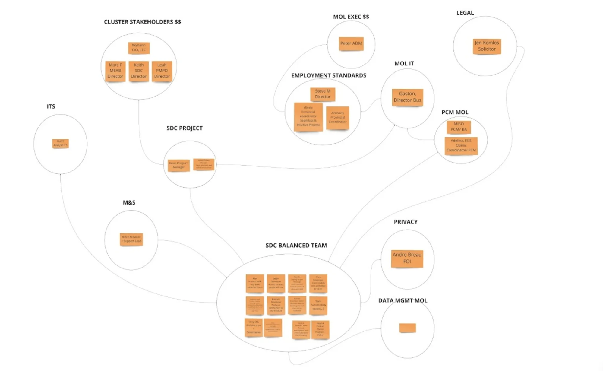
Who is involved in the claims process?

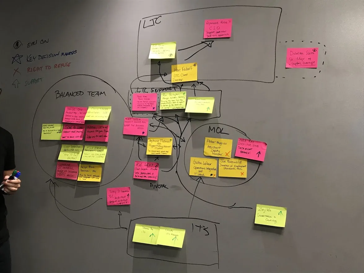
I led a stakeholder-mapping session where the team wrote names, roles, and key project interests on sticky notes, grouped teams together, and used arrows to show connections. Key groups: LTC Cluster, ITS, SDC Project Team, MOL Execs, Employment Standards, Legal, Privacy, and Data Management.

Stakeholder map

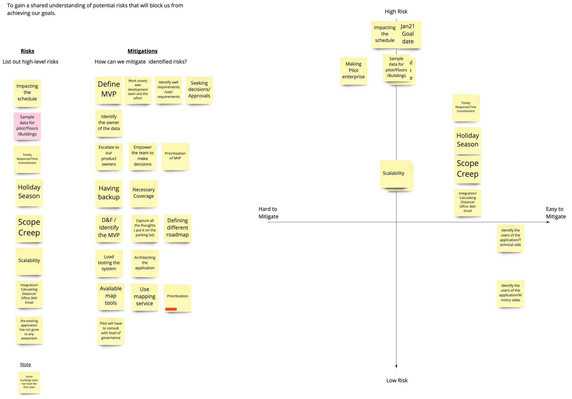
Identifying and ranking project risks

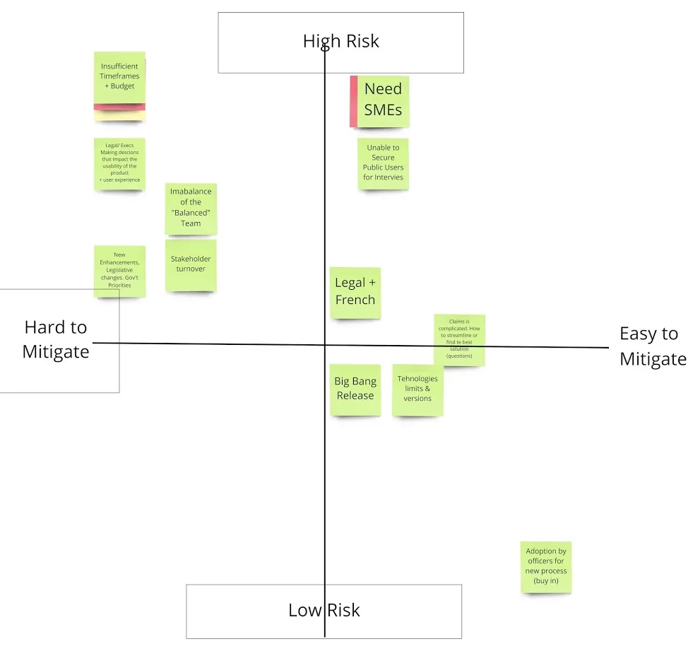
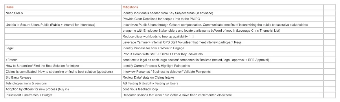
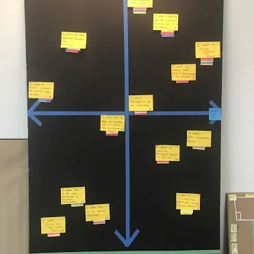
I hosted a risk workshop where each team member listed their top 5 risks, then guided the team in ranking them on a 2×2 grid: Y-axis (high vs. low risk) and X-axis (easy vs. hard to mitigate).

Risk matrix Risk mitigation list

Meet Clancy and Melissa

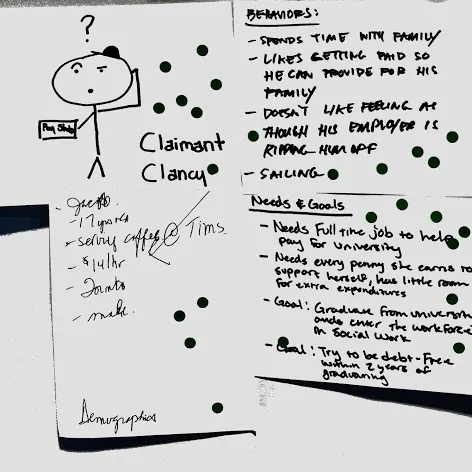
I guided a personas workshop that created real people the team could relate to and build empathy for. Claimant Clancy and ERO Melissa shaped every design decision throughout the project.

ERO Melissa persona Claimant Clancy persona

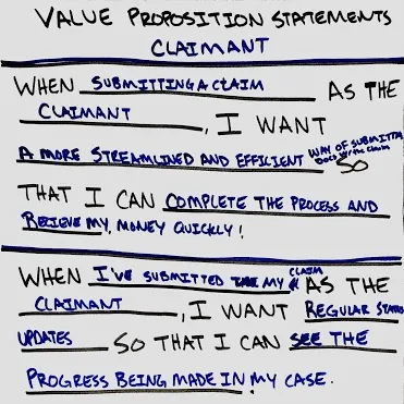
What does each user need most?

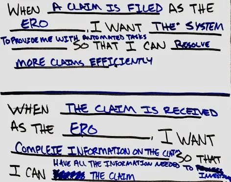
For the Claimant
"A streamlined way to submit documents with my claim so I can complete the process and receive my money quickly — with regular status updates along the way."
For the ERO
"A system that provides automated tasks and complete information on each claim so I can resolve more cases efficiently without chasing missing data."
Value proposition claimant Value proposition ERO

Understanding our two key users

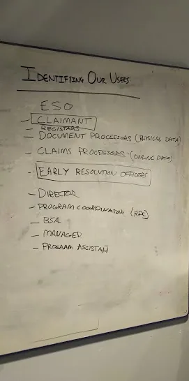
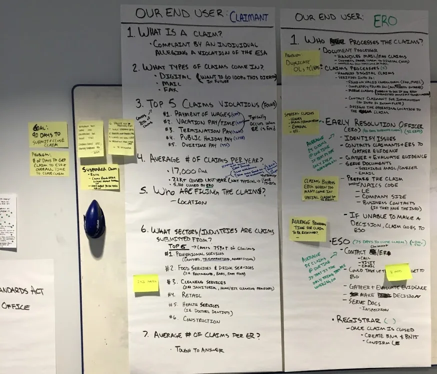
I chose to focus on Claimants and EROs — the two groups most involved in the claims process that we knew the least about.

User list End users whiteboard

Mapping the full claims journey

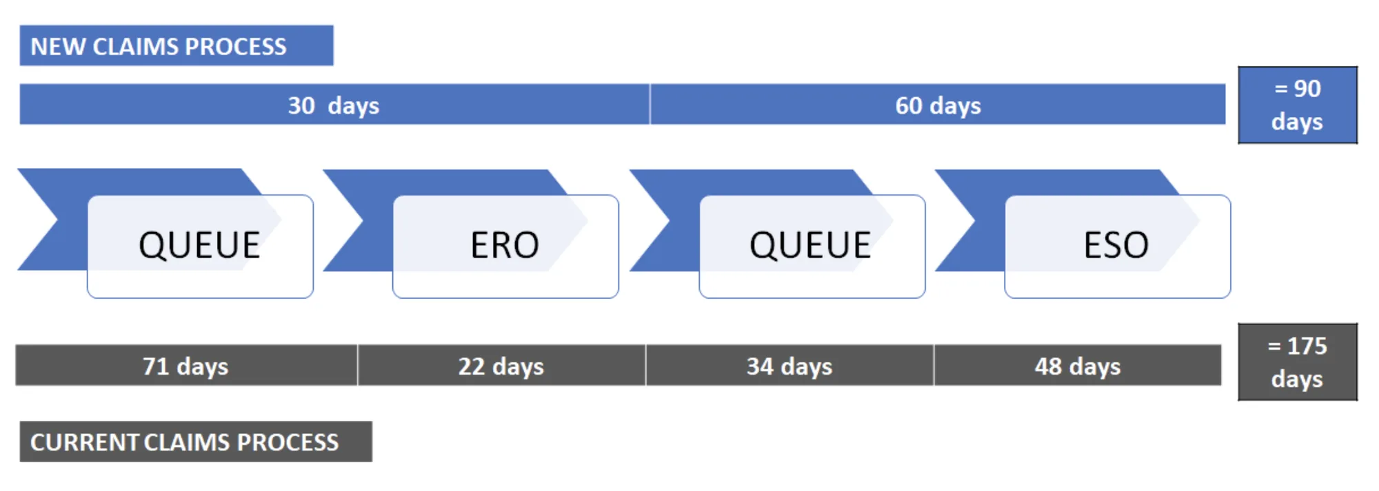
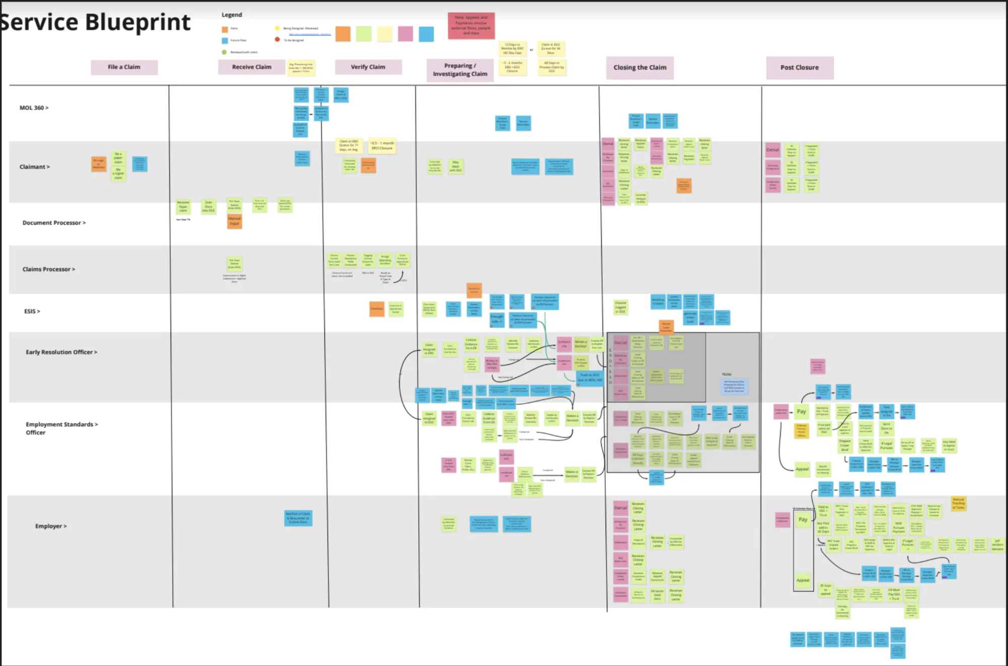
I mapped the current paper process from claim submission to closure — highlighting all key players, stages, and average time in each queue. This service blueprint became our north star throughout the project.

Claims processing flow
Service blueprint

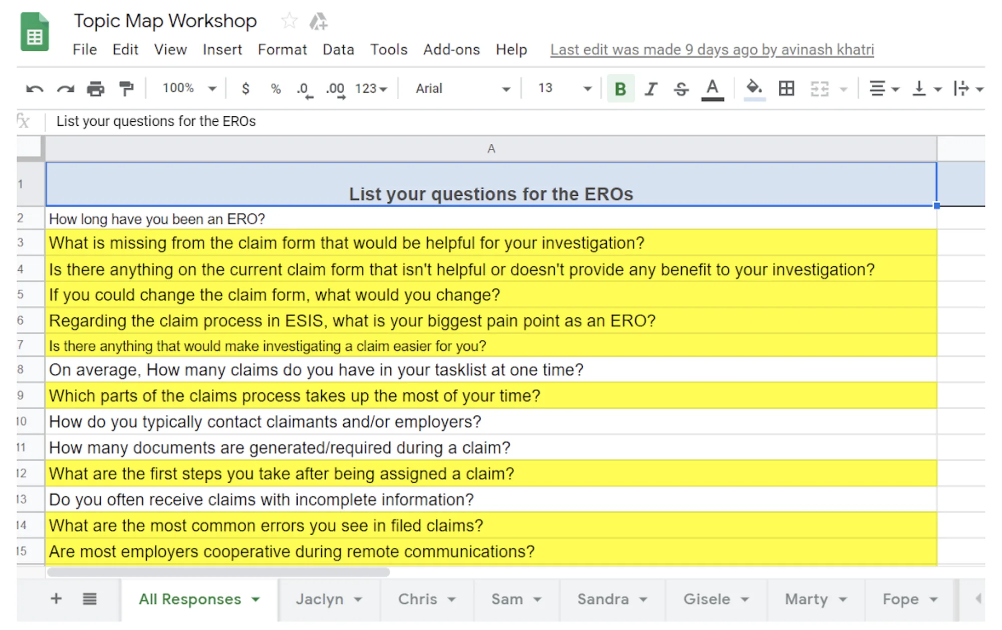
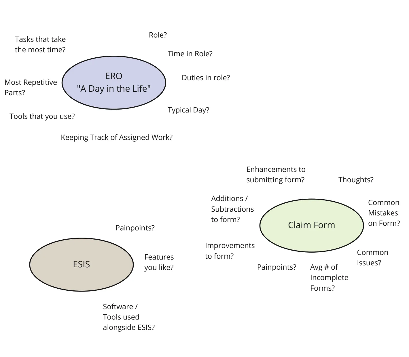
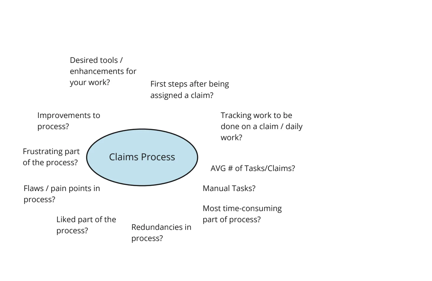
Interview prep & topic mapping

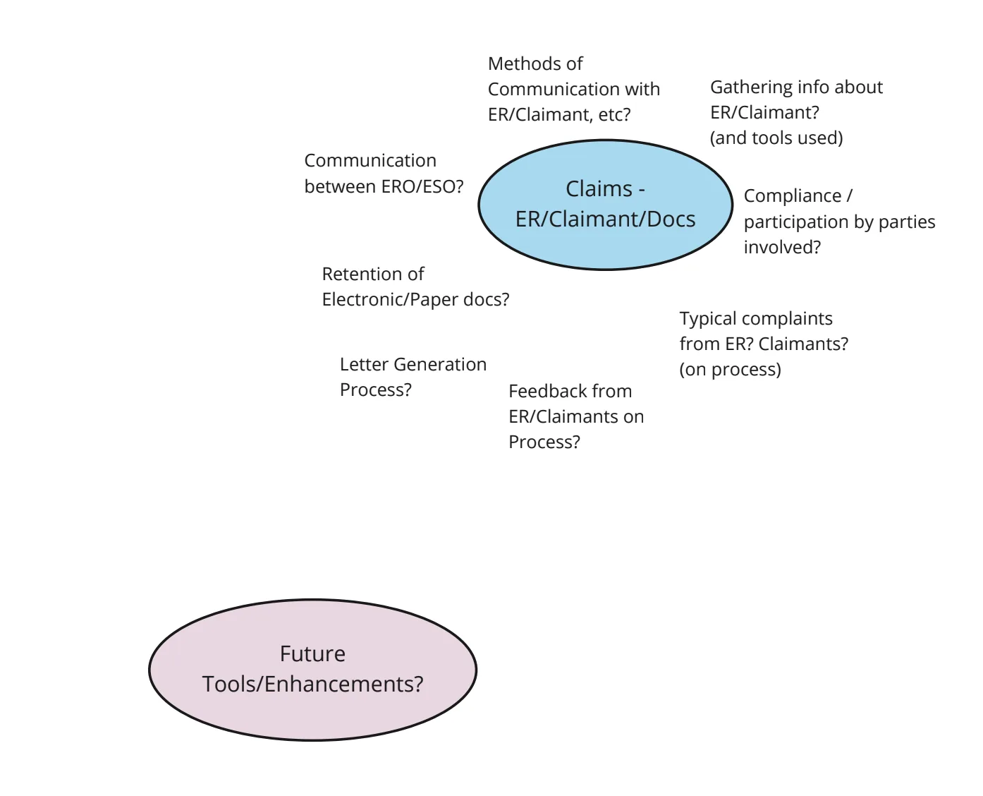
I led interviews with 5 EROs across a full day. Beforehand, I organized a session where each team member wrote potential questions, then consolidated the top ones into a topic map — clustering by themes: a day in the life of an ERO, the current system (ESIS), the claims form, claims process, and employers/claimants/documents.

Interview questions Topic map 1 Topic map 2 Topic map 3

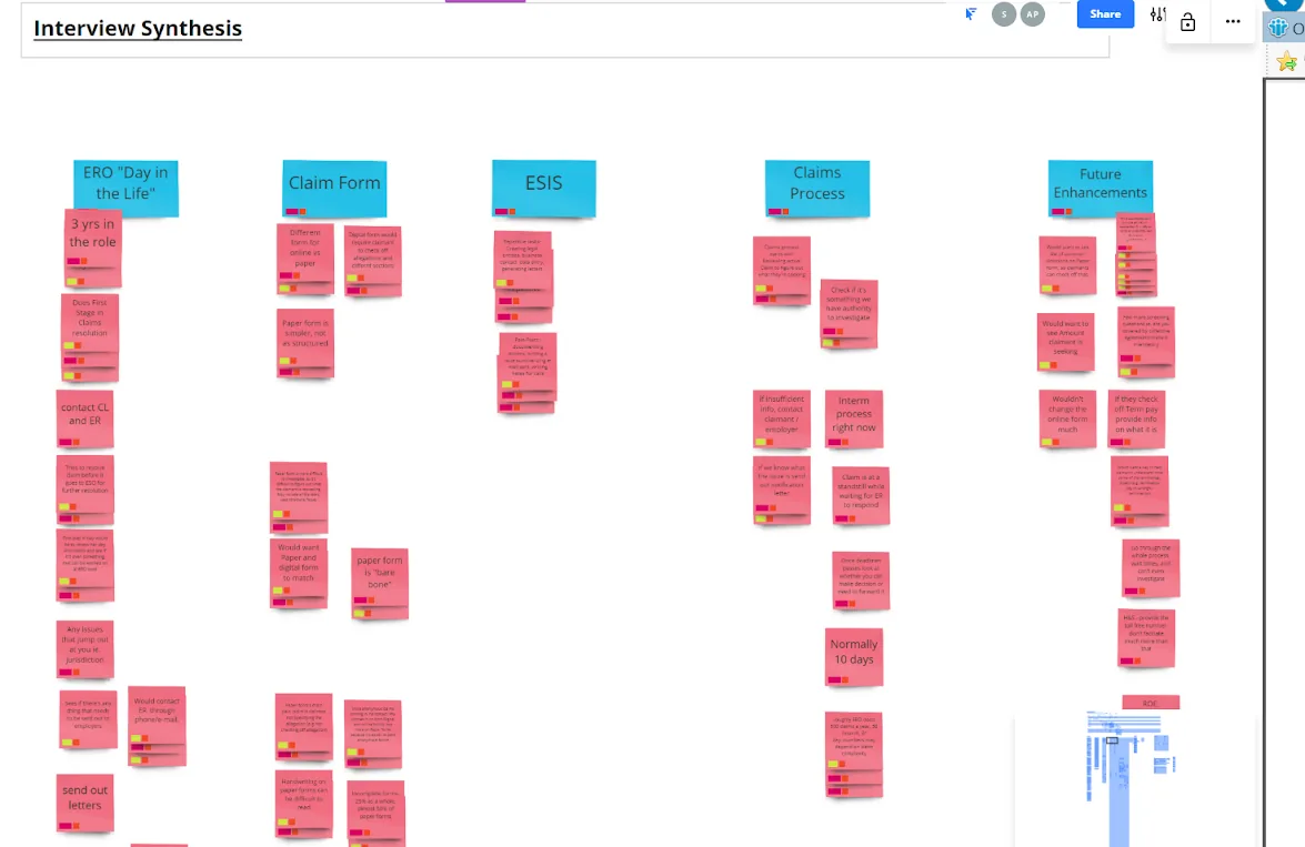
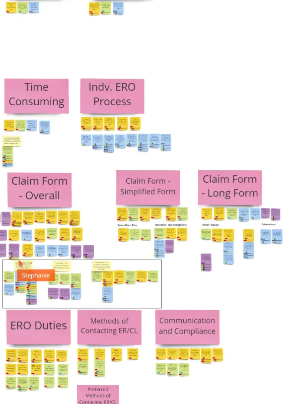
Synthesizing insights from 5 ERO interviews

I ran a synthesis session where each interview was color-coded and key insights grouped by theme. This affinity mapping surfaced the patterns that drove our design priorities.

Interview synthesis Synthesis detail

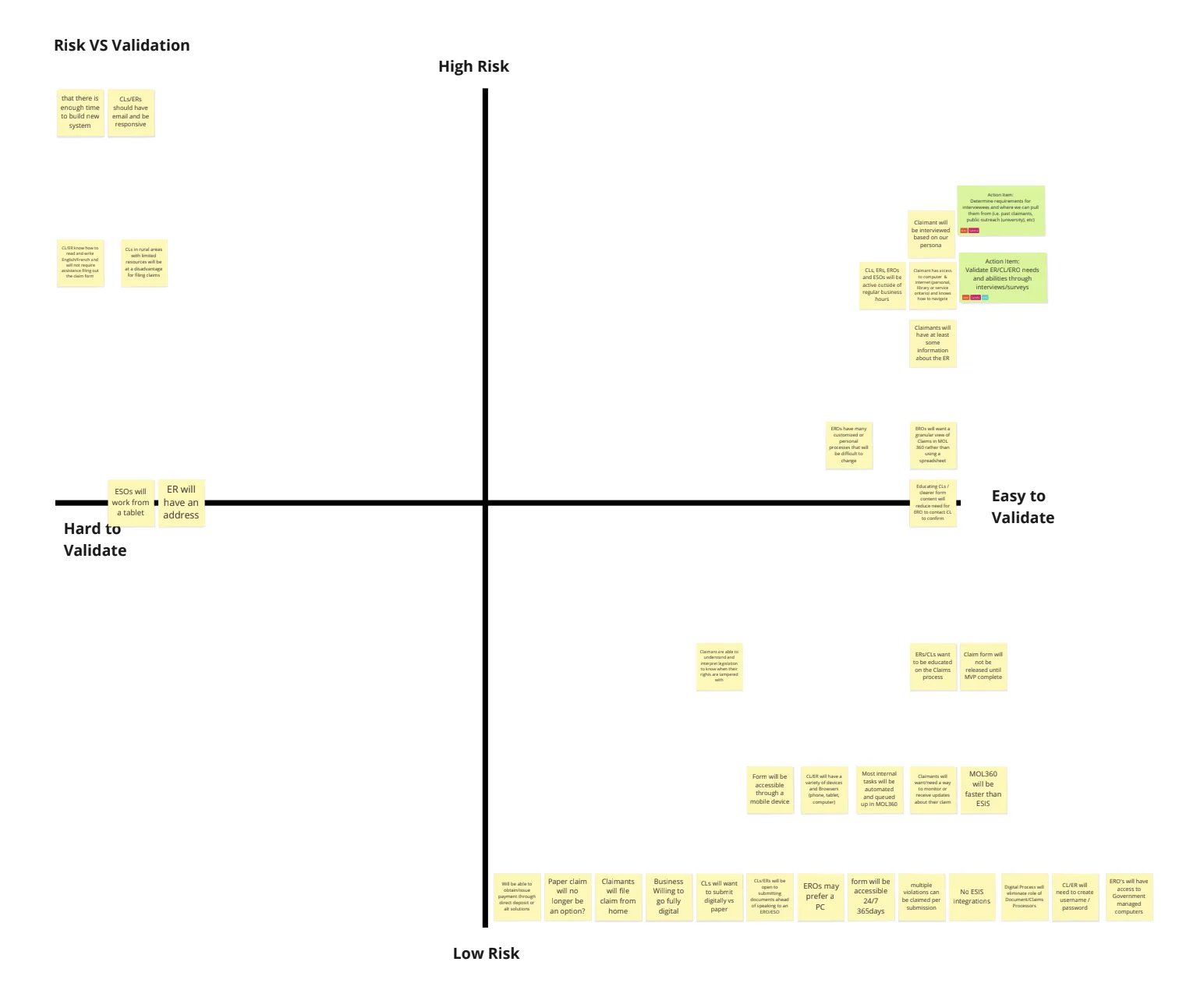
Mapping assumptions on a risk/validation grid

I guided the team in mapping assumptions on a 2×2 grid: Y-axis (high vs. low risk) and X-axis (hard vs. easy to validate) — to prioritize what needed research before we could make decisions.

Assumptions grid

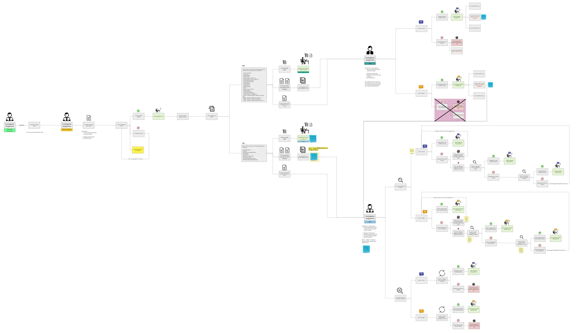
MLTSD 360 Claims Investigation Assignment Algorithm

Birds eye view map

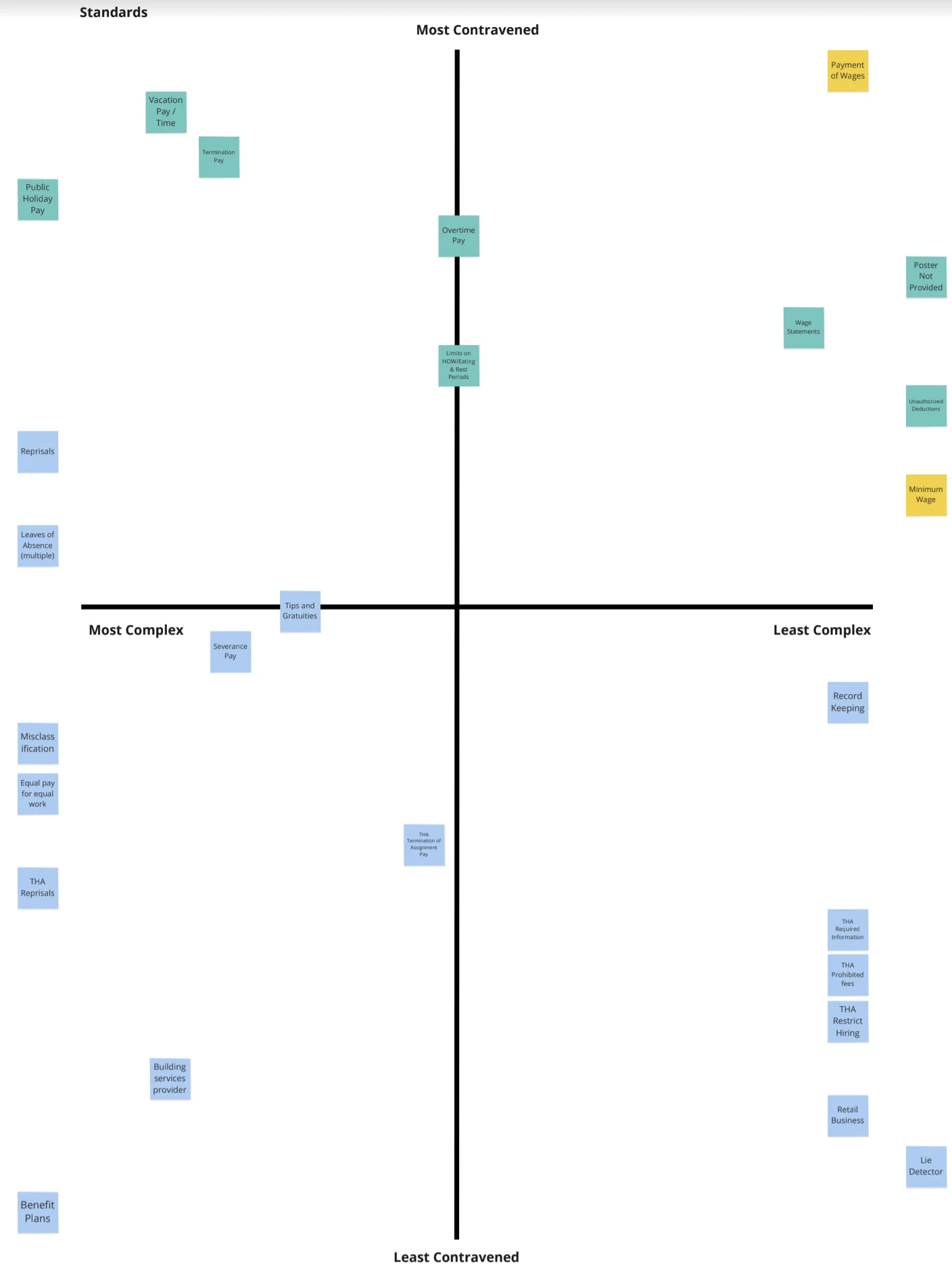
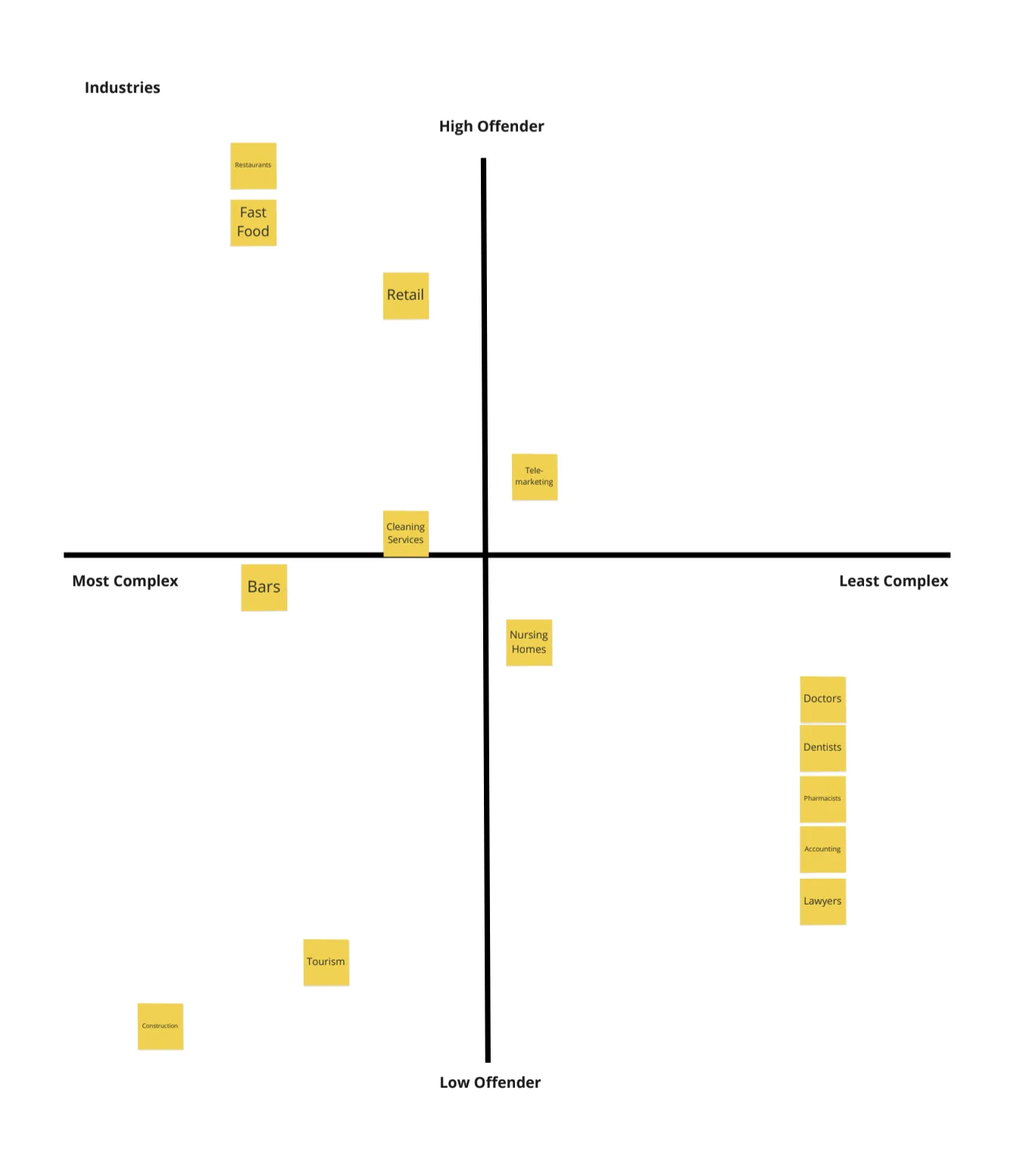
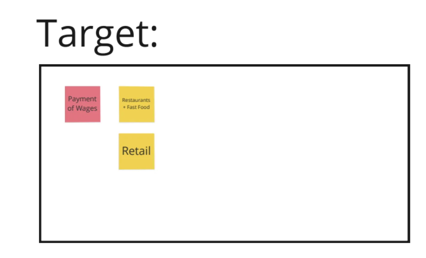
Ranking violations and industries by complexity

I partnered with MOL Subject Matter Experts to rank employment standards on a 2×2 grid — most contravened vs. least contravened on Y-axis, and most complex vs. least complex on X-axis. We did the same for industries.

Standards prioritization grid Industry prioritization Standards detail

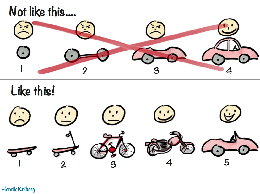
Finding our skateboard

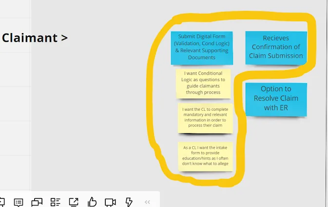
I led the team to our "golden nugget" — inspired by the Agile skateboard analogy — the portion of the future service blueprint where we chose to start. We focused on collecting better data and guiding Claimants through the claims process as the highest-value starting point for both Claimants and EROs.

Skateboard analogy Golden nugget highlighted

From insights to first sketches

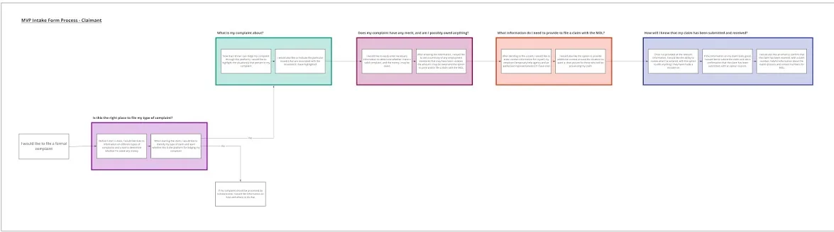
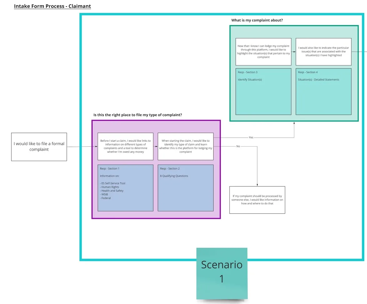
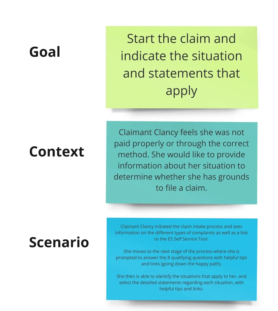
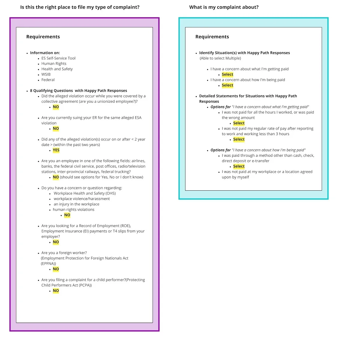
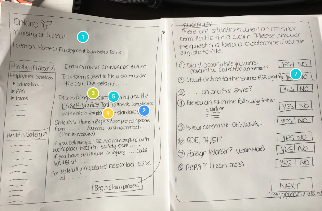
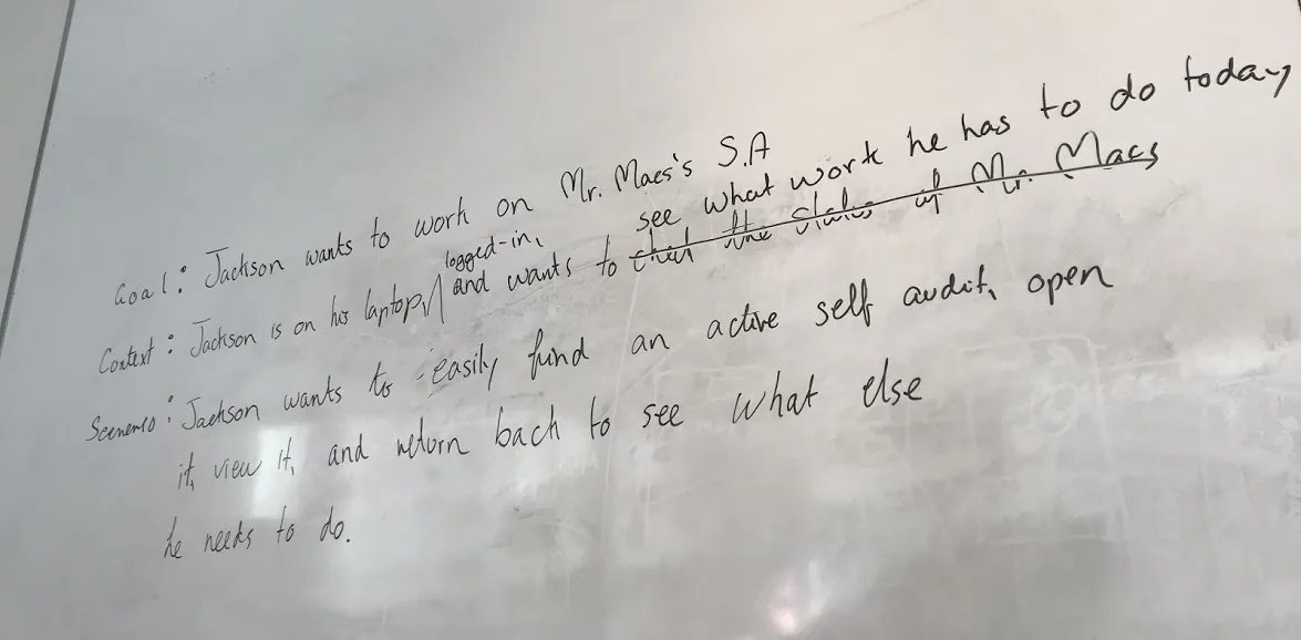
I broke the intake form into scenarios, wrote goals for each, and created a real-life scenario for Claimant Clancy. I then ran a sketching-and-critique workshop where the team sketched solutions and critiqued them digitally using Zeplin.io.

MVP flow chart Scenario 1 Scenario goals Detailed requirements Sketch with critique

Selected screens

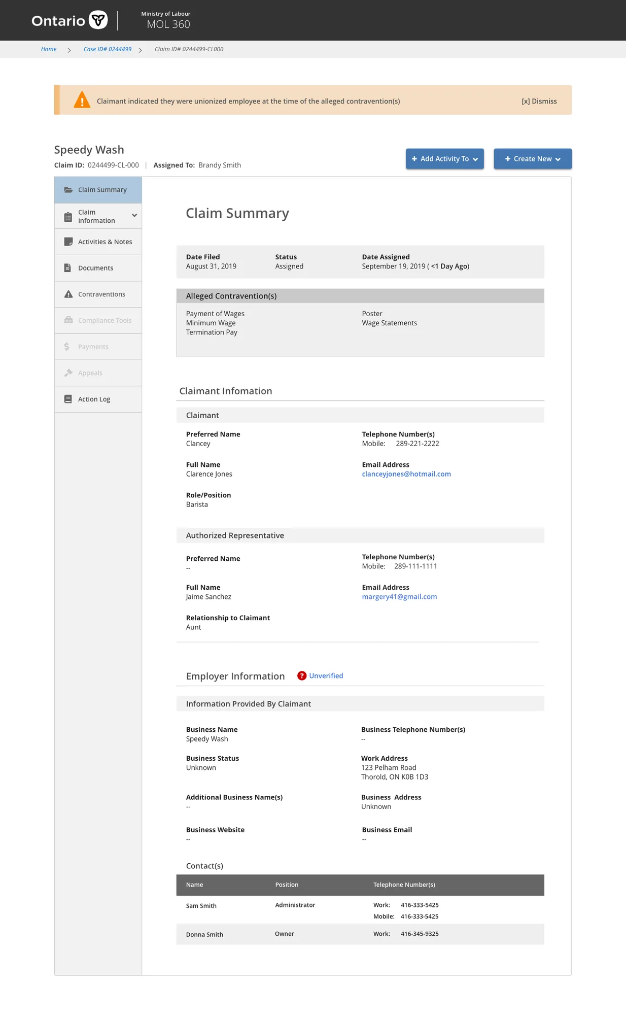
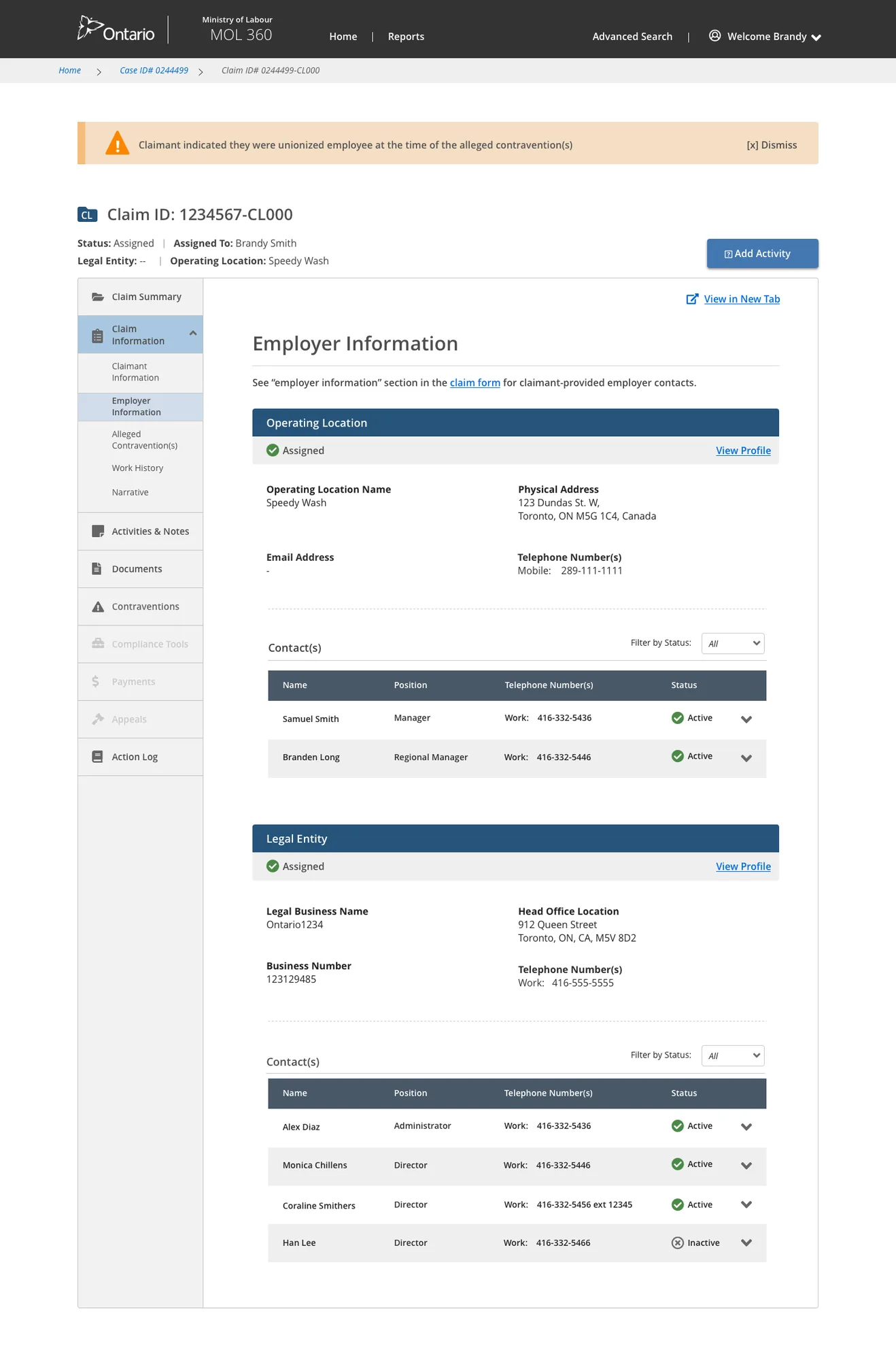
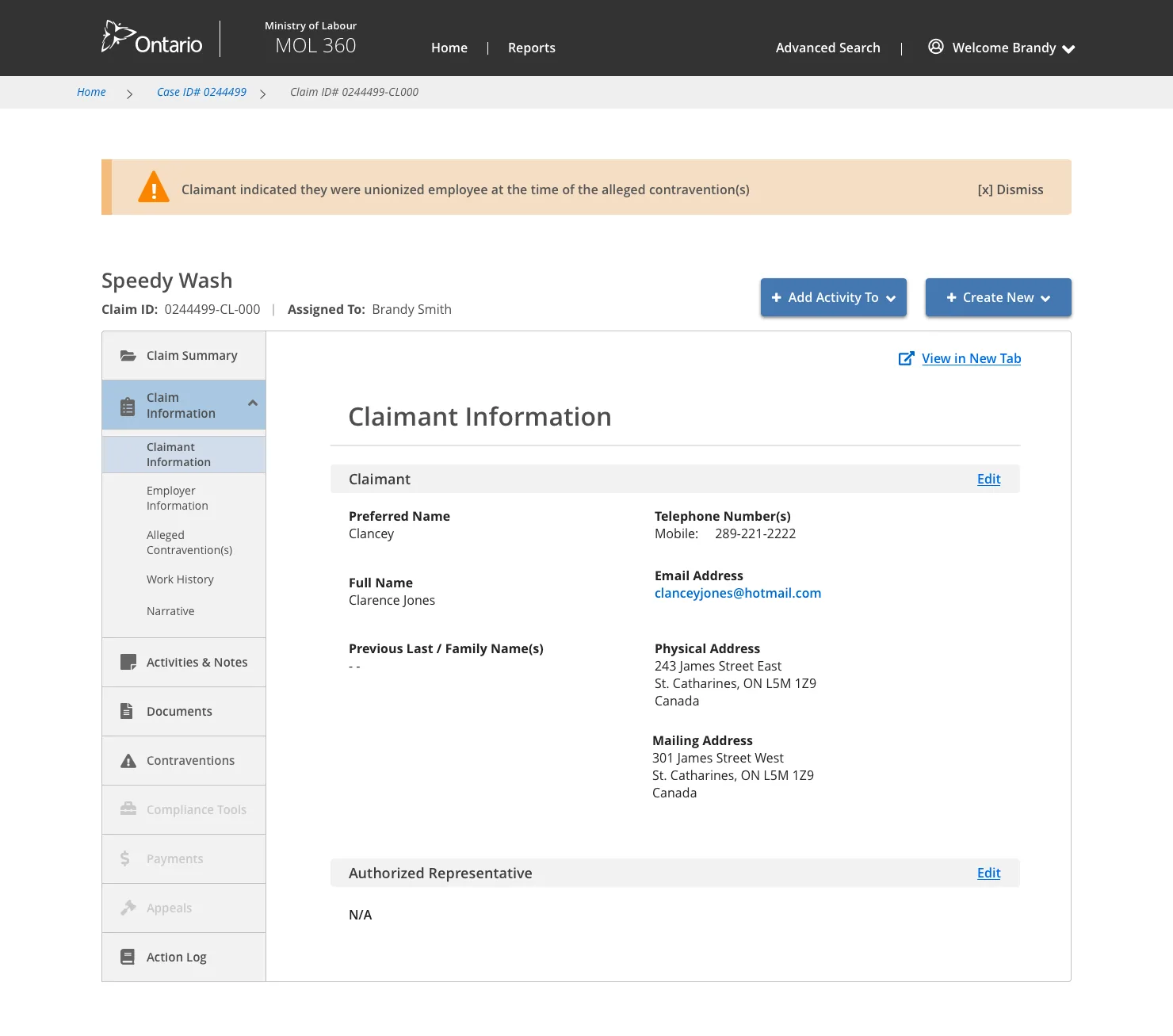
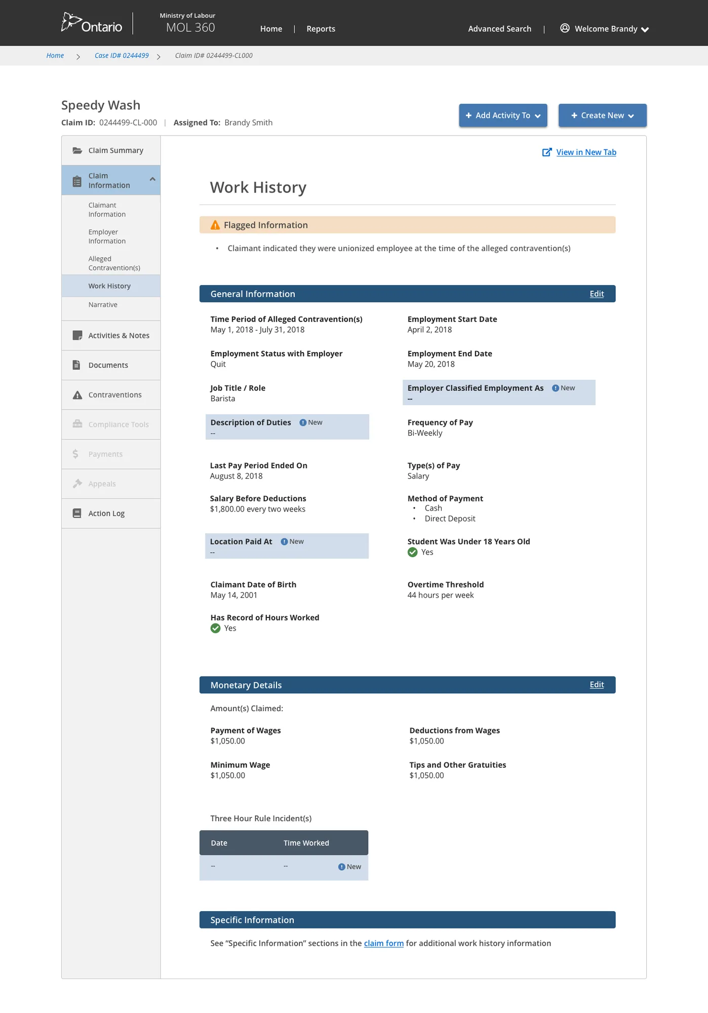
Claim summary Employer information Claimant info Work history
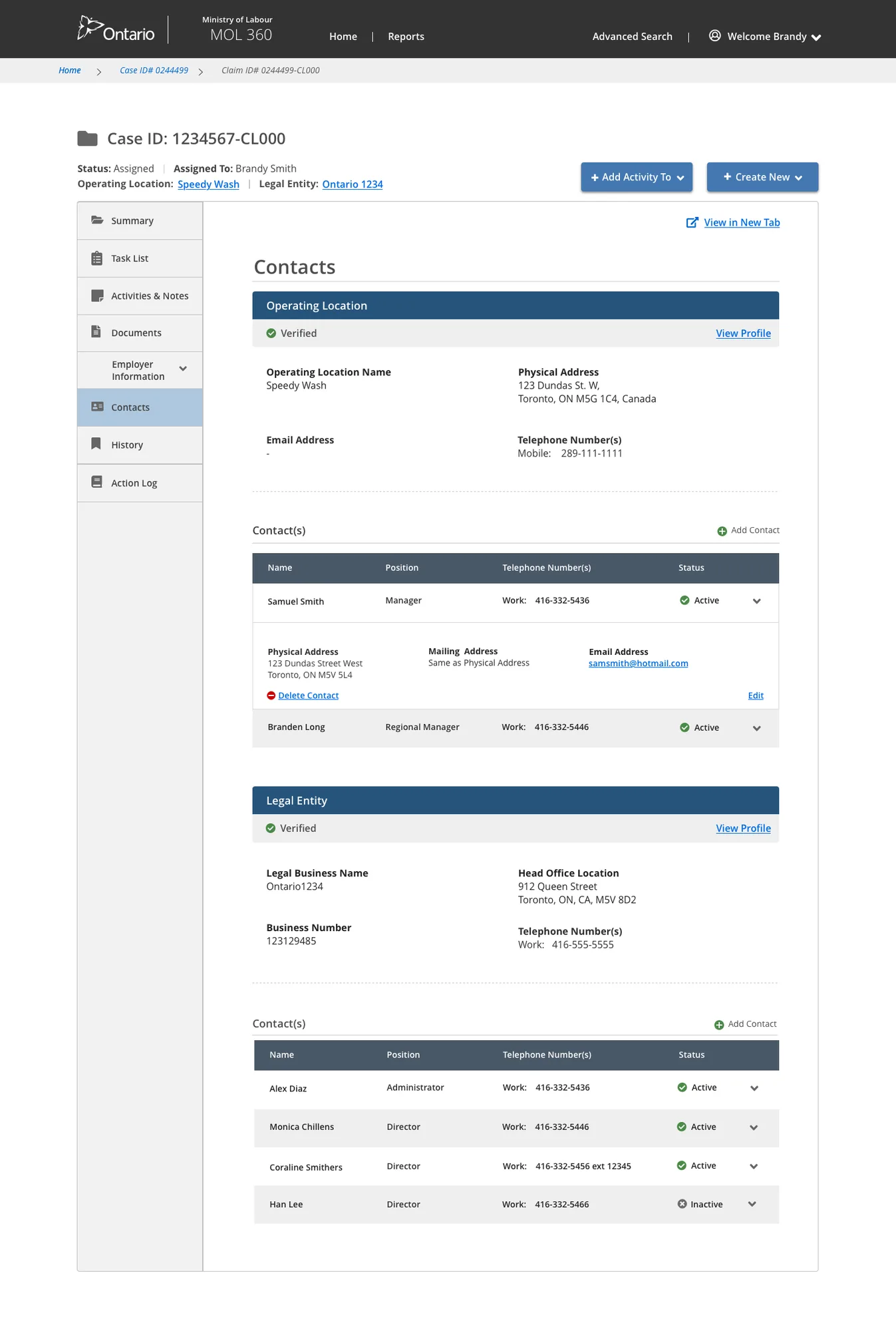
Add contact
Also Ministry of Labour
Self-Audit Digitization Tool →
Also Ministry of Labour
Officer Case Management Portal →
Ministry of Transportation · Responsive Web · 2020–2021

Highway Corridor
Management System

Role
Senior Product Designer
Client
Ministry of Transportation
Platform
Responsive Web

Expanding a permit system into a full land development review platform

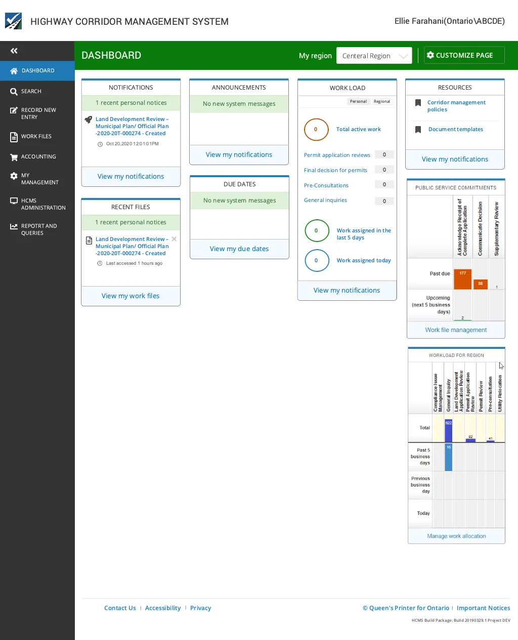
The Ministry of Transportation implemented HCMS in 2017 — a web platform where clients submit permit applications, connect with MTO staff, track reviews, pay fees, and receive permits entirely online. MTO then sought to expand HCMS to support the full land development review process: from pre-consultation through to permit issuance.

A system that couldn't connect stakeholders

No stakeholder connection
No system connecting MTO to external stakeholders. Land developers couldn't track review status or know who to contact.
Internal tools only
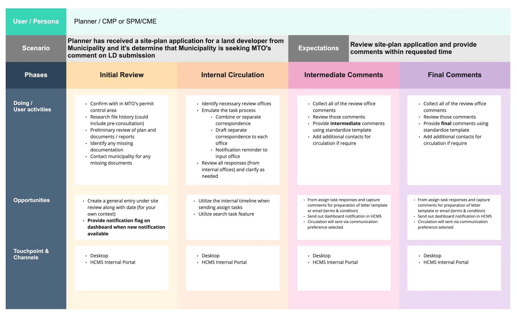
Teams used spreadsheets and simple databases — strictly internal and inadequate for collaboration.
No end-to-end flow
No file connectivity from pre-consultation to permit. No traceability, no timeline for reviews or comments.
No geographic search
Inability to geographically display, search, and connect files across Ontario's road network.

Understanding who uses the system

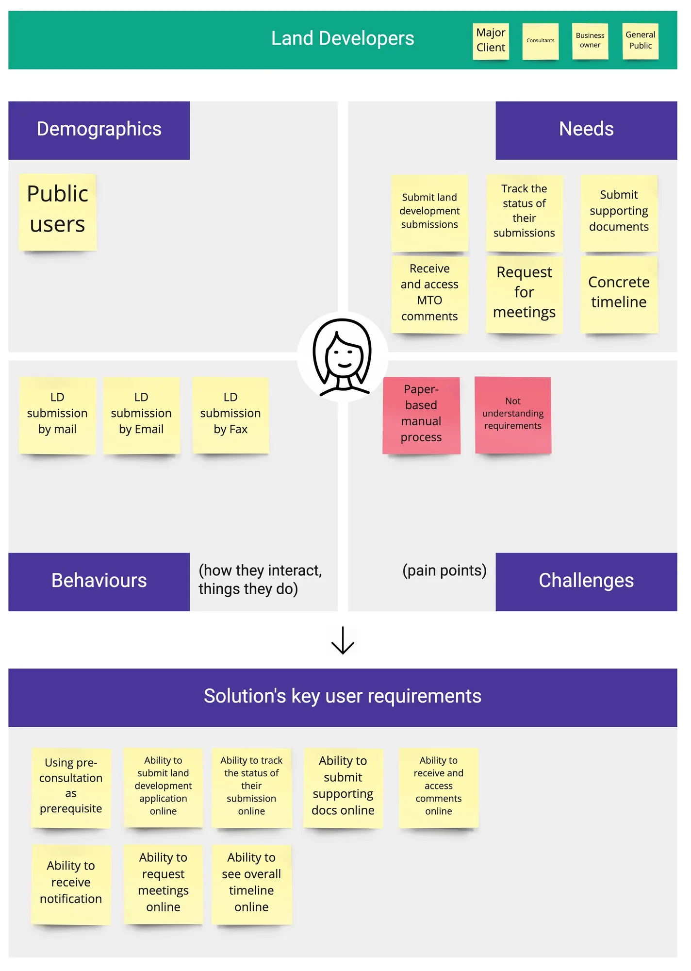
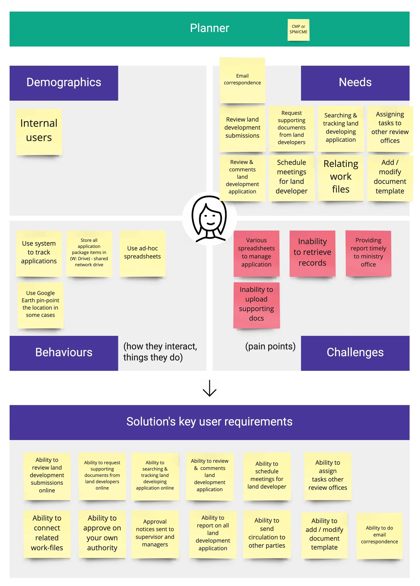
I facilitated a sprint to map out the key user personas — land developers, municipalities, and MTO staff — capturing their goals, frustrations, and workflows before touching any design.

Persona 1 Persona 2

Mapping the problem space

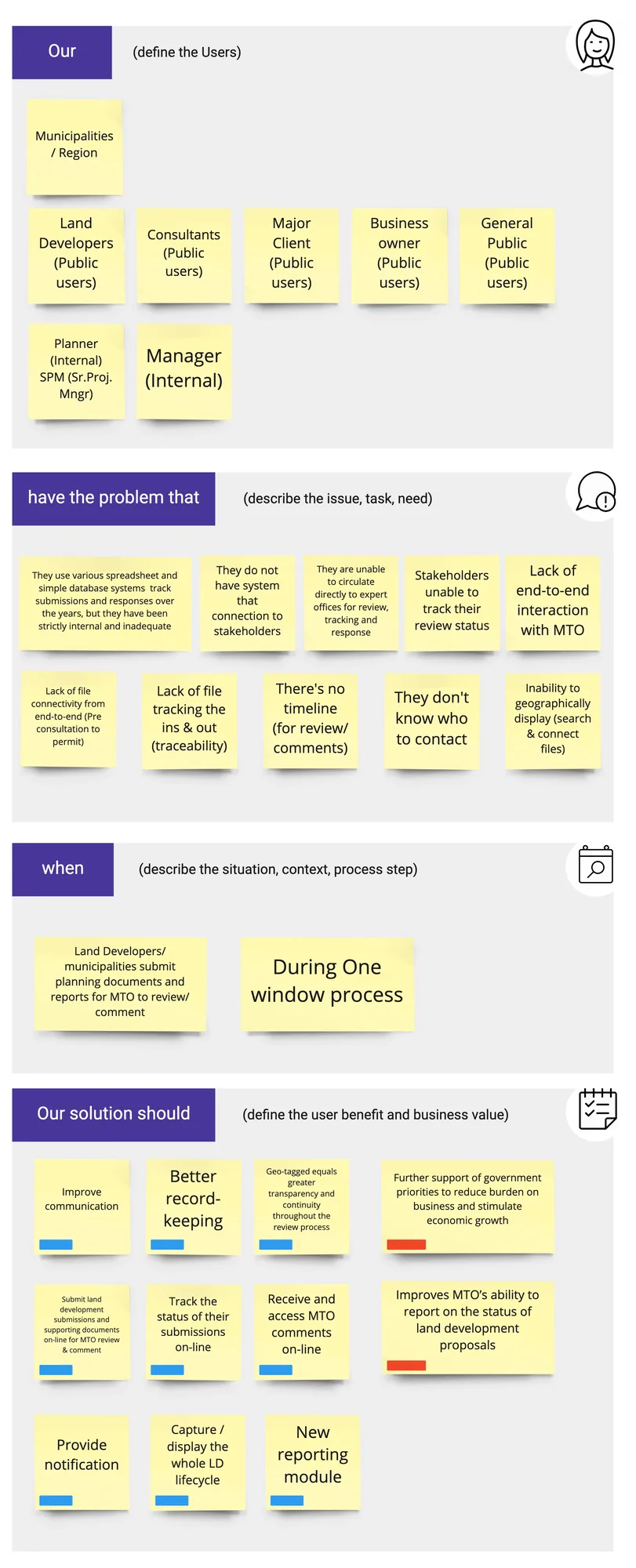
I facilitated the workshops where the team documented the full problem statement — mapping all the gaps, pain points, and missing capabilities that needed to be addressed in HCMS 2.0.

Problem statement workshop

Mapping the full land development journey

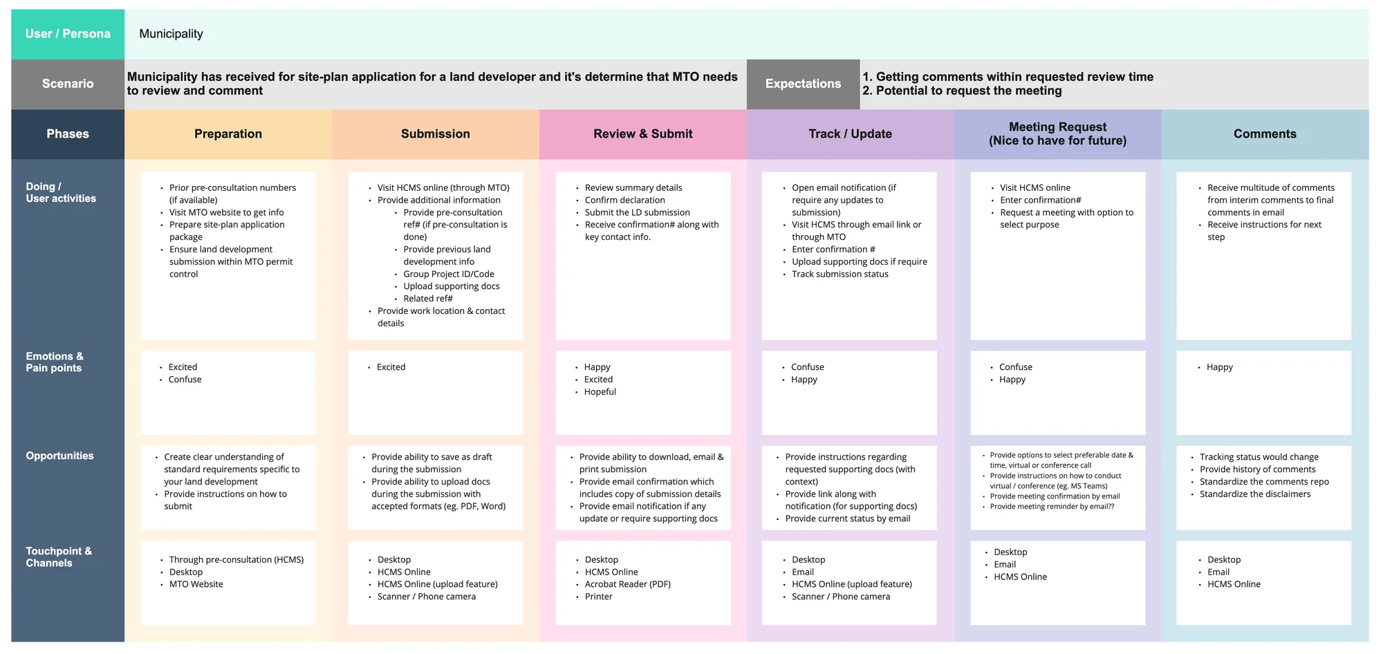
I facilitated the mapping of the complete end-to-end user journey — from initial pre-consultation through land development review to final permit issuance — identifying every touchpoint, handoff, and gap in the current process.

User journey map 1 User journey map 2

Final screens

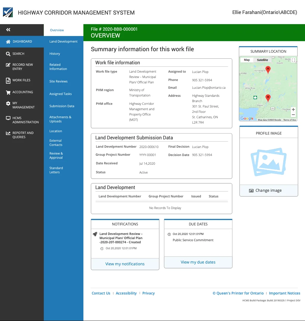
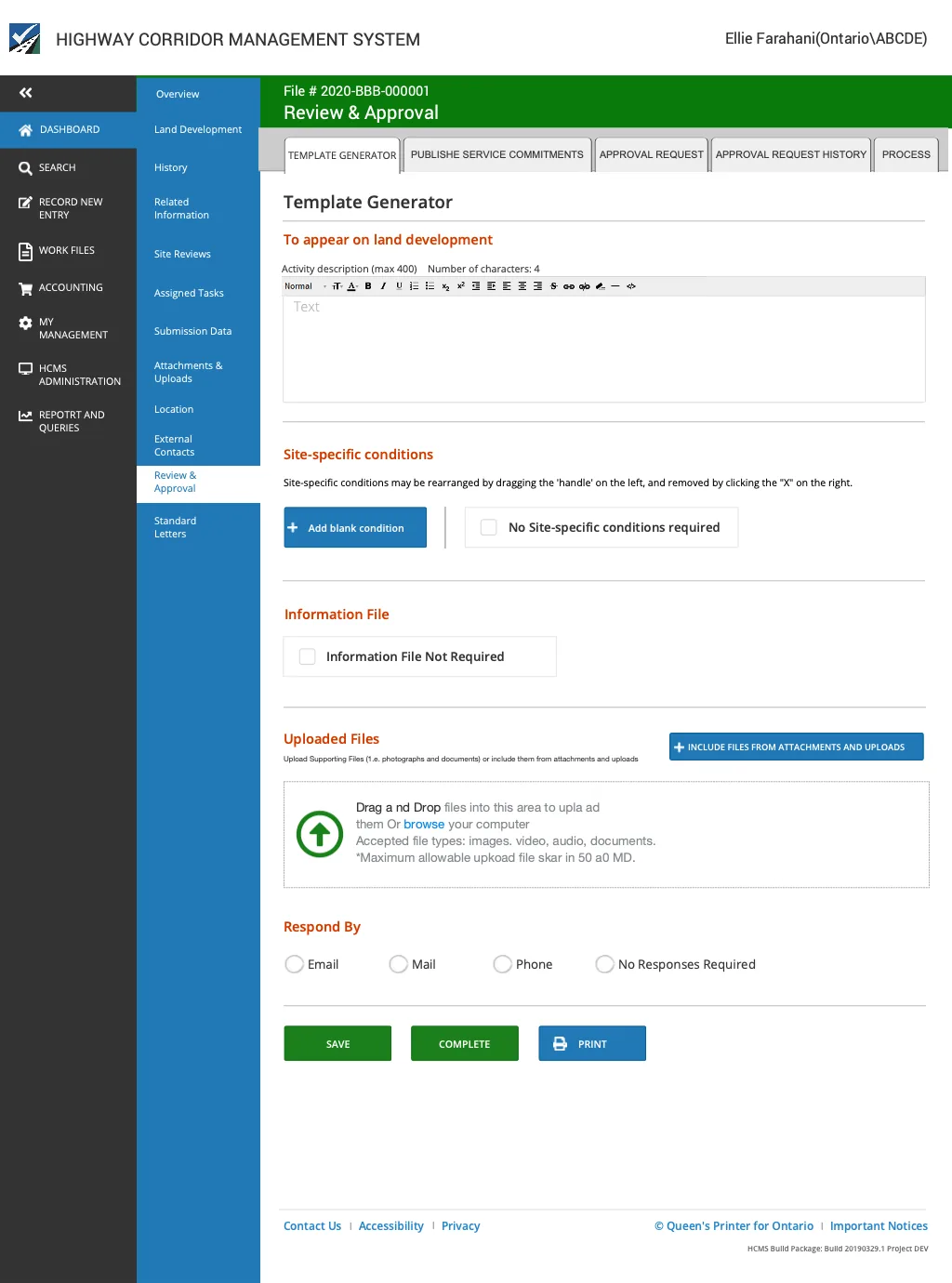
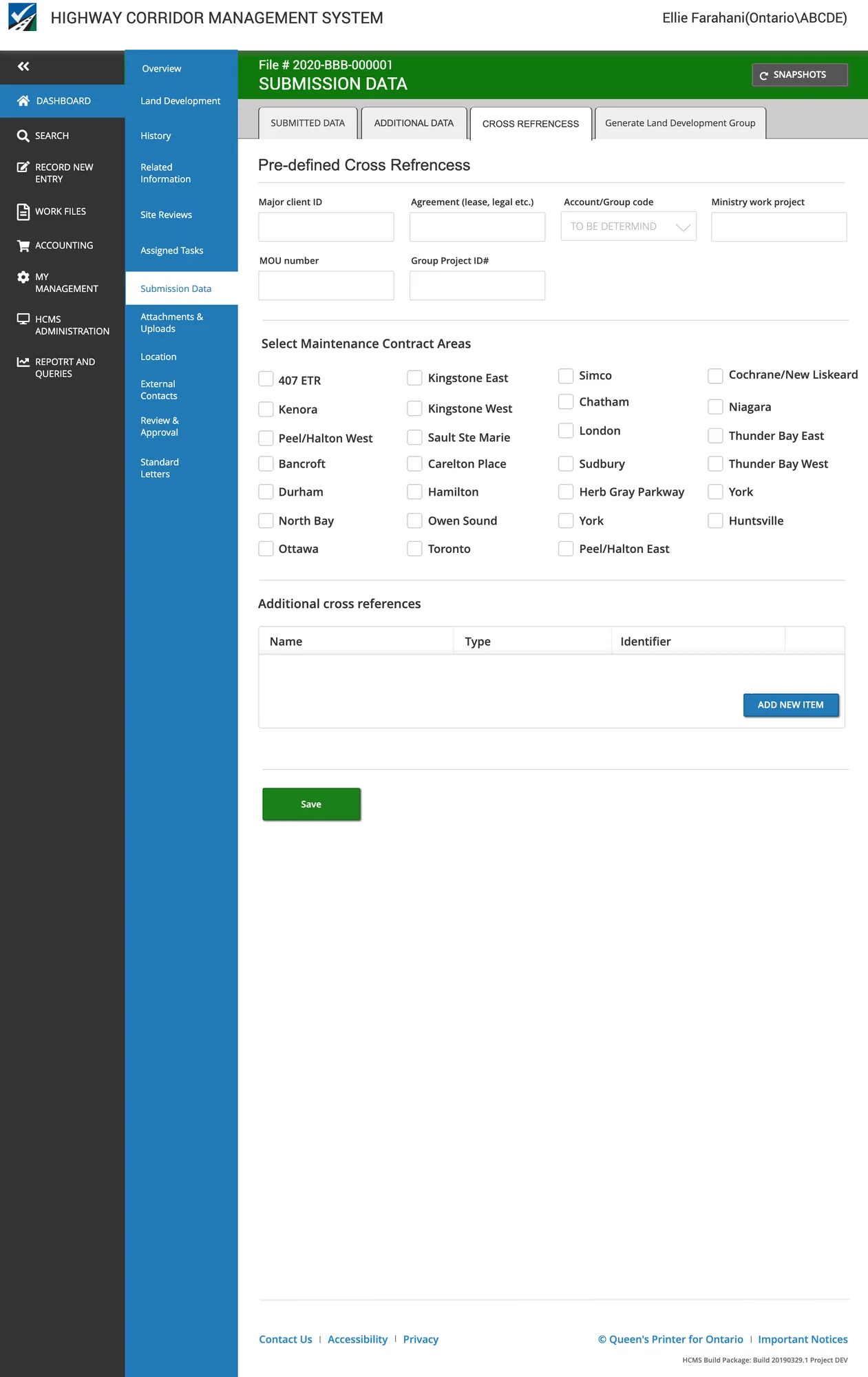
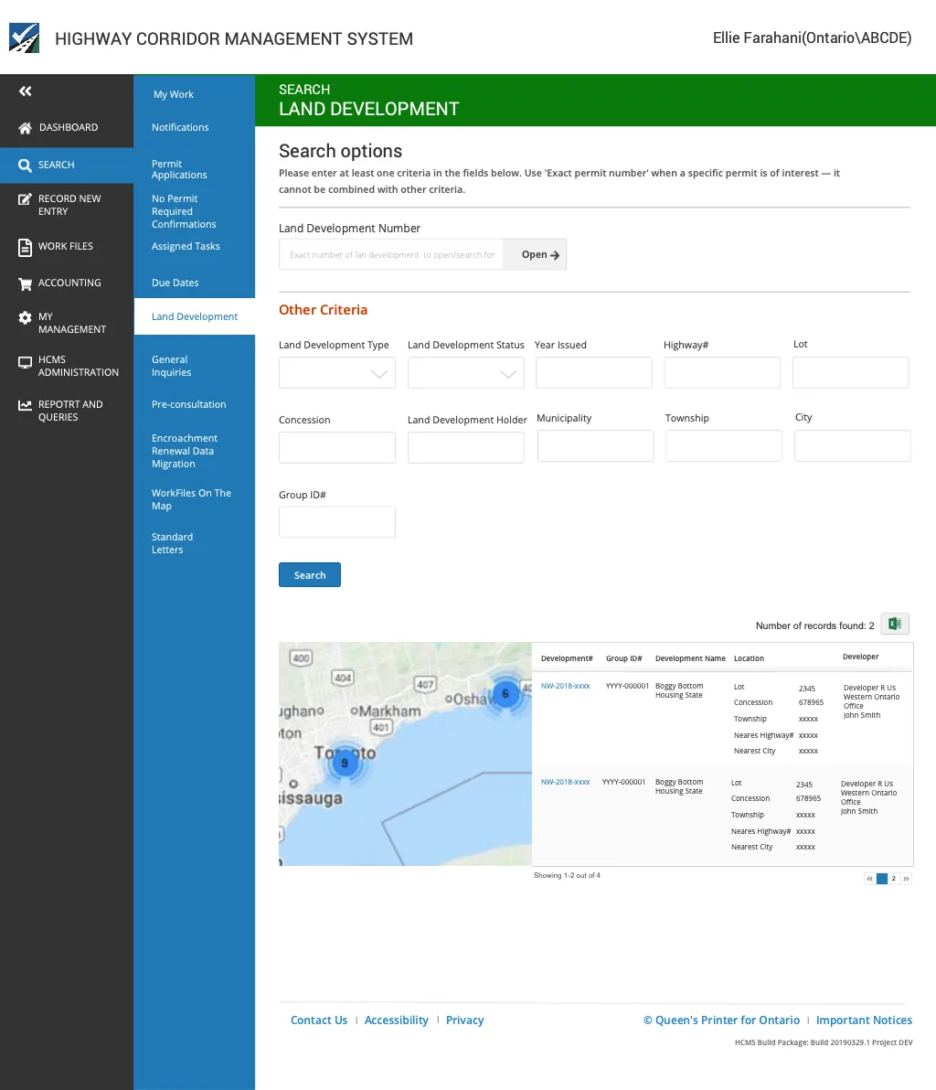
The final high-fidelity designs delivered a connected, end-to-end platform — from main menu navigation through submission, review, search, and permit management.

Main menu Overview Review and submit Submission data pre-defined Search Submission data detail
Also government work
Employee Workstation Reservation →
Also government work
Claims Processing System →
Ministry of Government & Consumer Services · 2020

Employee Workstation
Reservation System

Role
Senior Product Designer
Context
COVID-19 Recovery
Platform
Responsive Web

Enabling flexible government workspaces during COVID-19 recovery

With a growing number of Ontario Public Service employees working from home, the government wanted to explore "regional hubs" — allowing employees to work from an office near their home rather than their assigned ministry. The goal was to support COVID-19 recovery by reducing transit pressure and enabling flexible working environments.

To achieve this, employees needed the ability to share desks by reserving them at different times at locations nearest to their home.

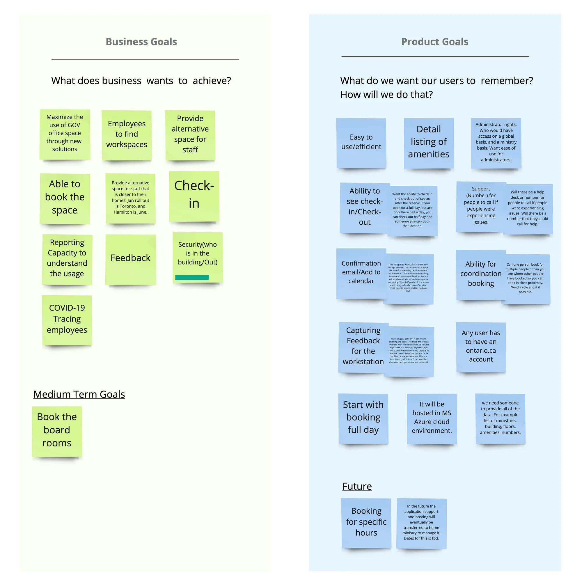
Four organizational goals

Support COVID-19 recovery
Enable regional hubs where employees can book office workspace near their home, alleviating pressure from the transit system.
Flexible working
Workspaces available to any employee on a first-book, first-serve basis regardless of their ministry.
Mobile workforce
Support a mobile workforce with a smaller real estate footprint without sacrificing employee productivity.
Increase sharing ratio
Increase the frequency of use of each workspace, minimizing real estate footprint while maintaining employee flexibility.

Goals workshop

Goals workshop

Risk & mitigation mapping

Risk and mitigation

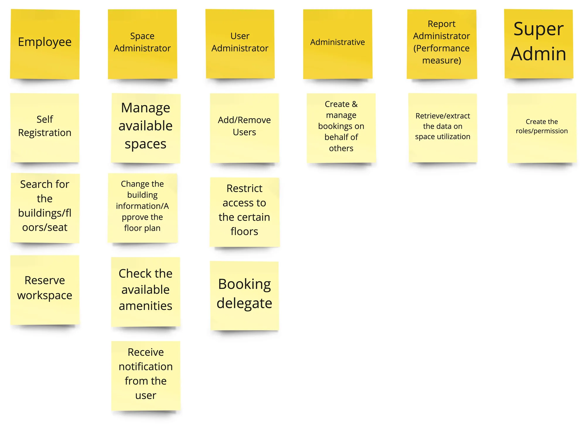
Roles & permissions mapping

Roles and permissions

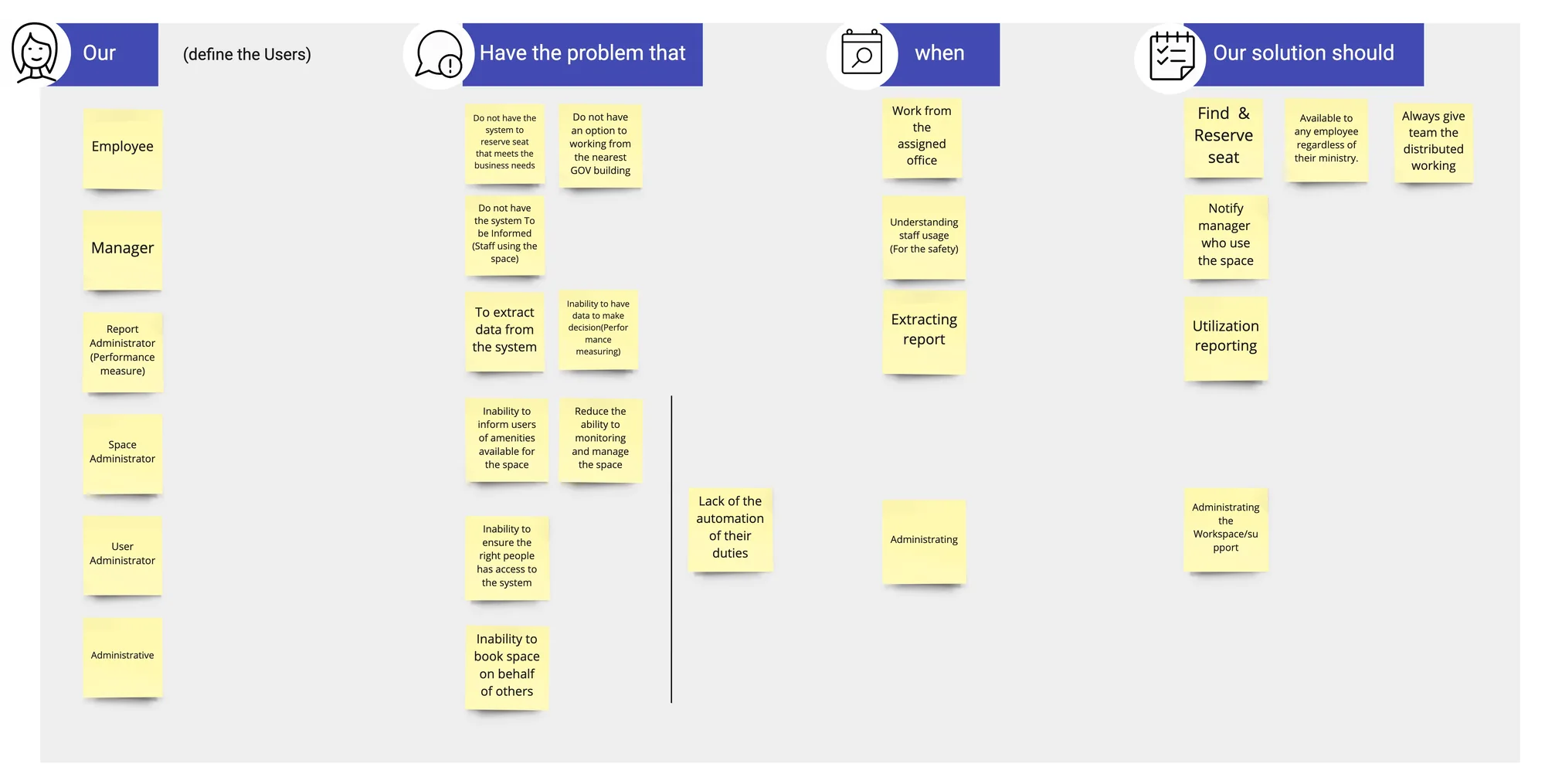
Value proposition

Value proposition

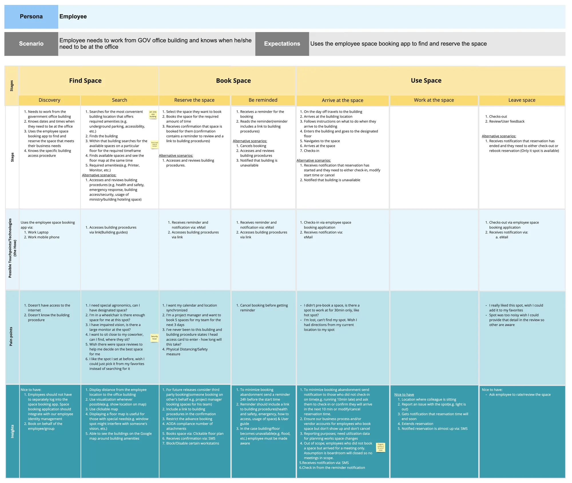
Work from GOV Office — Employee journey

Employee user journey map

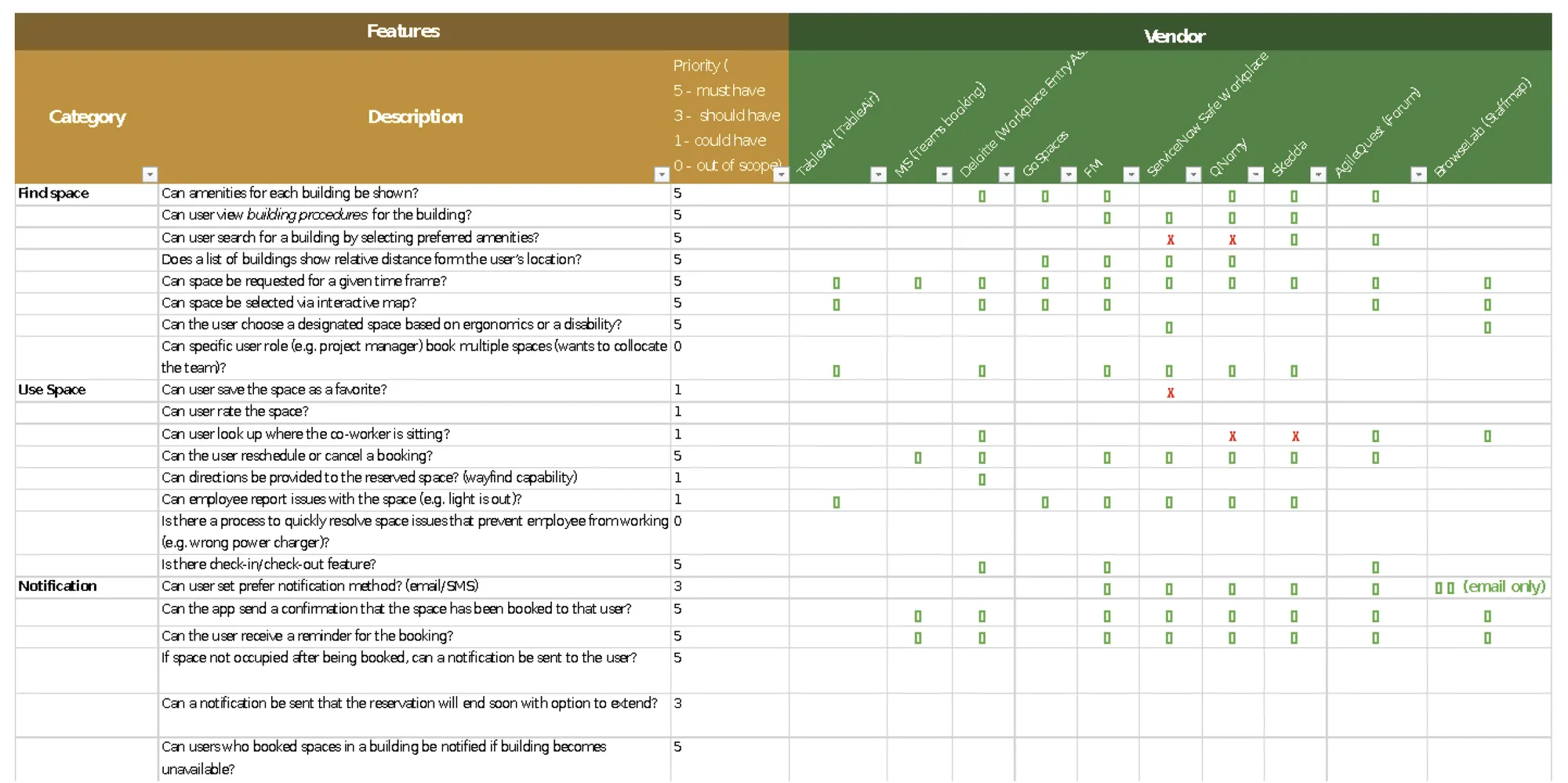
Market scan & competitive landscape

Market scan

Final screens

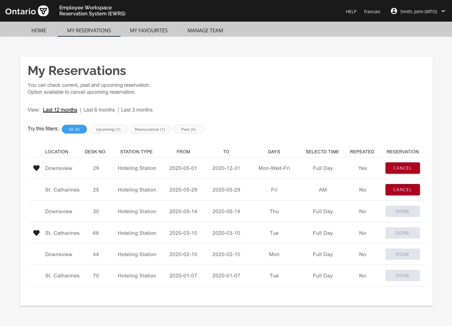
Dashboard — hoteling My reservations
Also government work
Highway Corridor Management →
Also government work
Claims Processing System →
Jonas Club Software · 2017–2018

Jonas Software
Platform

Role
UX/UI Designer
Type
Enterprise SaaS
Industry
Hospitality & Recreation

Designing a drag-and-drop widget system for club websites

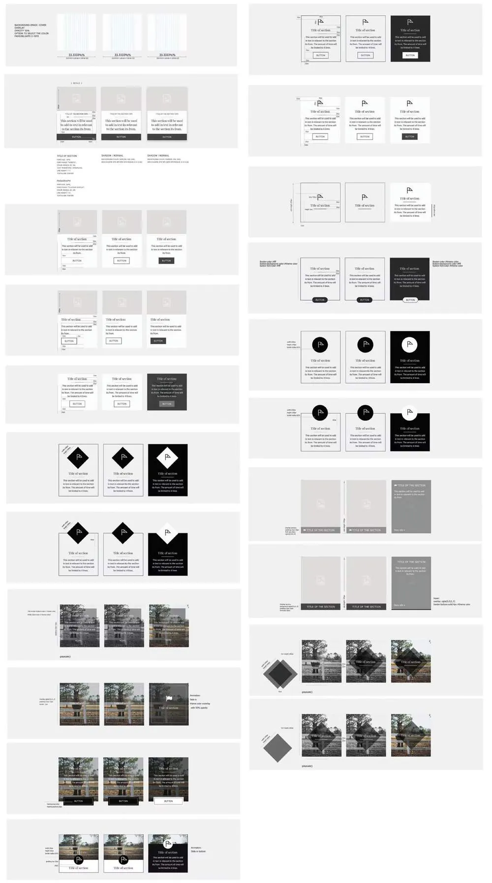
I joined the Jonas Software team to design various widgets for their platform — enabling users to easily build their custom websites by dragging and dropping components. Jonas serves golf clubs, hospitality venues, and recreational facilities across North America.

The work involved designing wireframes for each widget type and then refining into final visual designs that could be customized by clients to match their brand.

From wireframe to polished widget

Each widget was designed starting from low-fidelity wireframes that the full team could critique and align on — before moving to high-fidelity final designs flexible enough to accommodate different club brands.

Jonas wireframes

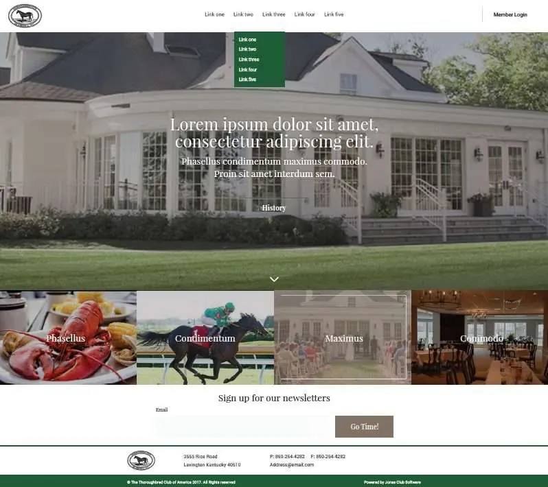
Customized website previews

The final customized websites built using the Jonas widget system — demonstrating how drag-and-drop components come together into polished, branded club websites.

Widget component Final customized website Jonas design 3 Jonas design 4
More recent work
TD MyAdvantage UBI Redesign →
Government work
Self-Audit Digitization →

Ministry of Labour · Design System · 2018

MLTSD Design
Style Guide

Role
Research & Design Lead
Adopted across
5+ digital products
Platform
Responsive Web

A shared design language for the Ministry of Labour

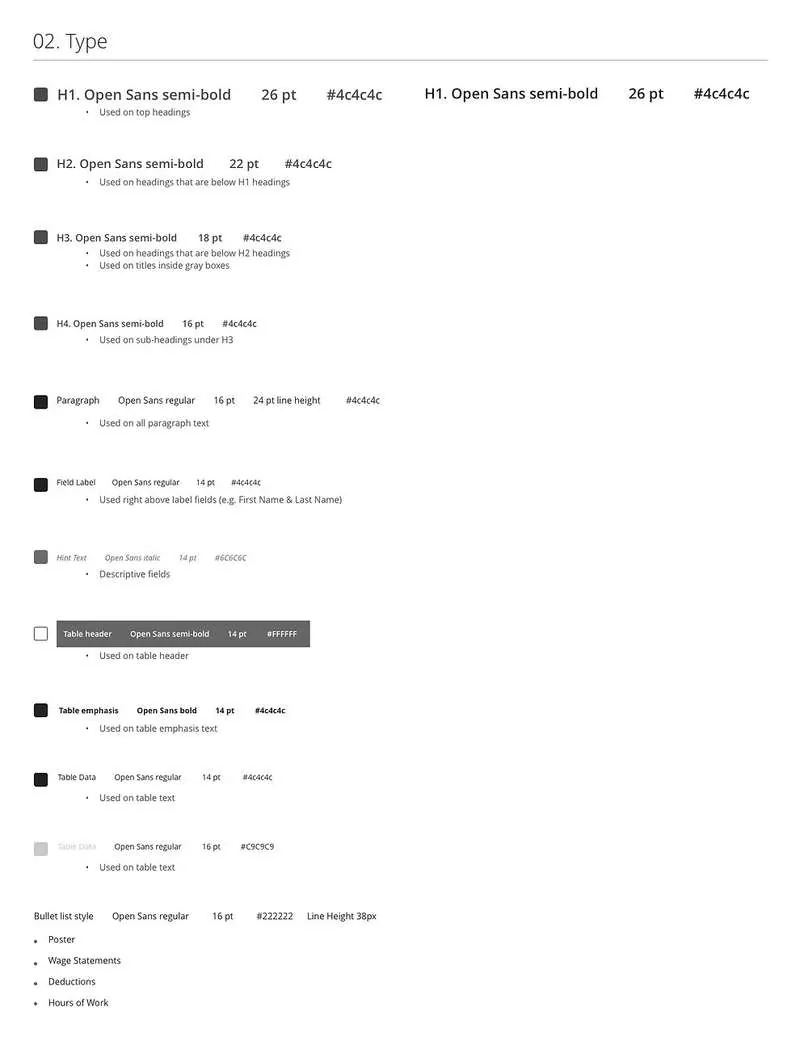
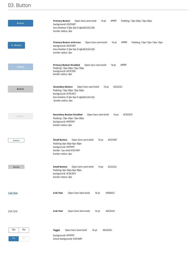
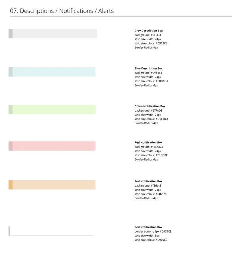
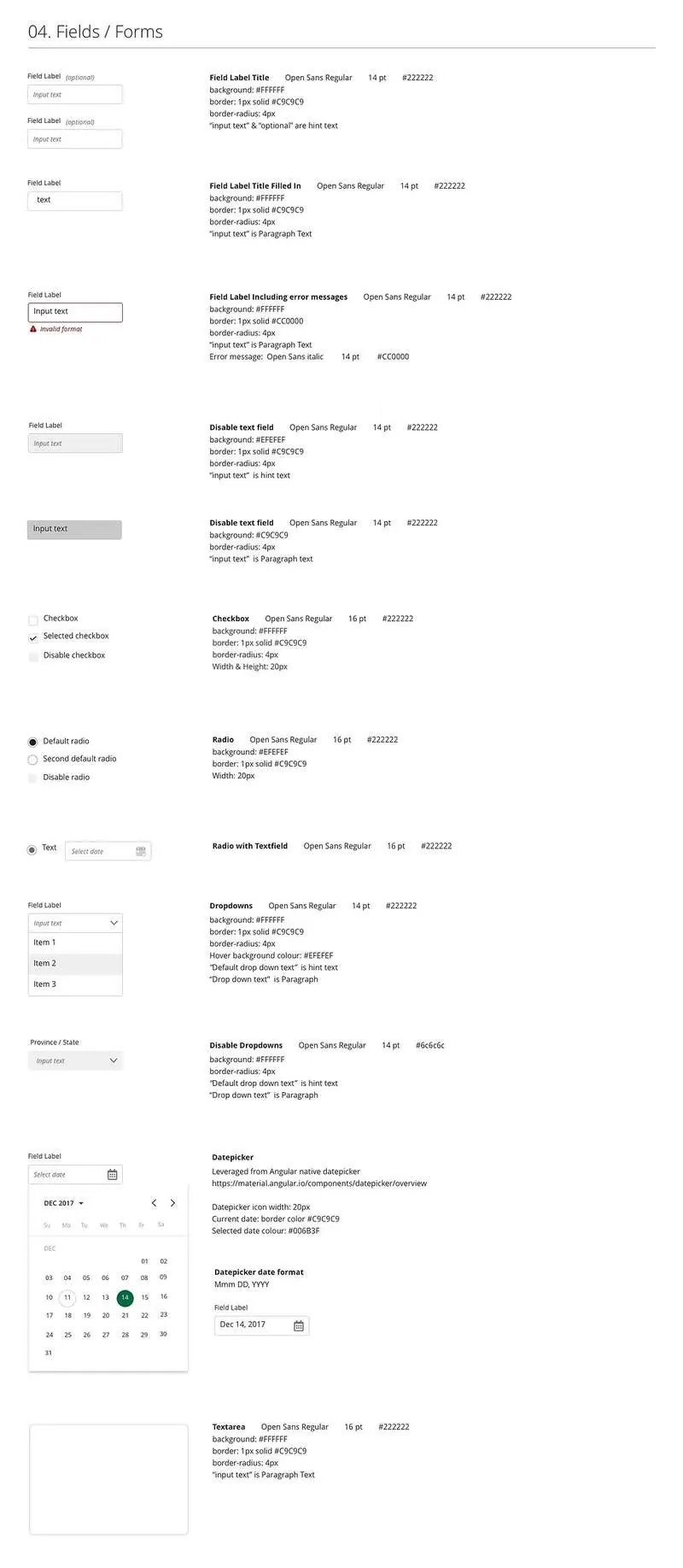
I designed and created the MLTSD Design Style Guide to ensure complete uniformity in style and formatting across all digital products built within the Ministry of Labour, Training and Skills Development.

Before this guide existed, each product team was making independent visual decisions — creating inconsistency across the self-audit tool, claims processing system, case management portal, and other Ministry products. The style guide became the single source of truth for colour, typography, components, spacing, and interaction patterns.

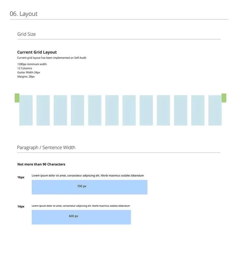
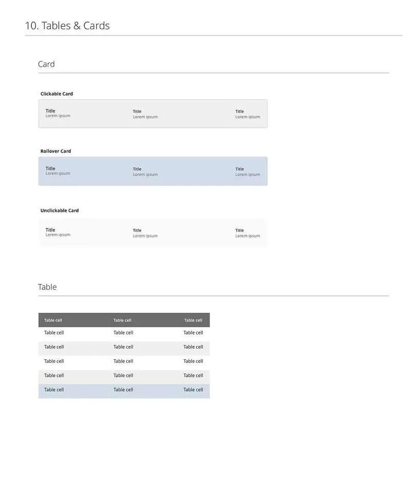
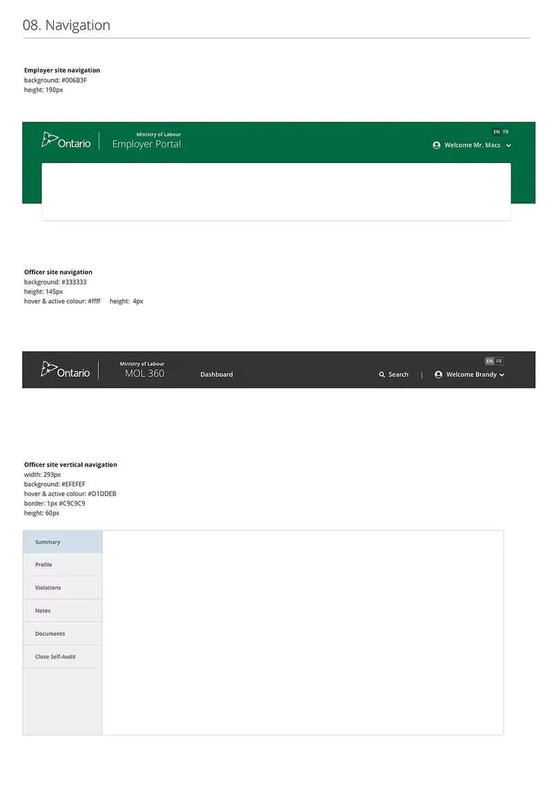
Colours & Brand Typography Buttons & Forms Alerts & Notifications Layout & Spacing Navigation Tables Assets & Icons

Brand colour palette

A consistent colour system ensuring all Ministry digital products share the same visual identity — meeting accessibility contrast requirements and aligning with Ontario government brand standards.

Colours

Type system

Defined heading scales, body text, labels, and helper text — with clear hierarchy rules to ensure readability and consistency across all screen sizes.

Typography

Interactive components

Buttons Alerts

Form patterns and layout grid

Forms Layout

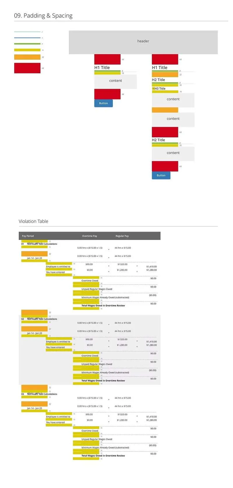
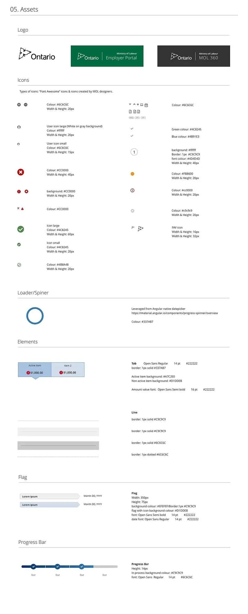
Padding system and icon assets

Padding Assets 1 Assets 2

Data display and navigation patterns

Tables Navigation
Built using this guide
Self-Audit Digitization Tool →
Built using this guide
Claims Processing System →
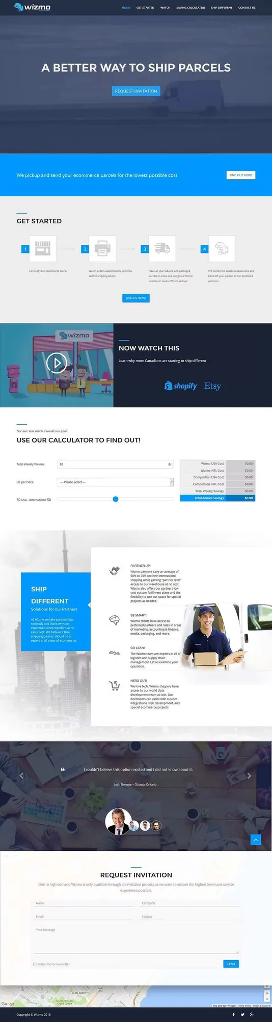
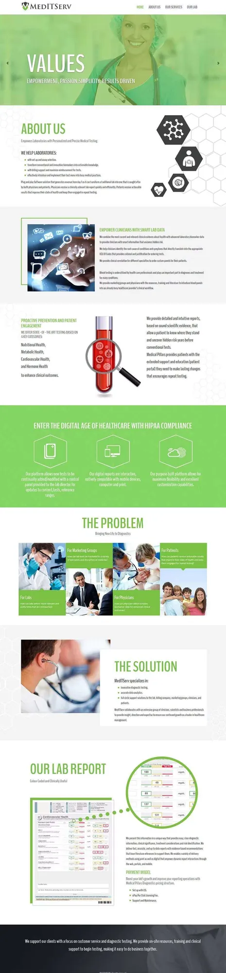
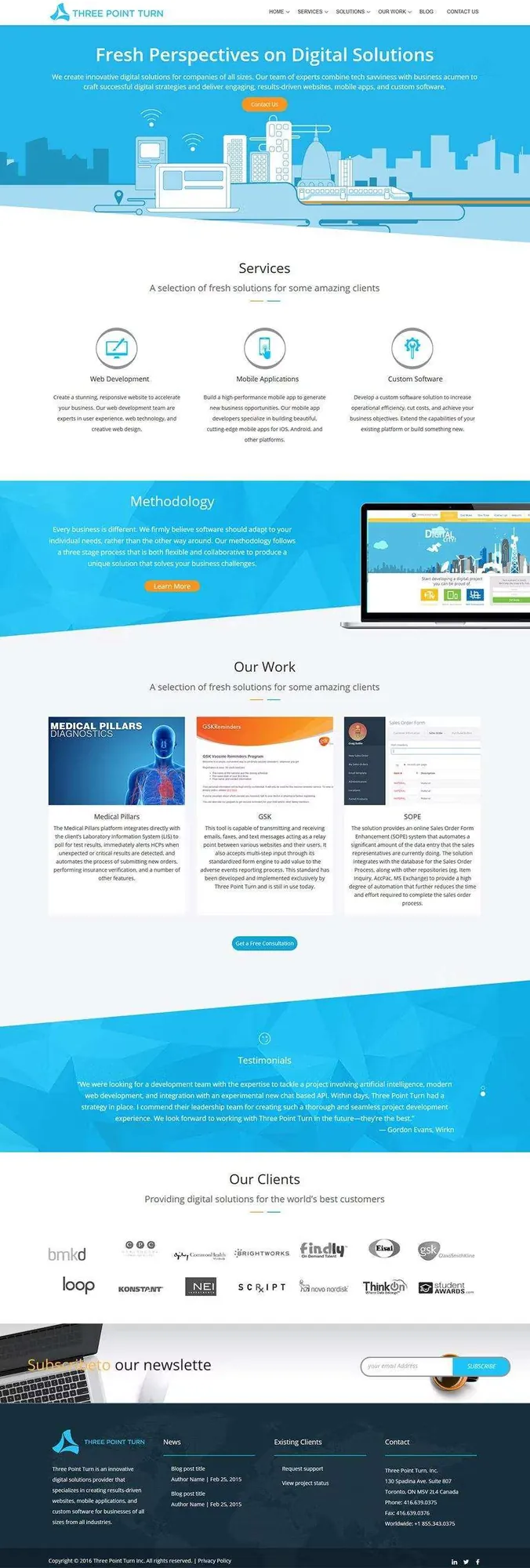
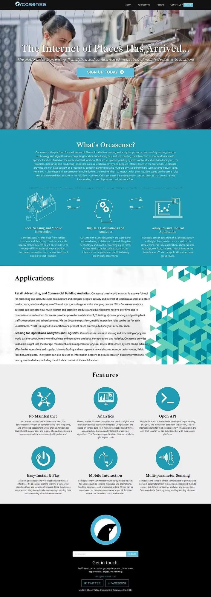
Three Point Turn · Frontend Design & Development · 2015–2017

Marketing
Websites

Role
UX/UI Designer & Frontend Dev
Projects
15+ websites
Deliverable
Design & built from scratch

Designed and built from scratch for 15+ companies

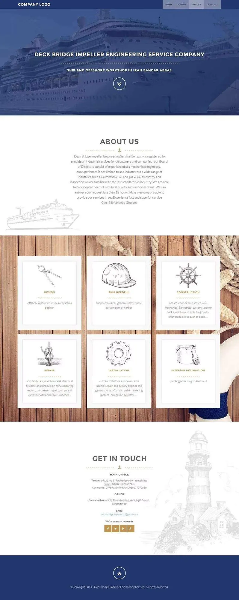
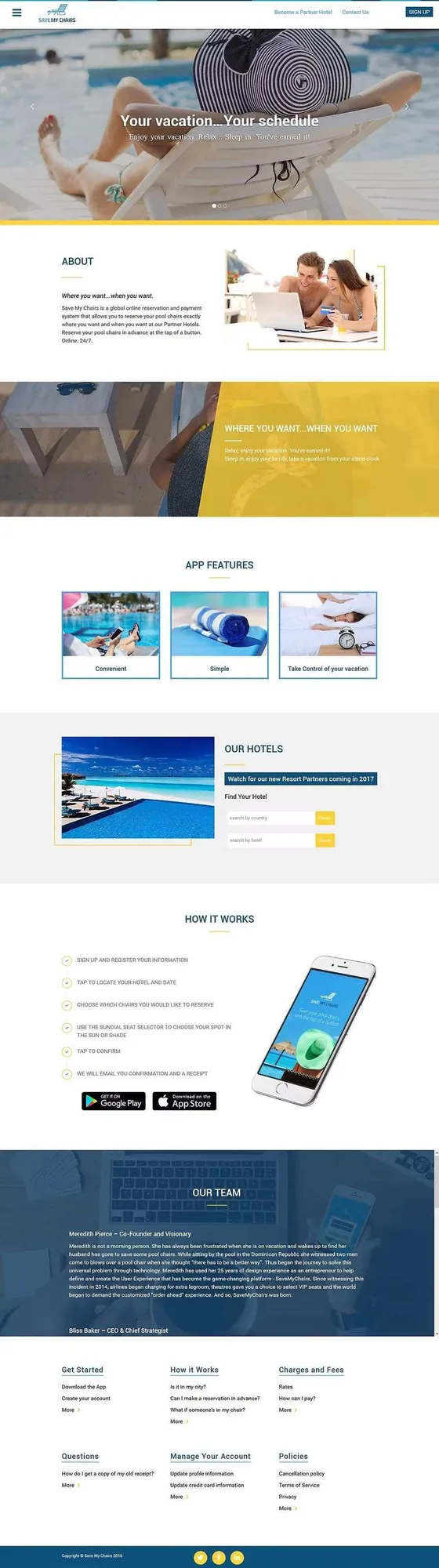
At Three Point Turn I designed and developed the frontends for over 15 prominent customer-facing companies from scratch — including all graphic assets, interactions, and responsive layouts. Each project was fully custom, built to reflect the brand identity and business goals of each client.

UX Design UI Design Frontend Development Graphic Assets Responsive Web Brand Identity

Six featured projects

Ship
Save My Chairs
Wizmo
Med
Three
Orca
Ministry of Labour · Responsive Web · 2018

Self-Check
Tool

Role
Research & Design Lead
Partner
Pivotal Labs
Live Product

Helping Ontario workers understand what they're entitled to

A large number of employees in Ontario were not being paid what they're entitled to — and many employers simply weren't educated in the Employment Standards Act. My goal was to create a tool that fills that gap.

While building the Self-Audit application, I saw in employer interviews just how difficult it is to understand complex employment standards like Public Holiday Pay. If employers were struggling, employees likely were too — which sparked the idea to leverage our Self-Audit work and build a public-facing hybrid tool.

Public Holiday Pay Overtime Pay Minimum Wage Vacation Pay Hours of Work Completely anonymous

Designed for both sides of the employment relationship

Ontario Employee
Wants to understand what they're legally entitled to — holiday pay, overtime, minimum wage — without needing a lawyer or officer to explain it.
Ontario Employer
Wants to ensure they're complying with employment standards before an investigation happens — proactively, anonymously, and without fear of judgment.

Double diamond from day one

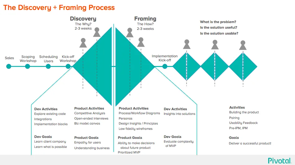
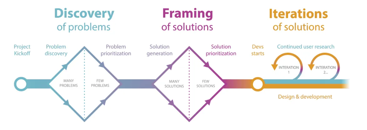
Every project at SDC starts with a Discovery & Framing phase — an intensive few weeks where the team sits together full-time to understand the software we're about to build. Coding is expensive and hard to change, so my goal was to reduce risk before a line of code is written.

Discovery and framing double diamond

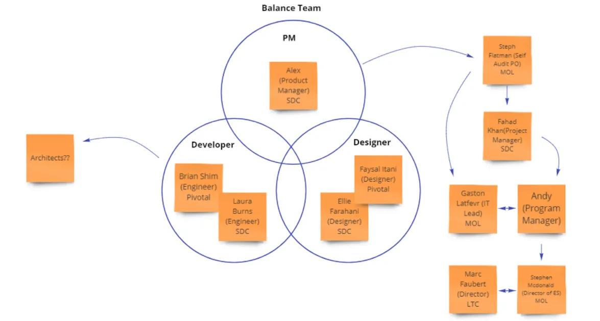
Understanding who was involved

I kicked off a stakeholder-mapping session: everyone wrote their name, title, and a key quote describing what they cared about on a large post-it, then I grouped teams, drew connecting arrows between relationships, and added external stakeholders and key funders — giving the whole team visibility into the ecosystem around the project.

Stakeholder map

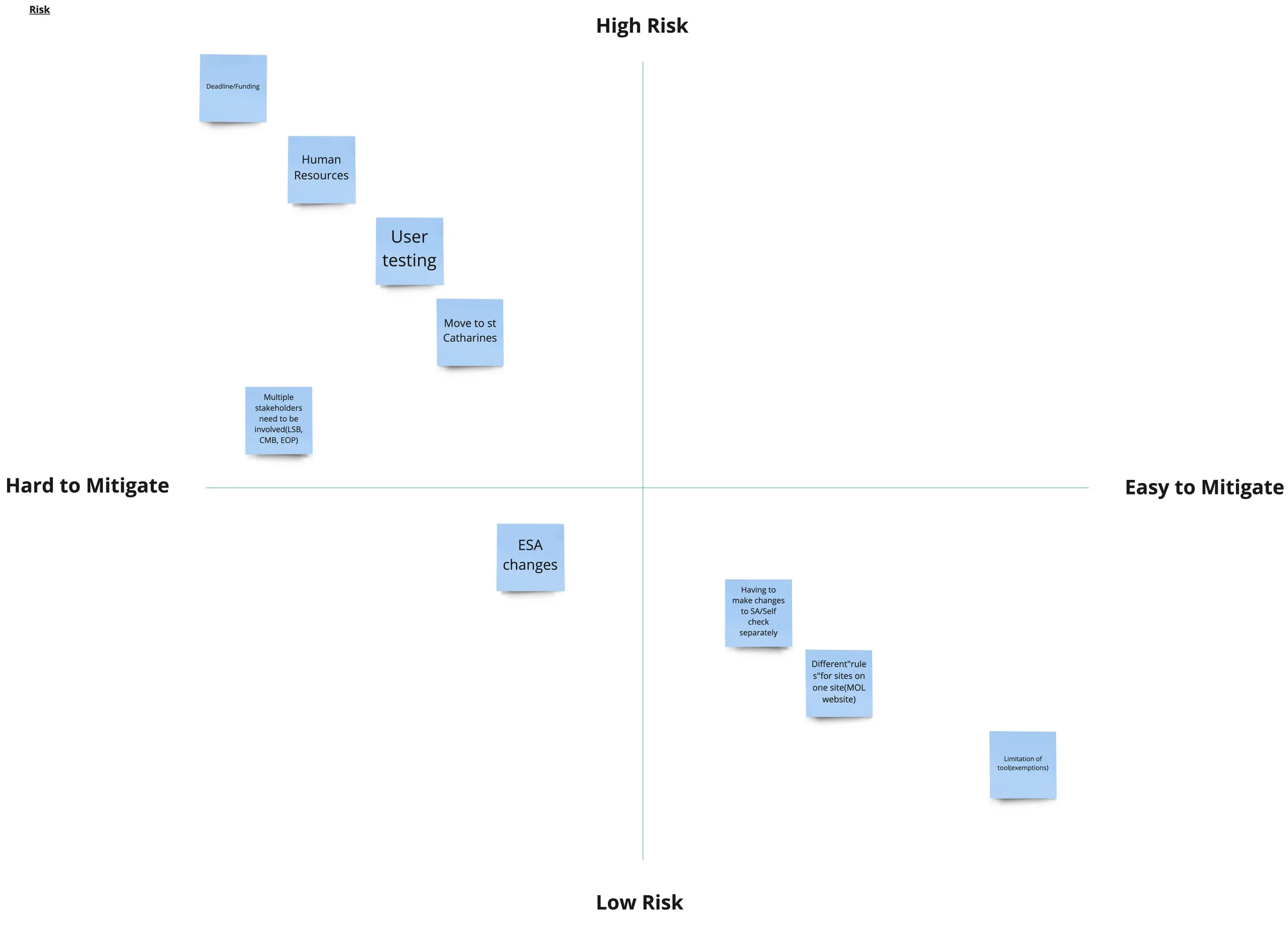
Surfacing and prioritizing project risks

I hosted an open forum for the team to share fears and concerns candidly. Top risks identified: funding deadline unknown with a new government forming, remote team members, no budget for user-testing incentives, an office relocation, and multiple stakeholder groups (LSB, CMB, EOP) creating red tape.

Risks workshop

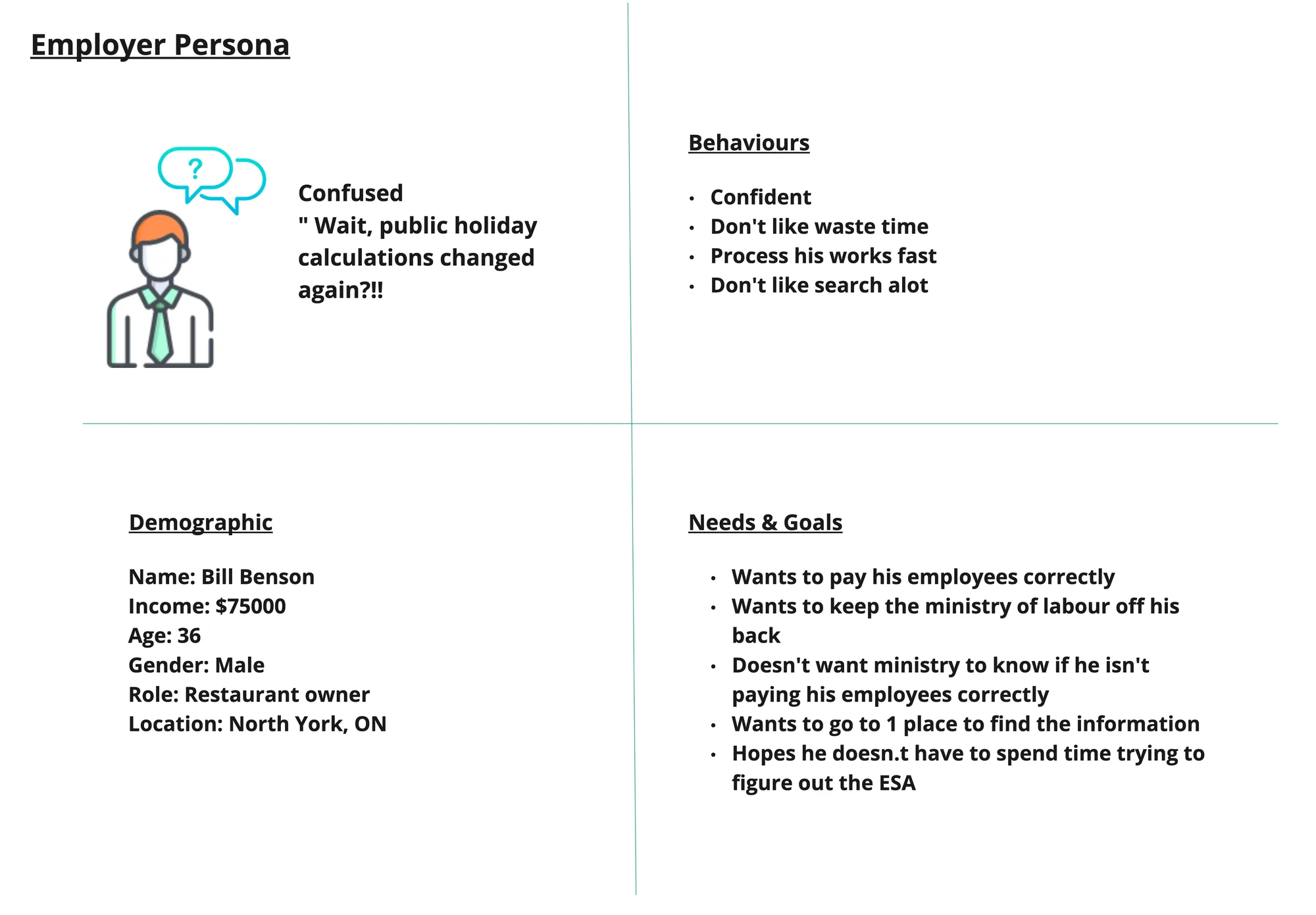
Building empathy for our two users

I guided the team in creating real personas — an Ontario Employee and an Ontario Employer — to give everyone a clear vision of the people using this software and build genuine empathy for their needs and anxieties.

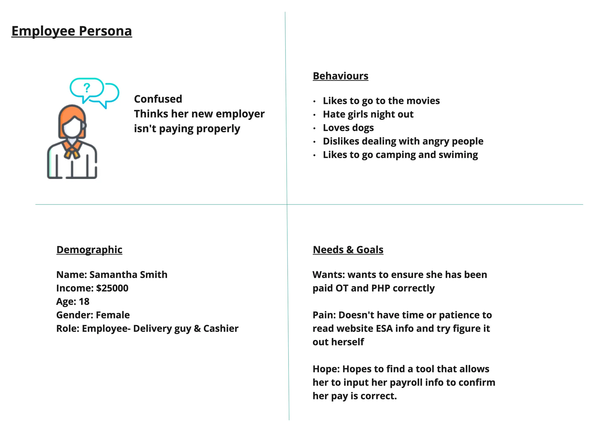
Employee persona Employer persona

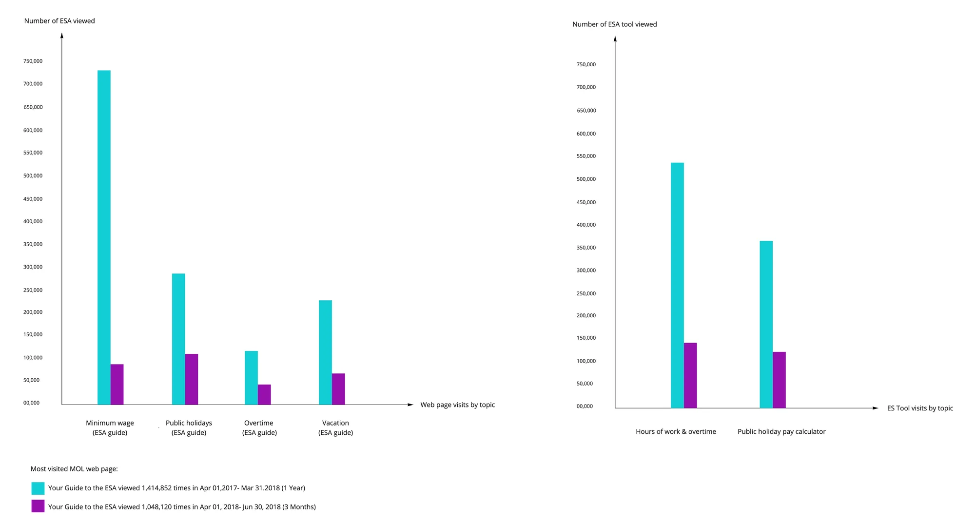
Employment Standards web analytics

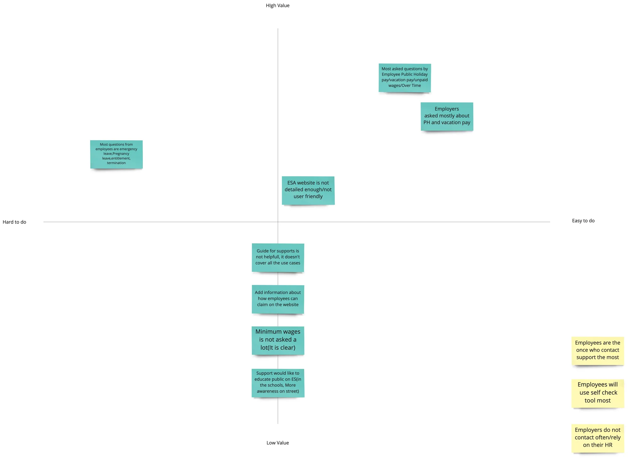
Before building anything, I dug into the existing web analytics from the Employment Standards website — pinpointing which standards users searched for most, where they dropped off, and what questions came up most often.

Web analytics

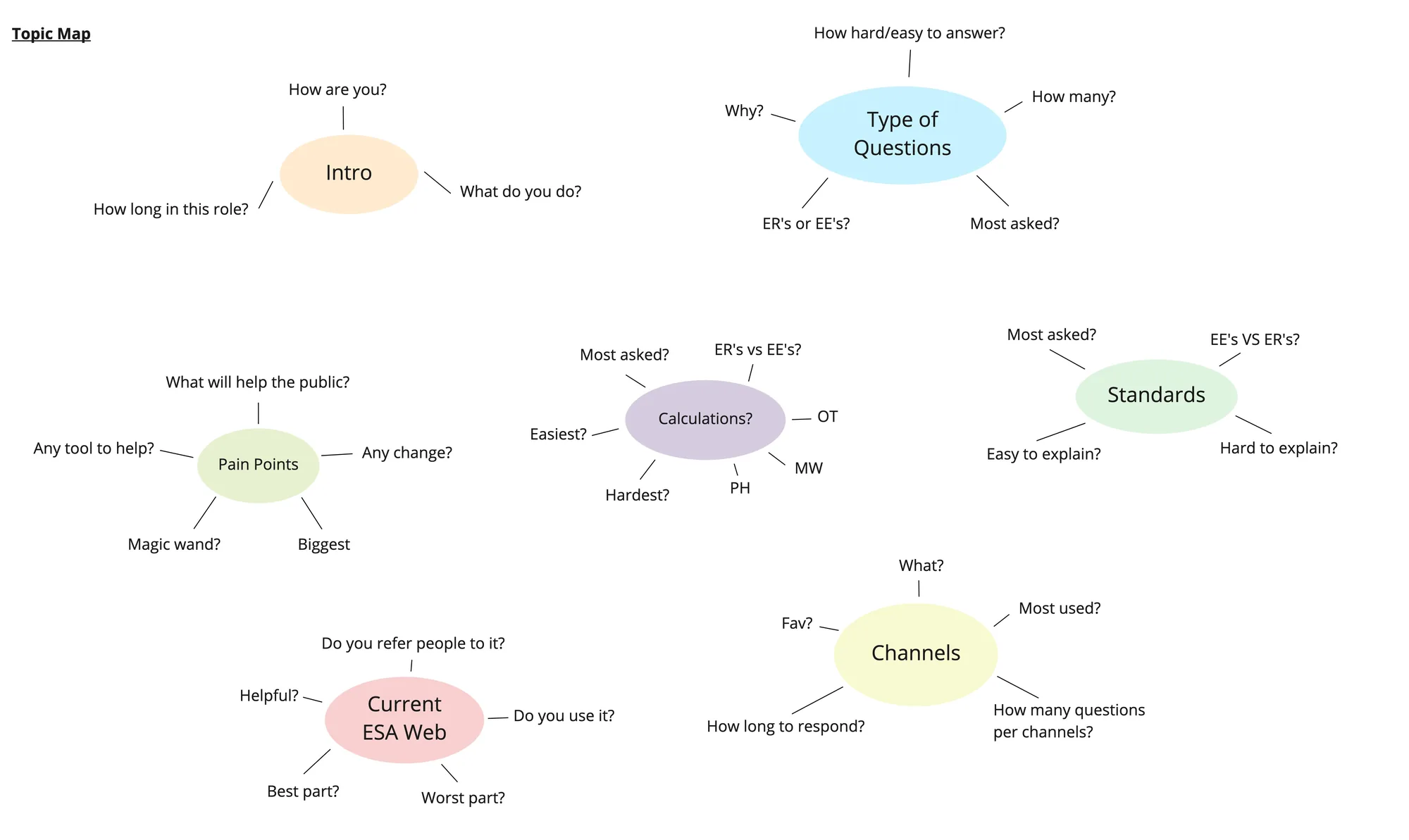
Preparing for exploratory interviews

Instead of a rigid list of questions, I organized interview topics into an affinity map — clusters of related themes so conversations felt natural. It became our reference guide during interviews with both employees and employers.

Interview topic map

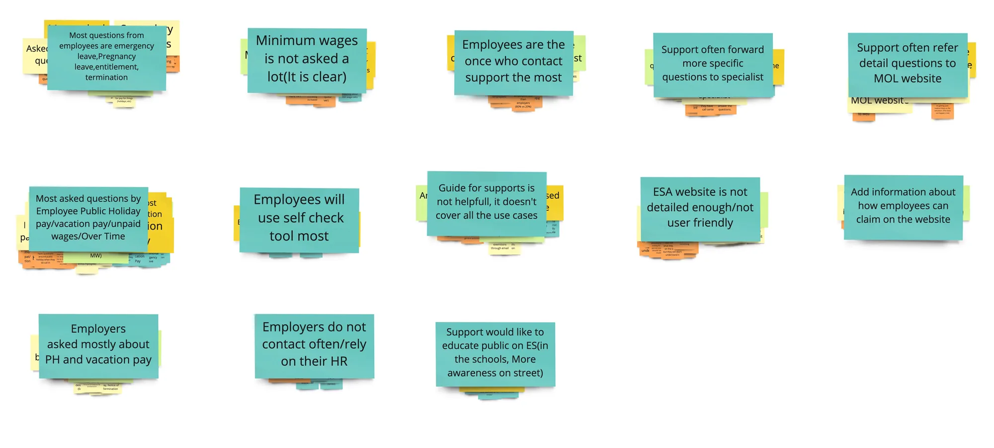
Synthesizing & prioritizing interview findings

After the exploratory interviews, I drove the synthesis — grouping insights by theme and prioritizing by frequency and impact. That work directly shaped the scope and design priorities for the tool.

Interview synthesis Interview synthesis detail

Selected screens

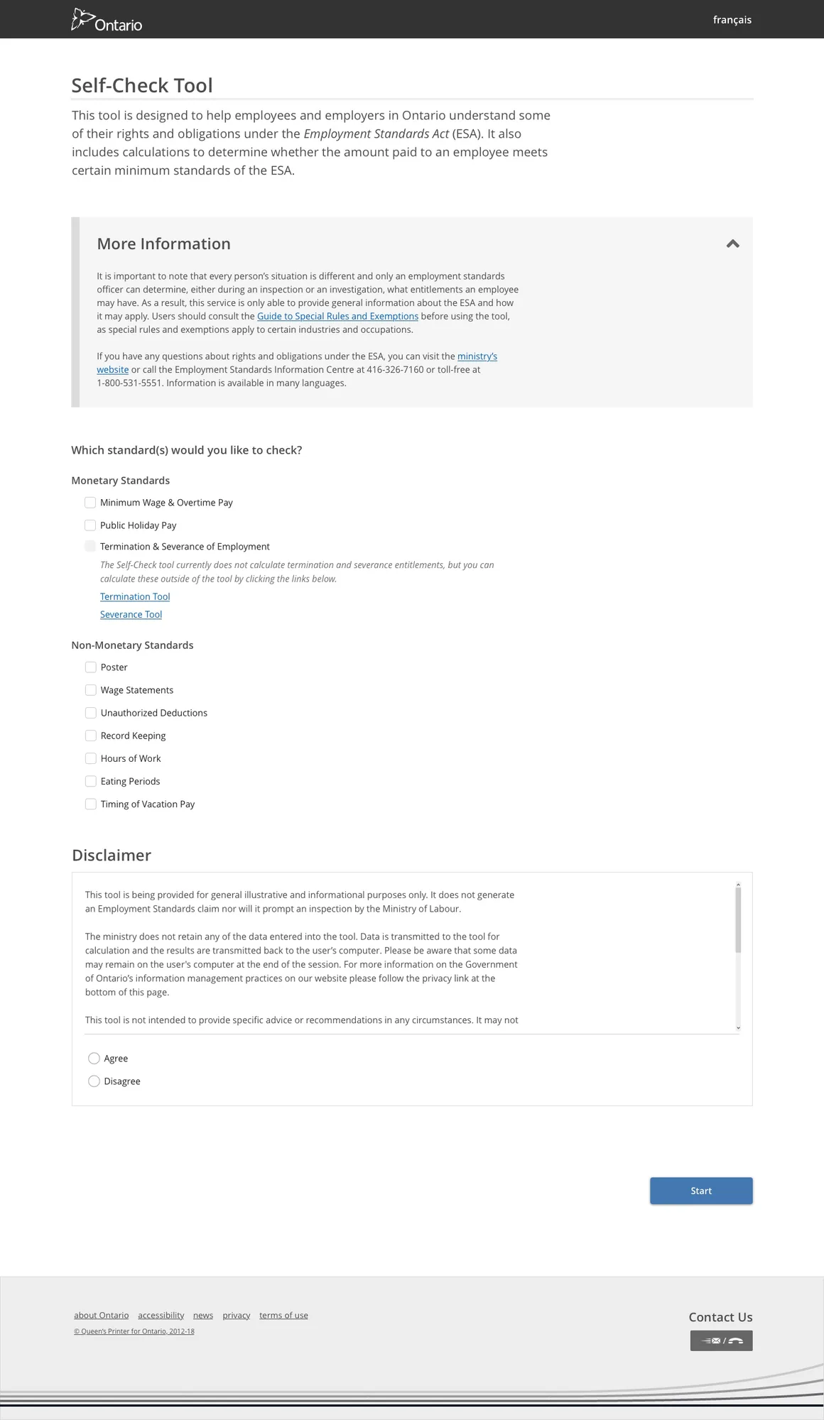
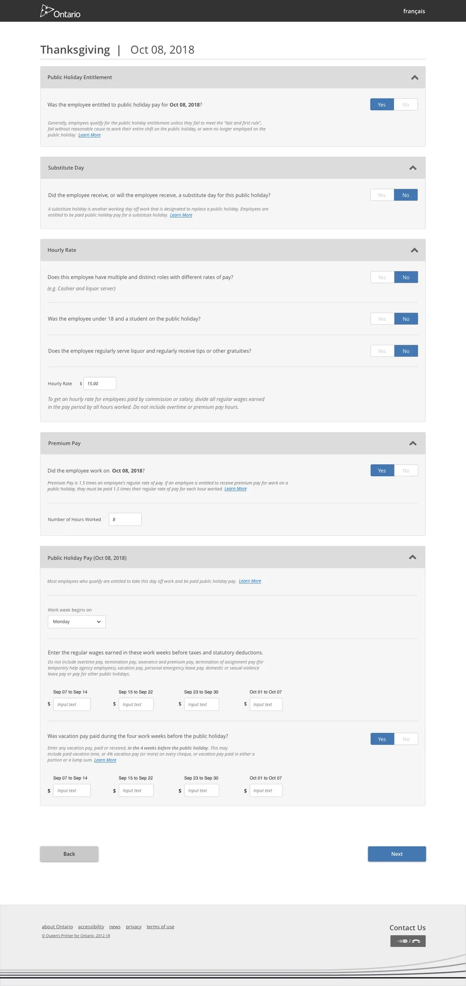
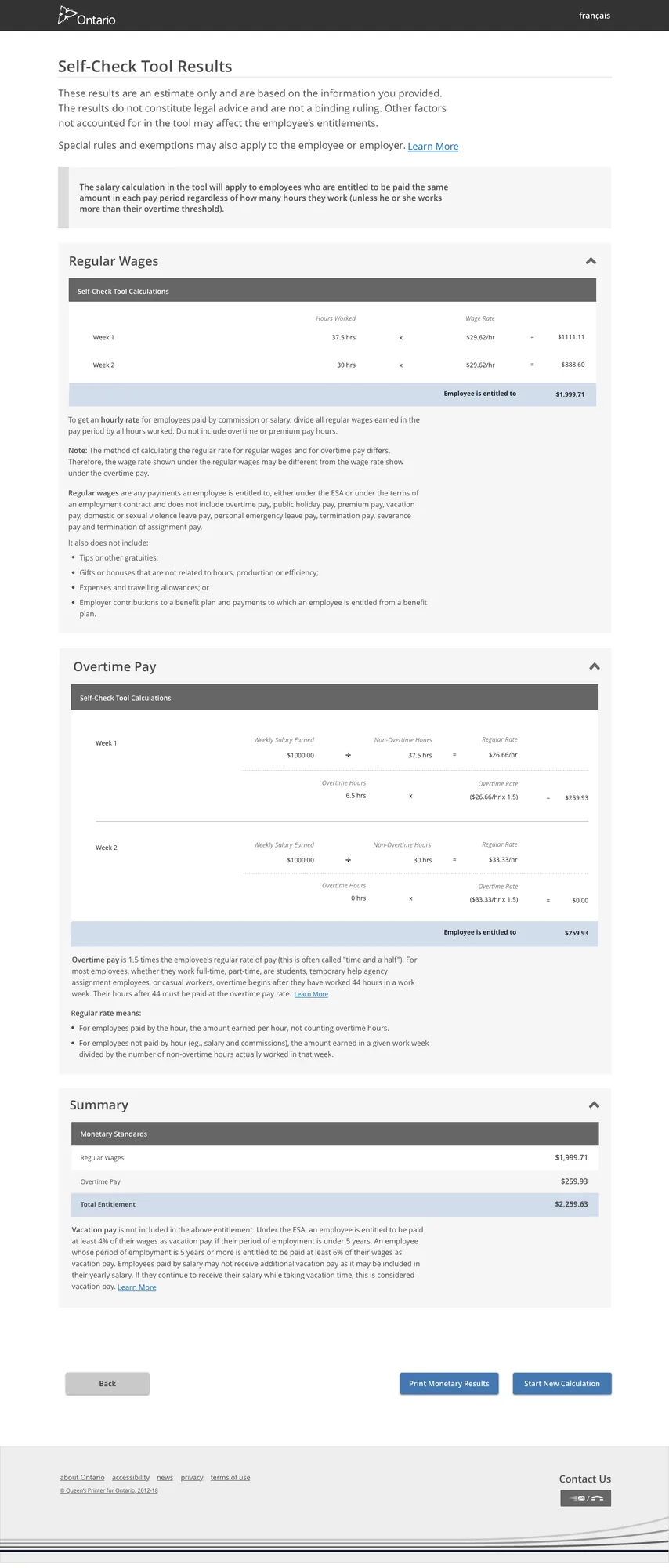
I designed a fully anonymous, self-serve compliance tool that lets any Ontario worker or employer check their entitlements for Public Holiday Pay, Overtime, Minimum Wage, and non-monetary standards.

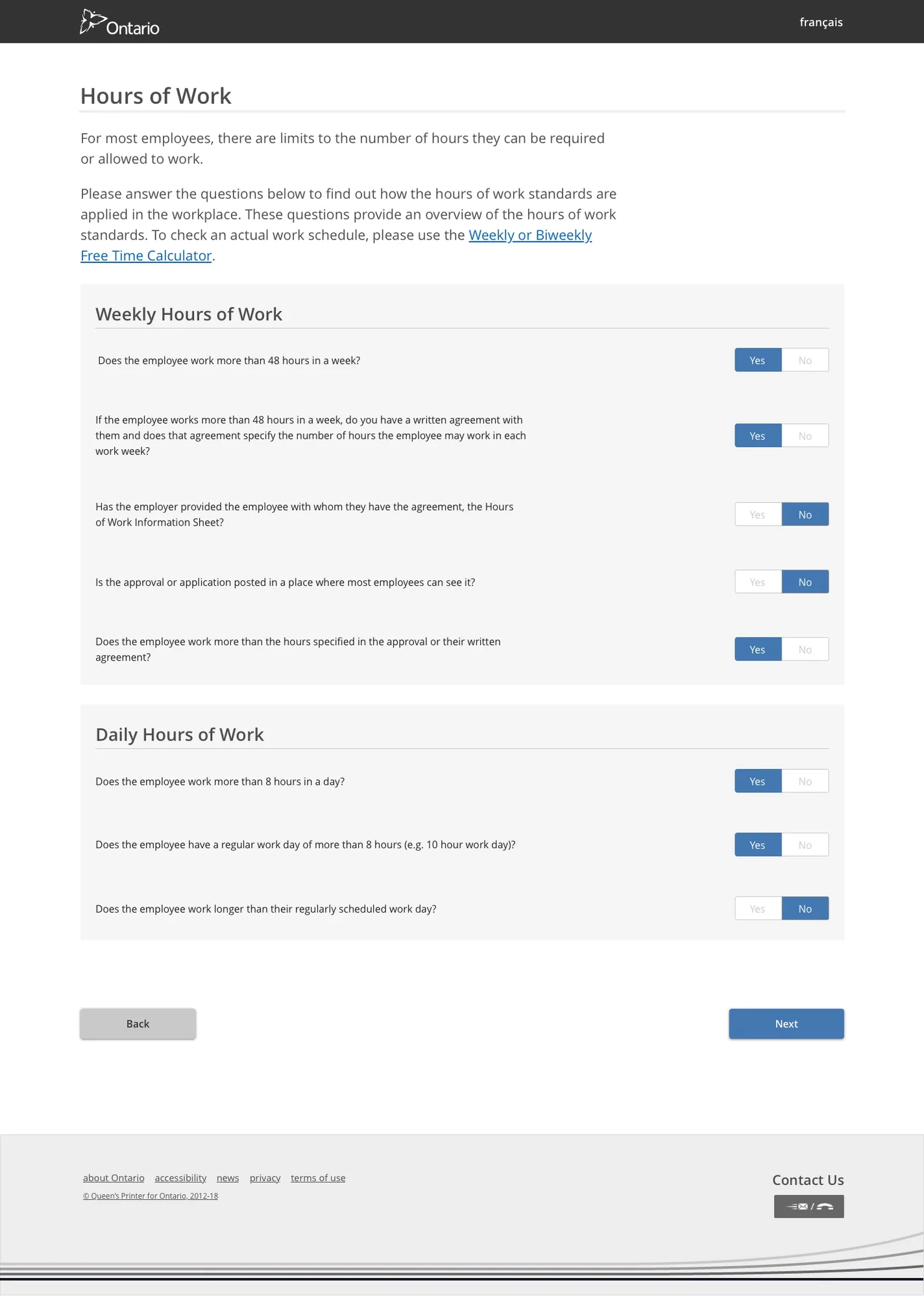
Landing page Public holiday data entry Salary result Hours of work
🌐 Live product: apps.labour.gov.on.ca/es-self-service-tool →
Related project
Self-Audit Digitization Tool →
Also Ministry of Labour
Officer Case Management Portal →
Ministry of Labour · Responsive Web · 2018–2020

Officer Case
Management Portal

Role
Senior Product Designer
Users
ESOs, Managers & Admins
Partner
Pivotal Labs
Platform
Responsive Web

Modernizing how Ontario Officers manage thousands of cases

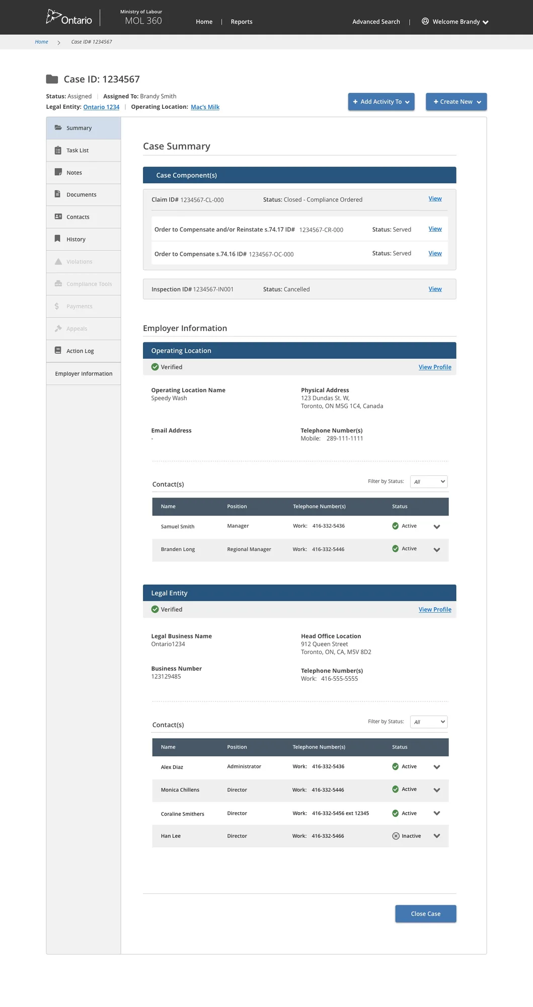
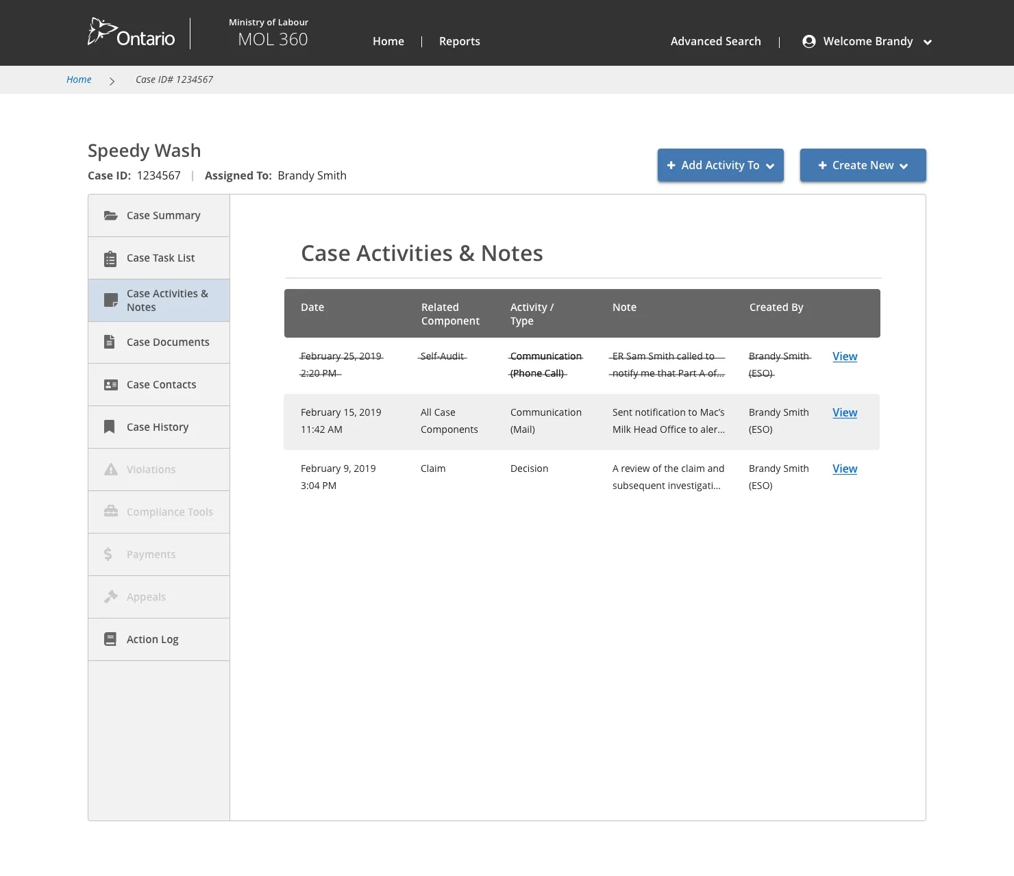
The Case Management system is the central tool used by Employment Standards Officers (ESOs) across Ontario to track cases, log correspondence, manage payments, generate letters, and store all data related to both inspections and claims.

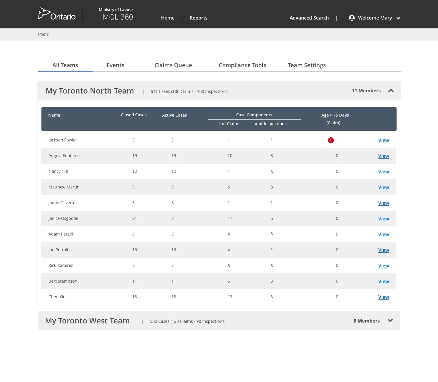
I led the design of three interconnected products: the Officer case management tool, an executive dashboard for managers to assign and track cases across districts and regions, and an admin panel for Business Systems Analysts (BSAs).

Officer Case Management Tool Executive Manager Dashboard BSA Admin Panel

Three products, one mission

Officer Tool
Modernize the ESO case management experience for tracking important dates, payments, generating letters, and storing all case data and correspondence from employers.
Executive Dashboard
Design a Ministry of Labour executive dashboard enabling managers to easily assign and track cases across teams in Ontario districts and regions.
Admin Panel
Design the BSA admin panel giving Business Systems Analysts the control and visibility they need to manage the system configuration.

Personas workshop

To gain a shared understanding of who was actually using this software, I ran a personas workshop — building empathy for users and visualizing their characteristics, motivations, and daily challenges across two core user types: Employment Standards Officers and Ministry Administrators.

Personas workshop

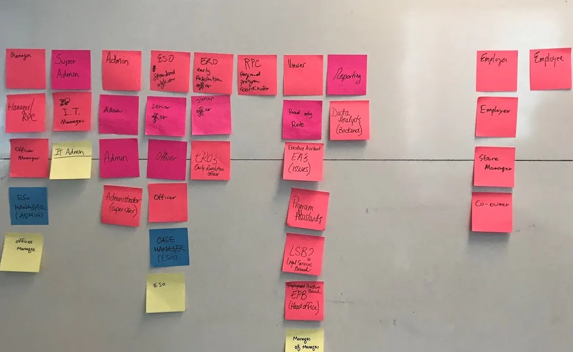
Roles & permissions mapping

Before designing any screens, I led a session to map out user roles and their associated permissions — ultimately reducing the number of roles needed for the initial launch down to only those that were absolutely necessary. This exercise directly shaped the information architecture and access control model.

Roles and permissions mapping

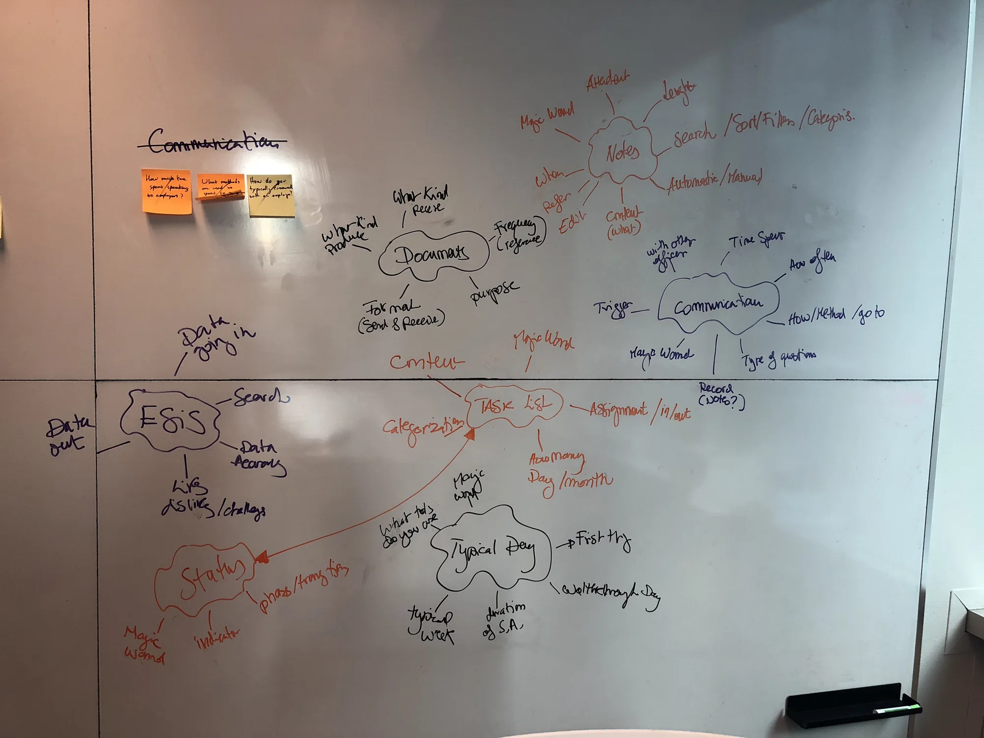
Interview prep & topic mapping

I organized interview questions into a topic map — clustering related questions around common themes so interviewers could have natural conversations with ESOs while covering key areas: a day in the life, the current system (ESIS), the claims process, employer interactions, and document management.

Interview topic map

Research synthesis

After every round of research, I guided a synthesis exercise to analyze interview findings. Results were color-coded by interview and grouped by key insight — making it easy to spot recurring themes across different ESOs and regions.

Research synthesis

Scenario writing & sketching workshop

After prioritizing the highest pain points for Officers, I moved the team into framing — starting with scenario writing to define specific user situations, then group sketching to visualize potential solutions. I got the full team sketching before going digital, so everyone was aligned before a pixel was placed.

Scenario writing step 1 Sketching workshop

Selected high-fidelity screens

A selection of the final high-fidelity screens, spanning three distinct but connected interfaces — the Officer case management tool, the Manager executive dashboard, and the admin panel — each tailored to the specific role and workflow it served.

Manager Executive Dashboard

Gave regional managers a real-time overview of all cases across Ontario — with assignment controls, workload distribution, and district-level tracking.

Manager executive dashboard

Officer Case Summary

The core Officer tool — a single view of everything on a case: dates, employer data, correspondence history, payment tracking, and quick actions for generating letters and logging notes.

Officer case summary
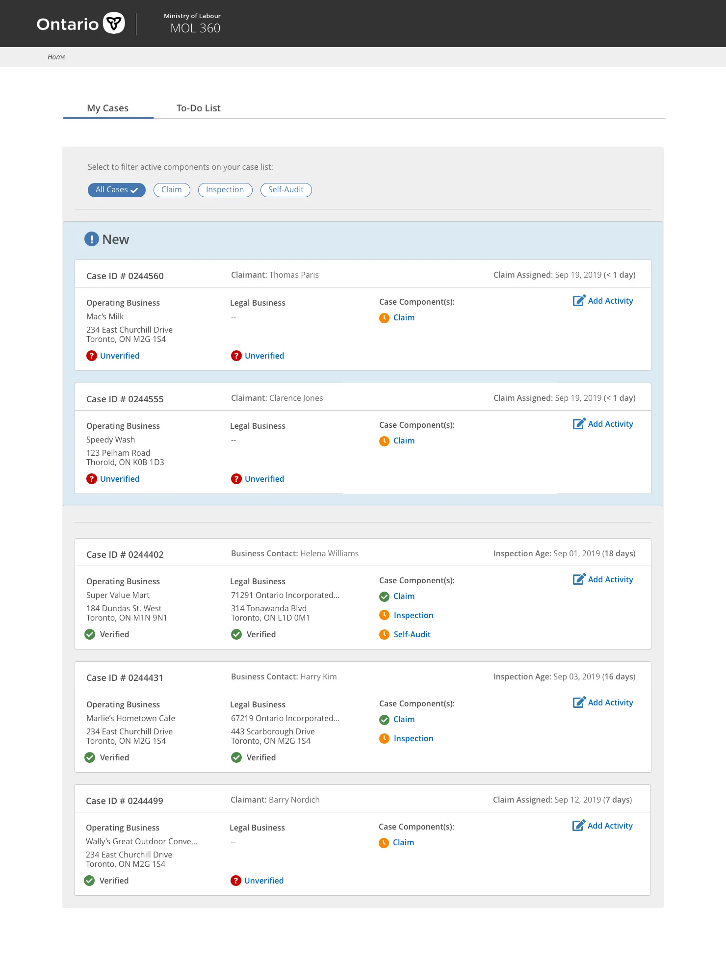
Officer case list

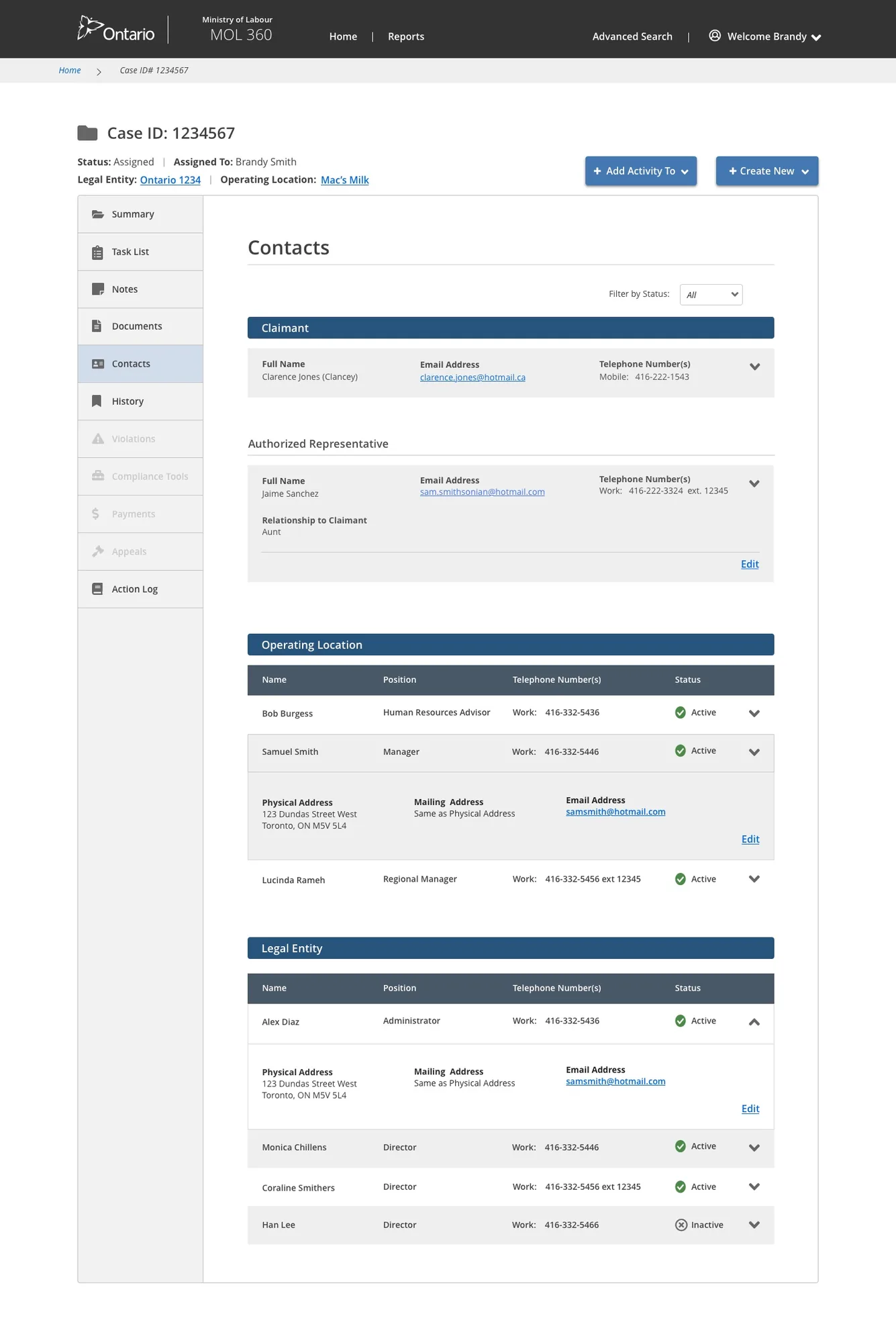
ESO Dashboard & Contacts

The Officer-facing dashboard surfaced the active caseload with priority indicators — and a contacts screen gave instant access to all employer and claimant information linked to each case.

ESO dashboard Contacts screen
Also Ministry of Labour
Self-Audit Digitization Tool →
Also Ministry of Labour
Claims Processing System →
Ministry of Labour · MoL360 · Web Application · 2018

Inspection
Tool

Role
Lead Designer
Users
Officers & Employers
Partner
MoL360
Platform
Web Application

Streamlining employment standards inspections across Ontario

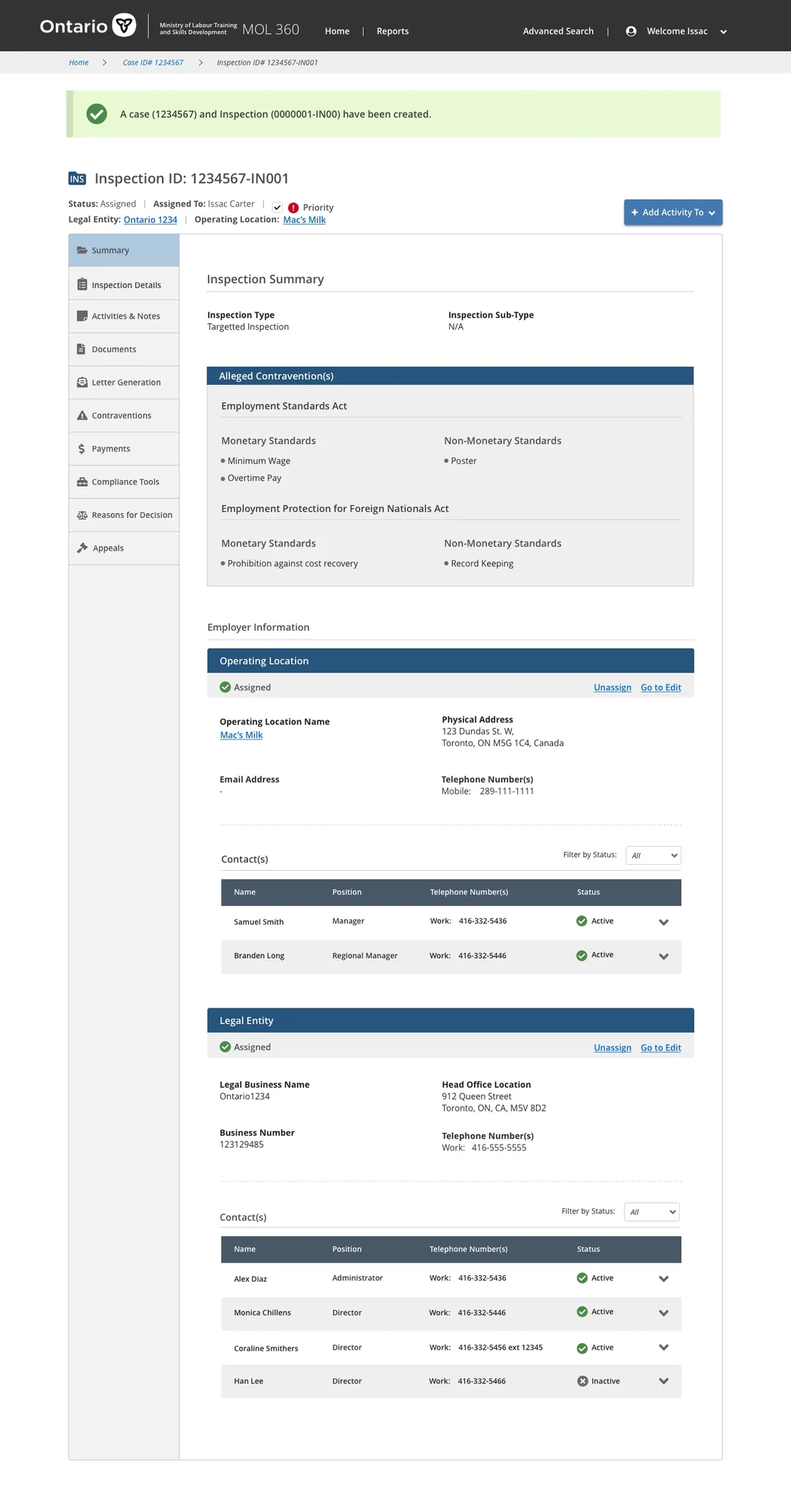
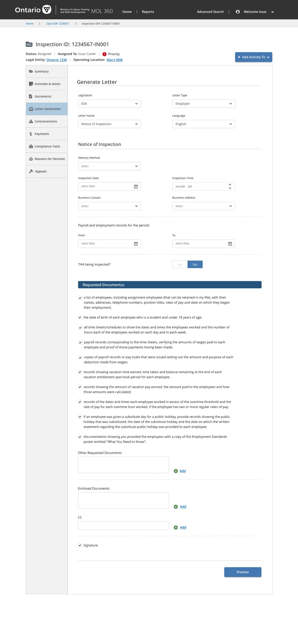
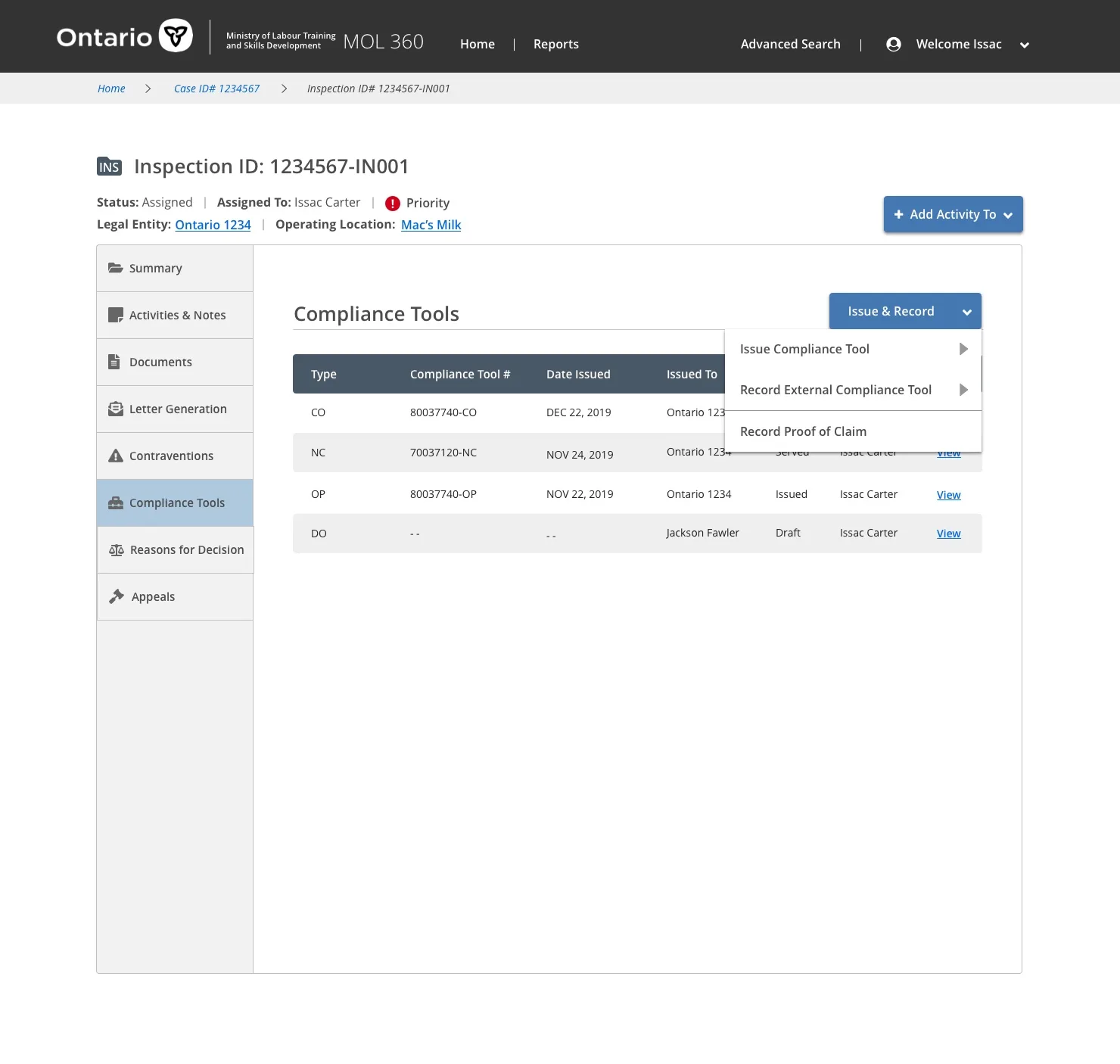
A digital tool designed to streamline the employment standards inspections conducted by the Ministry of Labour. The project followed a Discovery and Framing methodology — identifying challenges and shaping an MVP through workshops and user research before development began.

Discovery Framing User Research MVP Definition Service Design

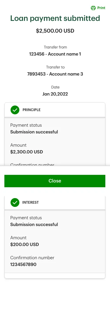
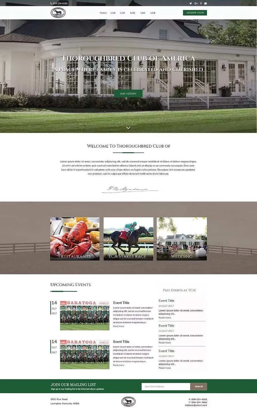
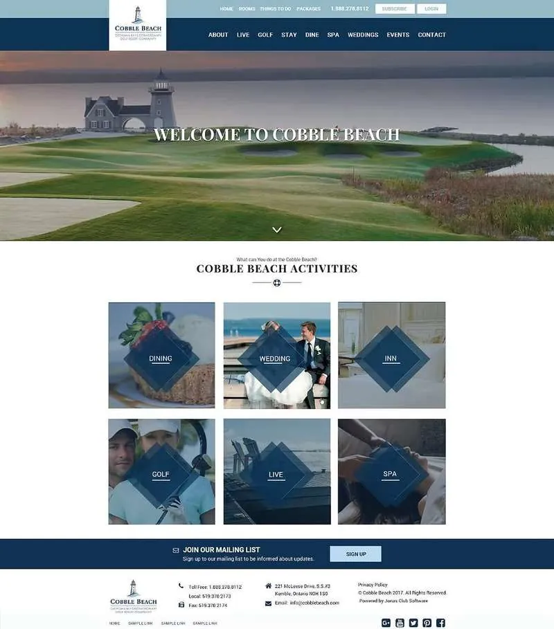
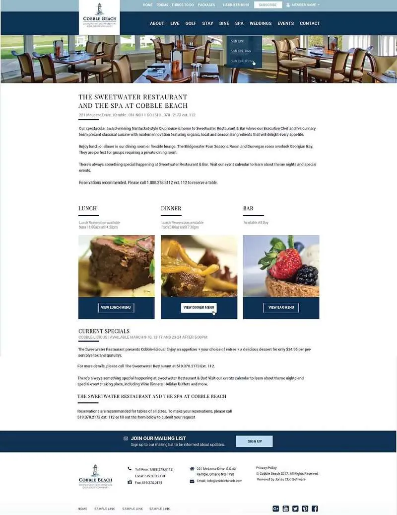
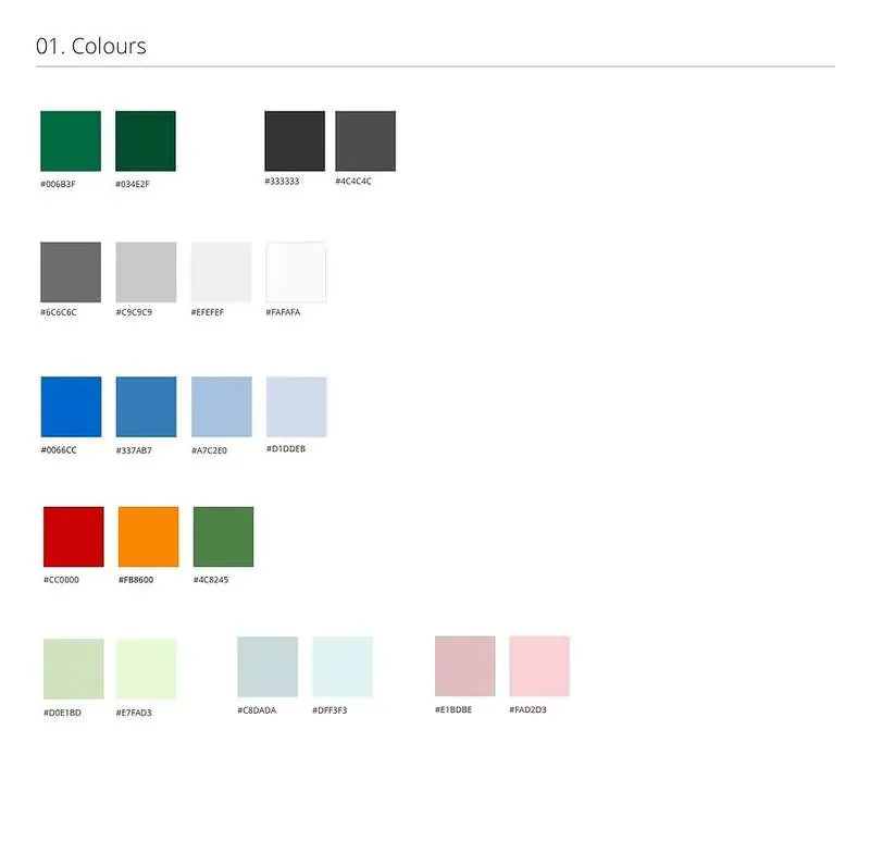
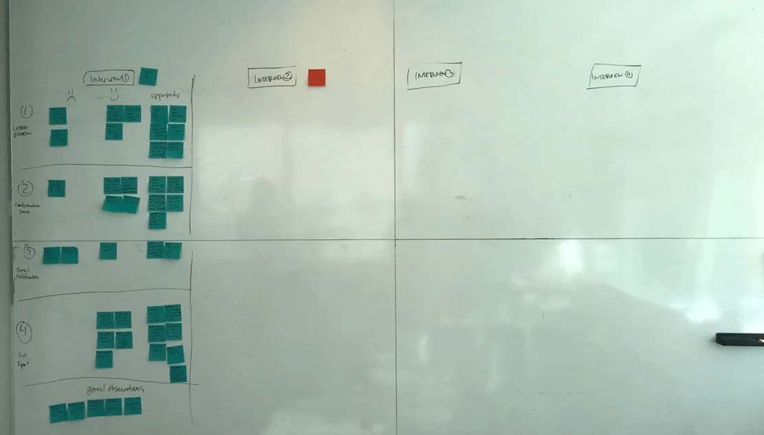
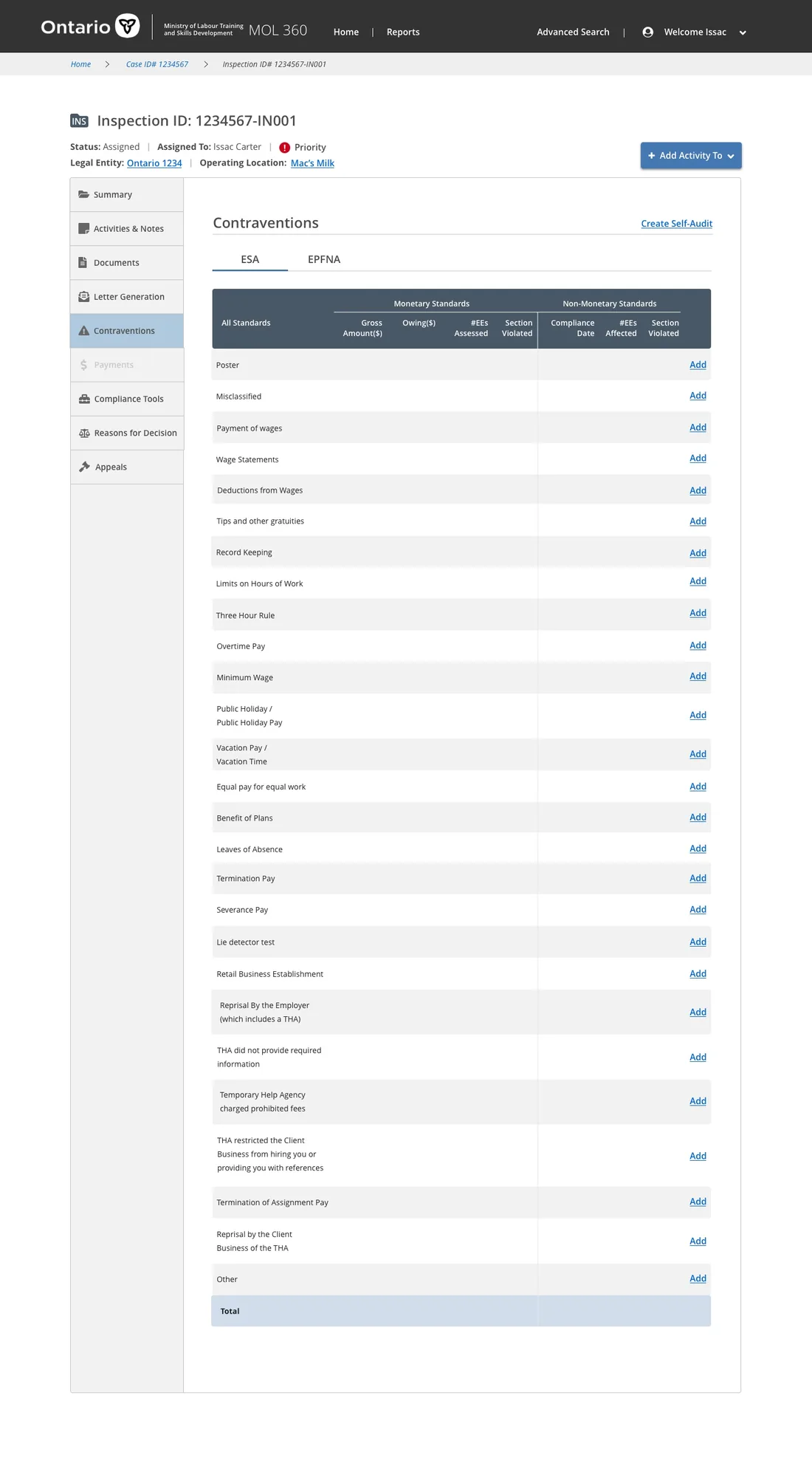
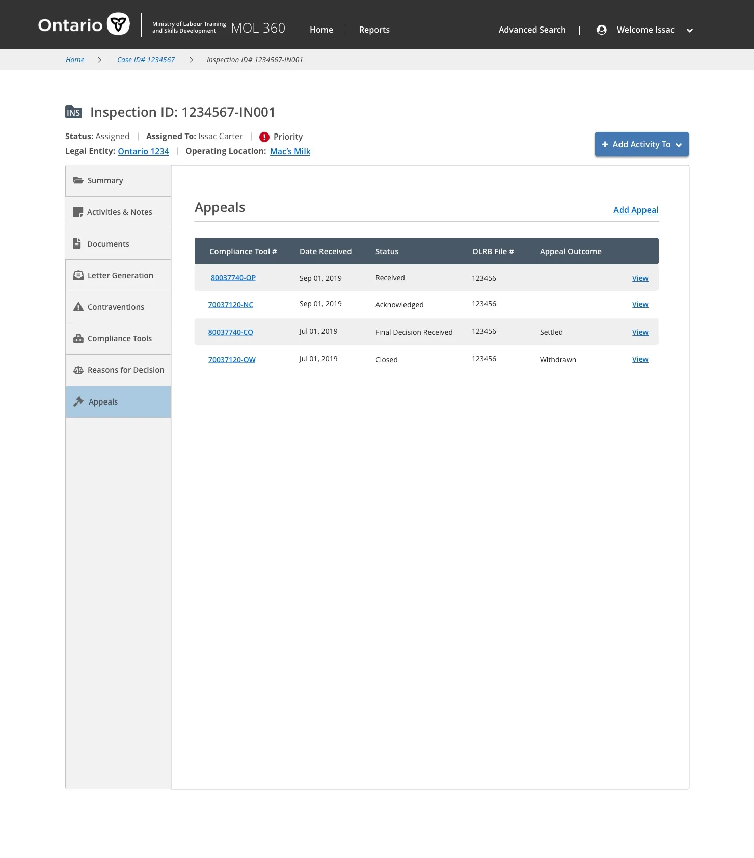
Five stages of an inspection

Before designing anything, I mapped the end-to-end inspection journey — from the trigger that initiates a case through to bringing an employer into compliance. These five stages framed every design decision that followed.

1 · Initiation
Triggered by risk analysis, claims, target sectors, or blitz operations. The officer confirms the legal entity and assesses eligibility before proceeding.
2 · Contact Employer
The officer initiates contact with the employer and serves the official Notice of Inspection.
3 · Site Visit
Remote or in-person. Scripted employer and employee interviews, test audits and self-audits, and — where needed — compliance orders, penalties, and tickets.
4 · Wrap Up
Receive self-audit documentation, issue the Notification of Compliance, and post the inspection report at the workplace.
5 · Bring Into Compliance
Issue overtime-pay orders, process possible appeals, and assess fines and potential collections.
MoL360 inspection user flow

Discovery & Framing

Discovery — I led the workshops and user interviews that surfaced the product's potential problems and challenges, then converged them into actionable priorities.

Framing — I led the sessions where we consolidated and prioritized the proposed solutions until the requirements and approach for the MVP were decided.

Discovery, Framing and Iterations methodology

Stakeholder mapping

I led an early mapping session that identified the key decision-makers, product observers, those with veto authority, and external support resources — giving the team a clear picture of who needed to be aligned and when.

Identifying risks & mitigations

I led a session where the team named the risks that could derail delivery — and planned mitigations for each: data sensitivity around cloud storage, decision-making slowed by lengthy command chains, hard deadlines and compressed timelines, scope outsized for the time available, interference with other MoL360 applications, and resource constraints.

Risk identification notes Risk mitigation notes

Exploratory interviews

I led exploratory interviews to build empathy and surface recurring topics across conversations, then organized and synthesized the findings to refine the project goals and align the personas more closely with real end-user needs.

Exploratory interviews

Synthesis & affinity mapping

I led the synthesis, grouping findings across all interviews to determine the primary areas of interest and pain points and building affinity maps that surfaced the clearest opportunities for the product to focus on.

Affinity map
Affinity mapping detail Affinity mapping detail

Desktop walkthrough

I ran a desktop walkthrough where a former Employment Standards Officer walked the team through a complete inspection scenario, chronologically. We mapped the many locations an inspection touches — office, parking lot, even a subway restaurant — divided the board by lifecycle stage, and documented the pain points and documents produced at each step to find the critical points of friction.

Desktop walkthrough setup Walkthrough mapping
Full inspection lifecycle board

Prioritizing pain points

I led the team in prioritizing pain points on a 2×2 matrix — weighing the value gained from alleviating each issue (assessed by the Product Owner) against implementation difficulty (assessed by the Inspections sub-team) — to focus effort where it mattered most.

Pain point prioritization 2x2 prioritization matrix

The lean exercise — roadmap planning

Throughout Discovery and Framing, I had the team collect ideas in a "locked solution chest" to avoid committing to an approach too early. Once enough research was gathered, I led the team in validating ideas against user insights and prioritizing them into a trial roadmap — exploring direction through iterative discussion rather than guesswork.

Roadmap planning

Scenario writing & sketching

I wrote realistic scenarios describing how the tool would deliver value — intuitive enough that an officer could navigate the software without formal training. In the sketching workshop I led, team members produced storyboards in tight 10–15 minute rounds, then circulated sketches for peer review and voting. I consolidated the most popular sections and features into high-fidelity mockups.

Sketching workshop Storyboard sketching

Usability interviews

I led usability sessions and captured feedback organized by individual user (color-coded) and by sentiment — happy, sad, and opportunities — making it easy to spot patterns across every participant and feed them back into the design.

Usability interview synthesis

High-fidelity mockups

I designed the final screens that brought the inspection workflow to life across five connected interfaces — each tailored to a specific moment in the officer's process.

Employer Relationship — OL & LE

Configures the relationship between an operating location and legal entity — the foundation every inspection is built on.

Employer relationship configuration

Employment Standards Assessment (ESA)

The assessment interface where officers record findings against employment standards during the inspection.

Employment Standards Assessment screen

Compliance Tools

A dashboard of the orders, notices, and actions an officer can issue to bring an employer into compliance.

Compliance Tools dashboard

Contraventions

Documentation and tracking of every contravention found, with the evidence and orders attached to each.

Contraventions tracking

Appeals

A table for managing the dispute process when an employer appeals an order or penalty.

Appeals table
Also Ministry of Labour
Officer Case Management Portal →
Also Ministry of Labour
Claims Processing System →